January 4, 2025
10 Examples of Bad Websites & their Reason
A running list of bad websites we discovered and why we think its bad that is frequently updated.
To be honest, we would have loved to call this a list of not so good websites, but its just simpler to call them bad websites to make sure we get the message across. But why have a blog post about bad websites?
Well as Charlie Munger said - much of success comes from avoiding common paths to failure. When creating a website, its almost easier to avoid what is bad, than to come up with something genius. Hence, we decided to maintain a list of what we think are bad websites (bad UX, bad choice of font, bad on page seo, bad accessibility et al). Hopefully this list leads to better websites for both those building and their visitors.
Recommended Article: Best website builder for Small Business
Introduction
So what is a bad website ? There are many ways to judge websites and classify them as bad. This is a subjective list of websites identified by the Konigle team as bad. We spend our entire time building internet marketing tools and research what are both good and bad websites.
What Makes a Website “Bad”?
A few key things:
- Poor user experience (UX)
- Cluttered layout and too many pop-ups
- Hard-to-read fonts or colours
- No clear purpose or messaging
- Not mobile-friendly
- Broken links or outdated content
- Poor SEO setup (so it doesn’t rank)

The list is no particular order but rather updated often as someone
on the team comes across a bad website and they post it to our internal
slack channel #bad-websites. Here we go.
Avoiding these common mistakes can save you money, time, and customers.
Tom's Guide
Tom's Guide was registered ~24.5 years ago. According to various SEO tools this website gets anywhere between 15 million to 50 million visitors a month and this has to be one of the most frustrating websites to visit. They seemed to have sold every possible pixel of a web page to advertisers. Assuming an average visit duration of ~ 1 minute, that's almost 250,000 minutes of frustration every month for us humans.
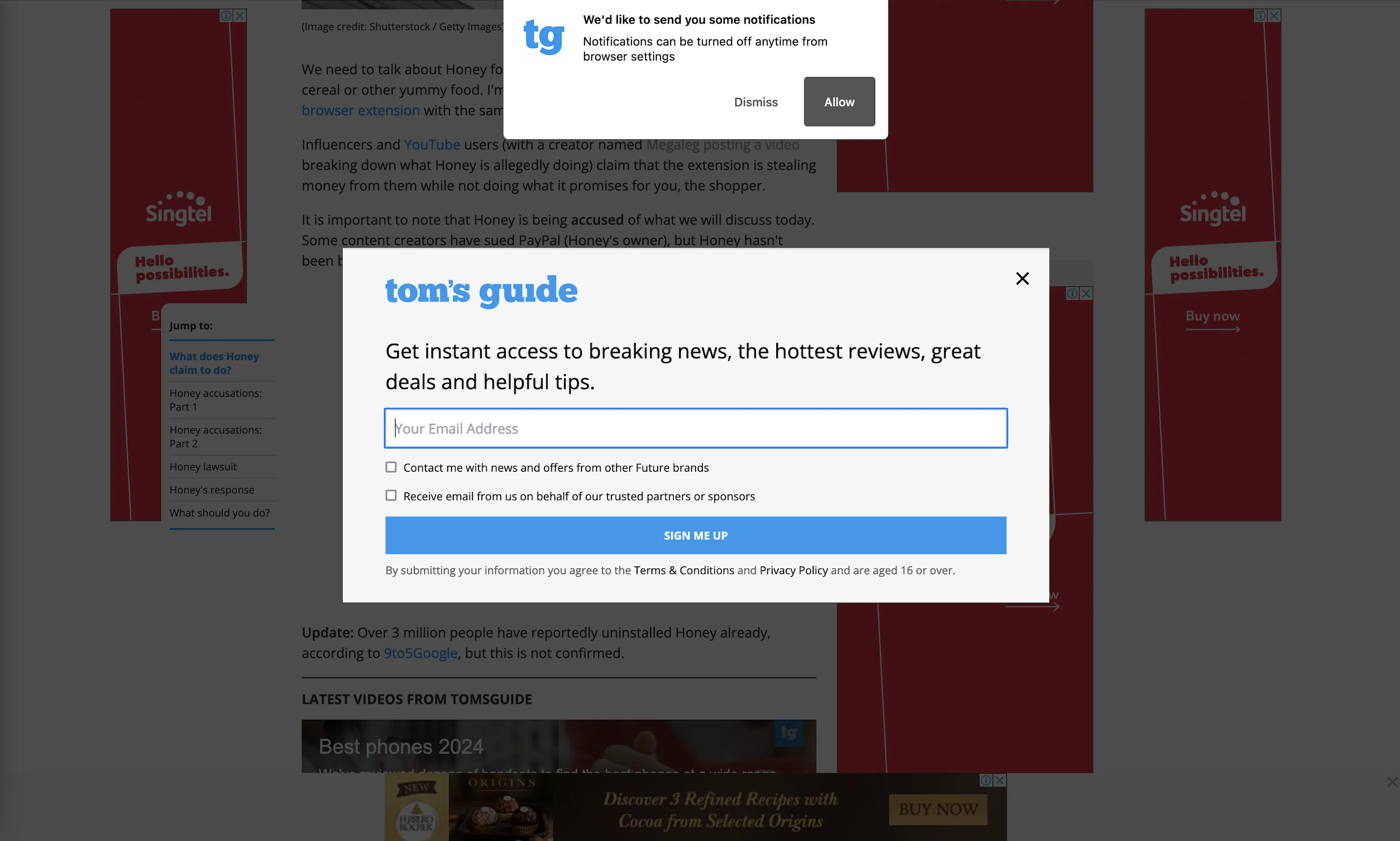
Apart from banner ads across every inch of the page, you are also greeted with a very bad implementation of an email popup. To make matters worse, you also get a subscribe for notifications popup almost immediately as you visit the page.
Apart from the user experience being bad while on the website, this website is a 3rd party cookie jar and just one visit to this website you are going to have these ads follow you on other websites too.
Sarkari Result
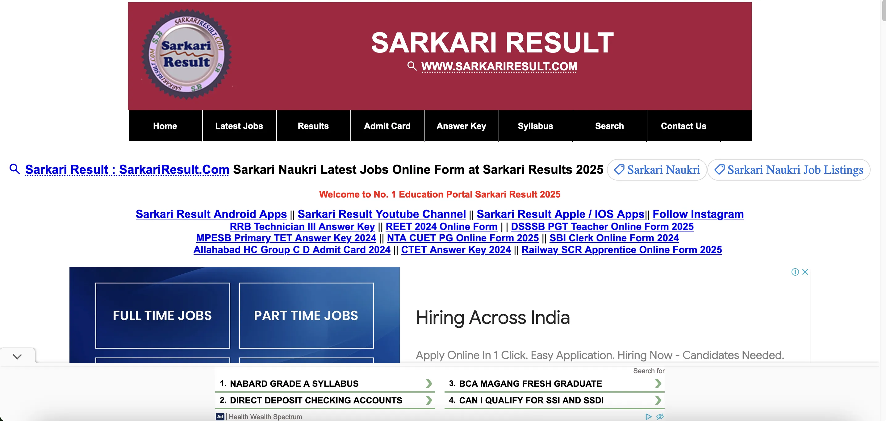
Sarkari Results is a 13-year-old website which focuses on providing information and resources on various government jobs in India. Usually there are standardized examinations in India to qualify to interview for a government job, hence they have different pages for admit cards, latest jobs, syllabus, answer keys etc.
They have a monthly traffic of almost 117 million from govt job aspirants across India!
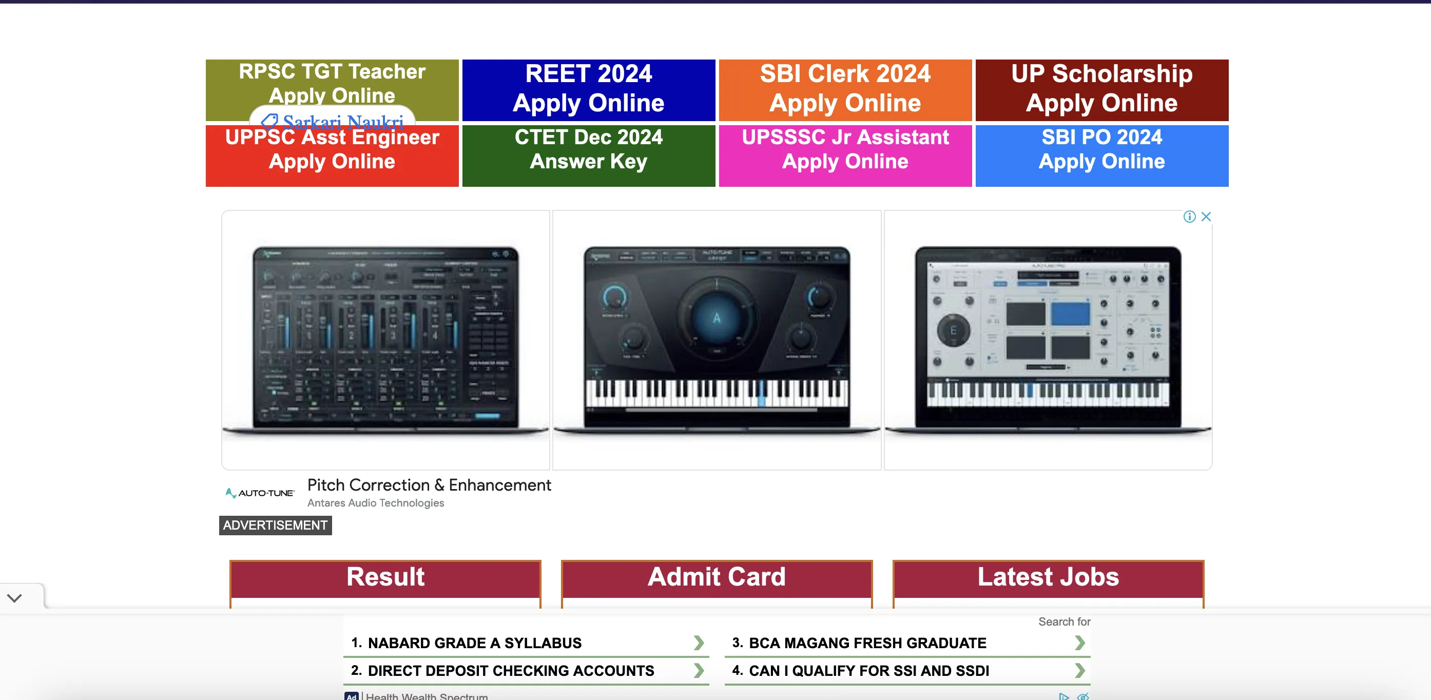
Their website is also bombarded with ads mainly from ad networks like Adsense and media.net. Almost all ad types are used strategically at several places to look as if its a part of the website and could mislead readers to click on them.
They have a very poor user experience with several bright colors, such as buttons and links all over. Core Web Vitals Assessment also failed when we tested the website and it's not even responsive on mobile. Most of Indian job aspirants visit this website on phone and its going to be a nightmare to navigate through this.
James Bond 007 Museum
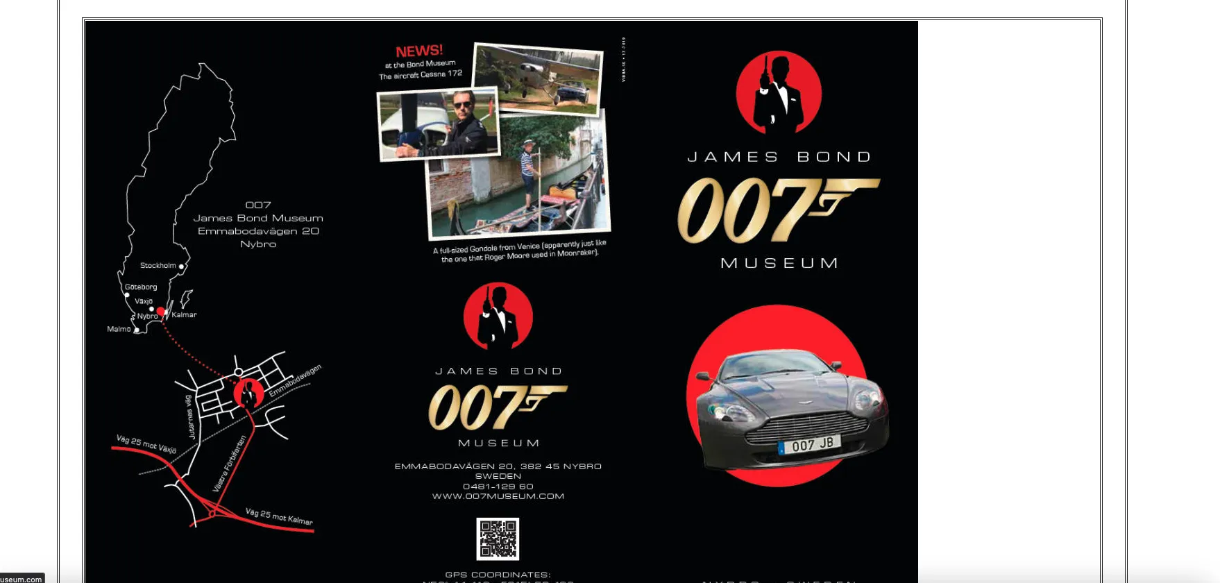
Even though James Bond is known for high-tech gadgets and electronics to use for all his top secret missions, apparently the website for his museum is not!
It's a single very long page with lots of images and multimedia served in a very dated look with clunky navigation and colours.
There is not even a proper menu structure, no clear hierarchy or a user-friendly navigation bar. The visitors will find it very hard to find the needed information, leading to frustration and increased bounce rates.
It's not responsive and is very hard to navigate even through a desktop screen, and do not even think of visiting this on a mobile screen. The website also appears to be very slow due to the large number of not properly optimized images and media on a single page.
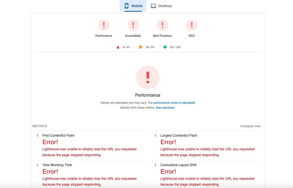
This is the first time I have seen something like this on Pagespeed Insights!
See how we turn this into a better website using Konigle in this episode.
And here is our updated version of James Bond Museum website.
Gates N Fences
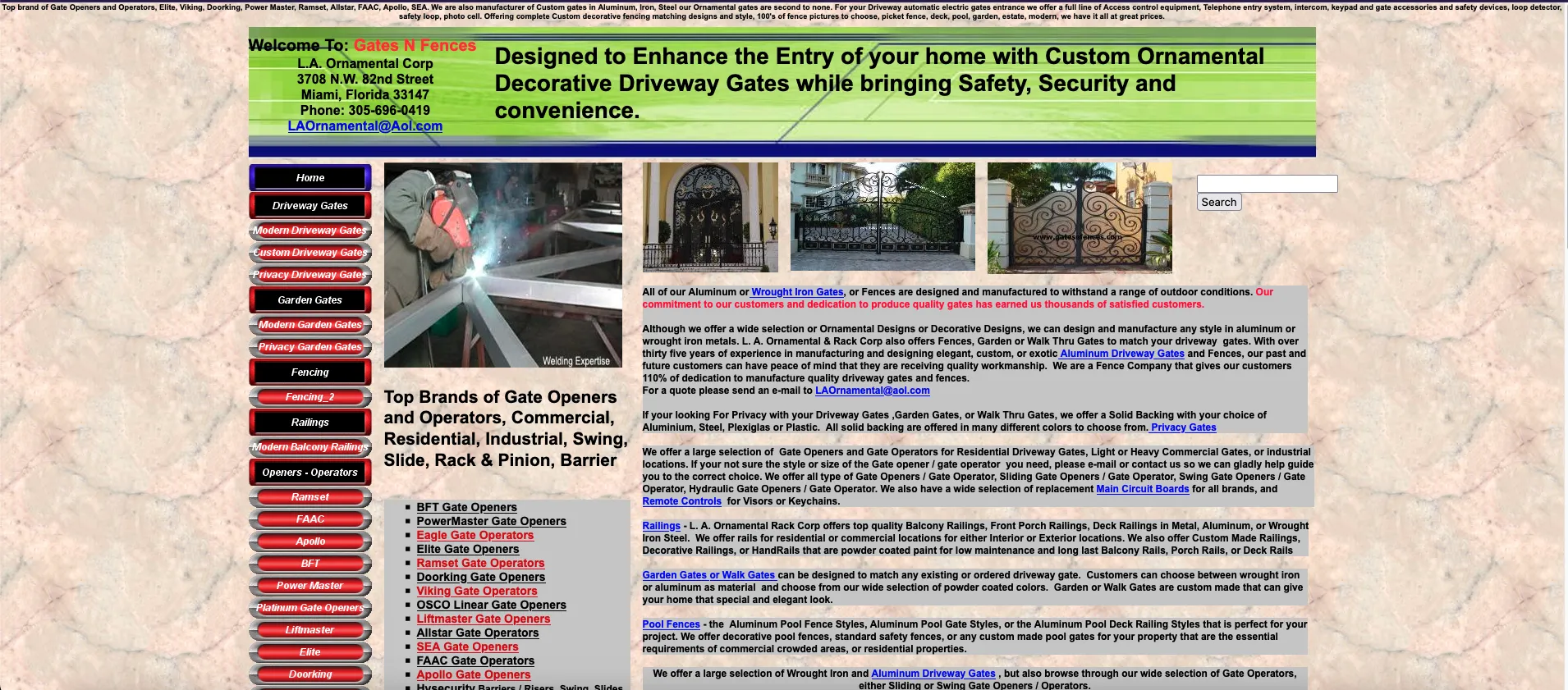
This website looks like someone threw a bunch of images, text, and buttons into a blender and hoped for the best. There's zero visual hierarchy—your eyes don’t know where to look or what to do next!
The navigation bar is cluttered with way too many options. No one wants to scroll through a dictionary of gate types just to the information they need. Also, there is no clear Call to Action.
As expected it's not responsive on mobile and it’s a nightmare of zooming, scrolling, and misplaced elements. Buttons are too tiny to tap too, feels like a game.
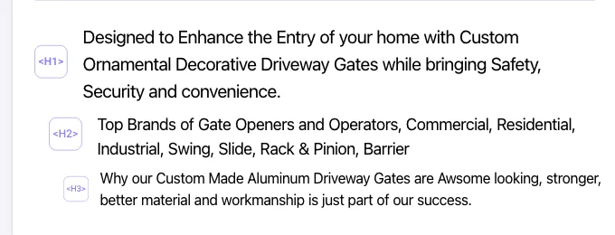
And this is what the page structure looks like. There’s no proper structure—not even proper heading usage. Clicking on random links leads to broken pages or super outdated content.
The same goes for the SEO title and meta description. You find some code in the meta description. GatesNFences.com is a time capsule from the 90s that desperately needs to be put out of its misery by someone who knows what he does or simply try Konigle!
Arngren
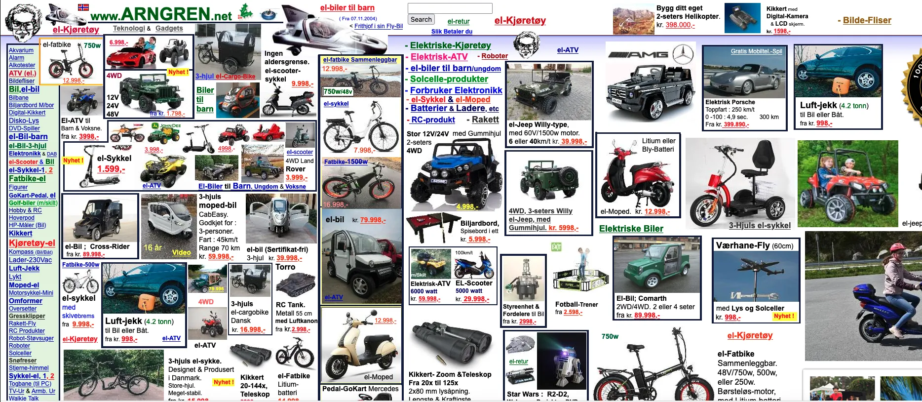
Arngren.net looks like someone lost a bet and had to fit the entire internet onto one page. It’s a wall of images, text, and links smashed together with no structure, spacing and alignment.
It has a DR of 65 which I suspect is from all the sites roasting it for its design. It mainly ranks for branded keywords only.
There are clickable elements everywhere, you might click on a random number thinking it’s a product when it’s actually a link to another mess!
On a phone, the site is completely unusable. It doesn’t resize properly, making everything tiny and unreadable.
LifeActionRevival.org
This site seems to think that stacking elements on top of each other is a cool design choice. I still don't understand what this website does - there are some lines of code, overlapping images everywhere, some links and what not!
There is a white line going from the top to bottom which makes this page very long and stretched.
There’s no clear messaging, no hero section explaining their purpose. Random sections are dumped together without guiding the user. The hero section is the first thing that someone sees on a page and should be well-defined. Website structure is a joke here!
Images take a significant while to load and even then there are errors on some of them.
Mosc.in
This looks like a pretty old website but the domain was registered in 2007 and has a DR of 57 and a lot of backlinks according to Ahrefs.
The menu looks outdated and barely stands out, but when you click on any of these links, there is a proper menu. But the homepage looks short and has lots of empty spaces.
There are no heading tags on the homepage - absolutely none!
It looks like a fast website due to the smaller number of sections and widgets, but you are wrong. Core Web Vitals failed on both mobile and desktop.
So we decided we make a church website for a church near me in our next episode.
Here is how it turned out to be: https://9fcixqeui3.konigle.net/
Coverscart.com
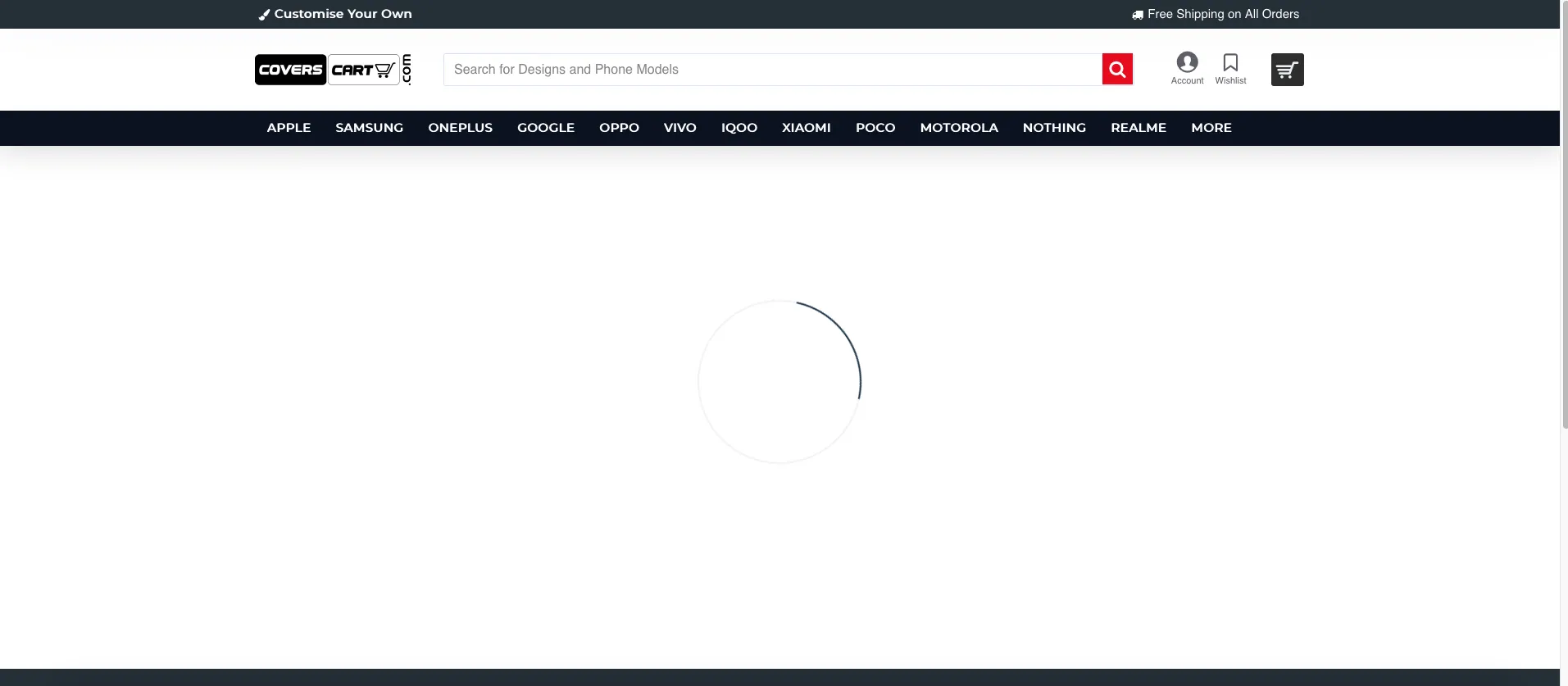
This is a website selling smartphone cases and is ranking well for amazing commercial keywords like phone cases, mobile cases online etc even without proper optimization.
The website is too slow and has too many bugs, ruining the user experience.
There is no proper structure as well, but still ranks for some really good keywords. With proper page structure and fixing these issues on-site.
They are very active on social media (combined followers of 3M+), and thats the main driver of these traffic and rankings. If they do proper optimization on these page, its going to drastically improve their conversions and sales.
Wondertabs.com
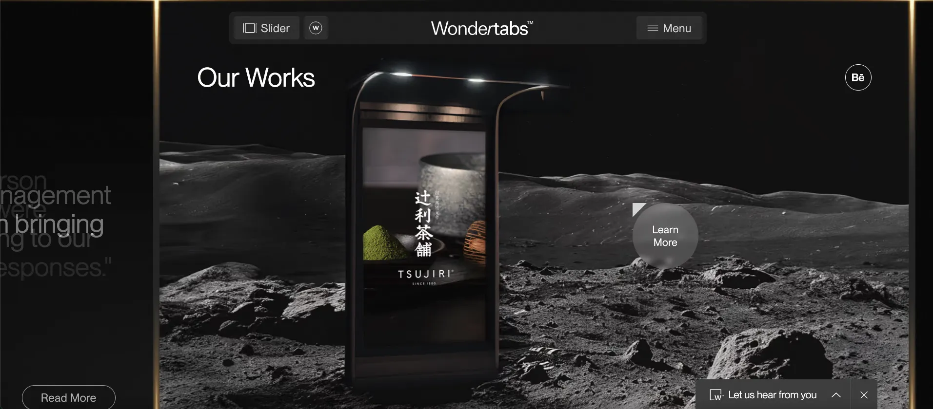
In the first glance, you might think this looks like a really modern website with a lot of elements and widgets to play around, but what about its negatives?
Sites with simpler designs converted 30% betterClear CTAs outperformed clever ones by 25%65% of brands wasted space "above the fold"
Beauty attracts, but clarity converts! - Internet
The website is pretty slow and fails the core web vitals. Also, the navigation is not the most user-friendly and is not guiding properly.
The main goal of a website should be to inform and convert users, and that should always be a priority.
Historian of the future
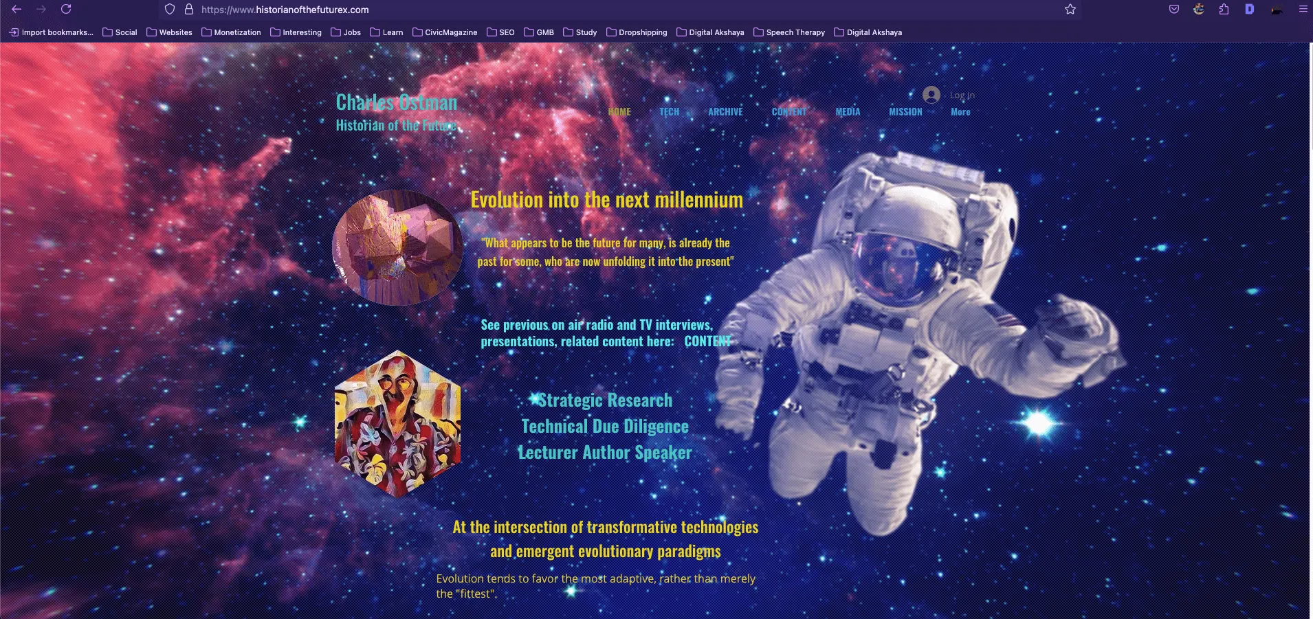
This looks like a pretty old website which definitely needs an update - the huge image as background completely distracts the user and makes the text less visible.
Text overlaps everywhere, making it impossible to read anything properly, even the colour of the Menu makes it very difficult to navigate.
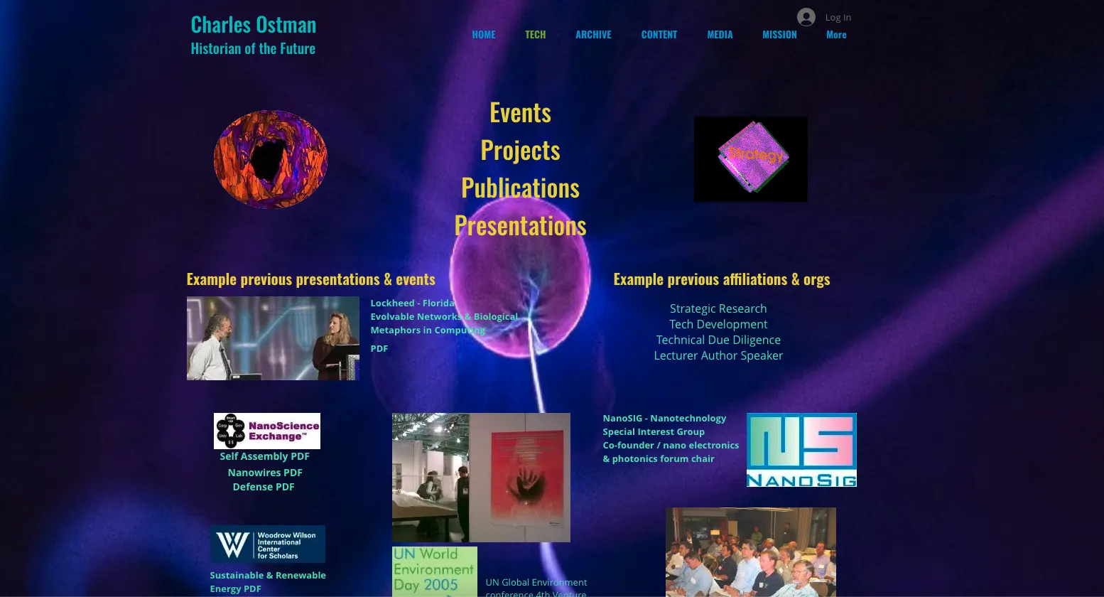
And when you check the other pages, the issue becomes even worse. It’s like they threw a bunch of text, images and gifs onto the page. The things they discuss are kind of modern and futuristic but what happened to their website?
Worldsworstwebsite.lol
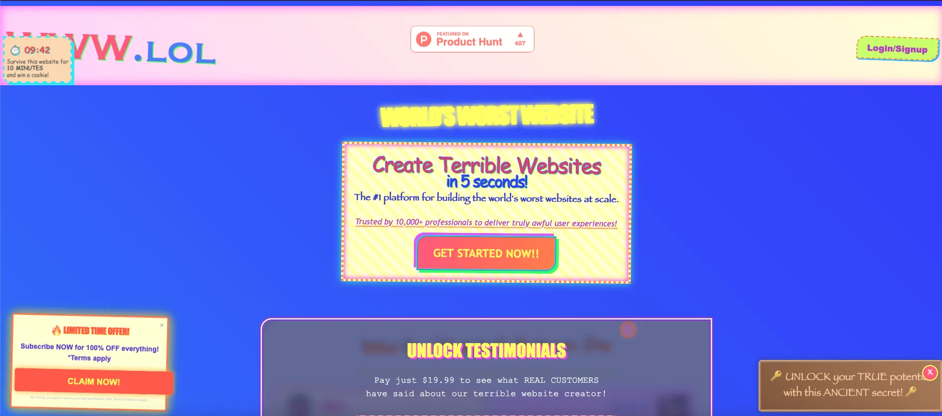
What happens when someone intentionally tries to make the worst website ever? Thats is precisely what Milo, an AI Expert did.
It was designed to make anyone get irritated - random popups, flashing screens, a joker jumping out, very bad music and what not? And without a doubt, this website currently wins the title "#1 Bad Website Ever".
Even I got a headache looking at it to review for this article, so open at your own risk.
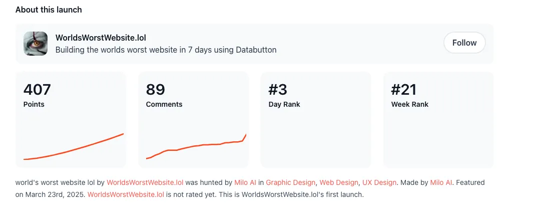
But it did get some attention on Product Hunt and users are crying in the comments.
What SMEs Can Take Away From This
Even big brands and popular sites get it wrong. But as an SME, you can’t afford to lose trust or customers because of just having a bad website.
Since your resources are limited, you should be able to get the maximum possible use by avoiding all these mistakes.
Looking to build a website?
If you are looking to create a website or revamp your existing website, we urge you to create a website that is great not just for bots but also humans. Yes, you can have a website that ranks well and also has great accessibility and user experience for visitors.
If you want to make such a website, you may want to try Konigle. We help you create a fully functional and complete website which suits your need. In addition to that, we provide you a digital employee that can help you update your site, make changes or even with marketing.
Let us know your thoughts and maybe share examples of bad websites that you may come across in the comments below.