March 6, 2025
99 Announcement Bar Examples for Websites
If you're running a small business website, your homepage is prime real estate. But most people land there... and scroll past without doing much.
That’s where an announcement bar can help — when used the right way.
It's that simple bar at the top of your site that can:
- Promote offers
- Share updates
- Drive urgency
- Capture sales
Let’s look at smart announcement bar examples you can steal for your own small business site — whether you're selling products, offering services, or doing both.
Here are 99 examples of brands using announcement bars on their websites. Examples include D2C and B2B brands. You can use this to get ideas for your own announcement bars on your SME websites.
Able Carry
Previously, they had a banner stating, "Subscribe to Thirteen Daybag Restock." This is probably done to create hype for their product by getting people to subscribe to receive updates when that product gets restocked.
This is great because this gives an impression that the product is in high demand and people are even subscribing or getting on a waitlist to buy this product when it comes back in stock!
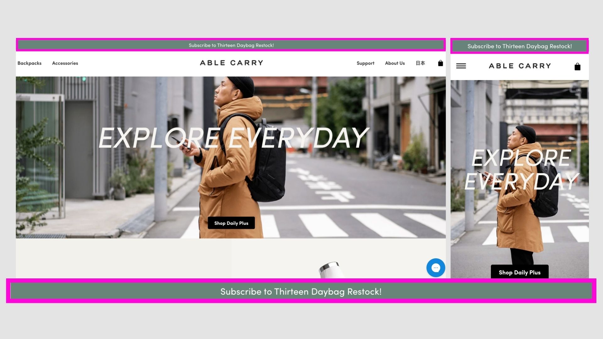
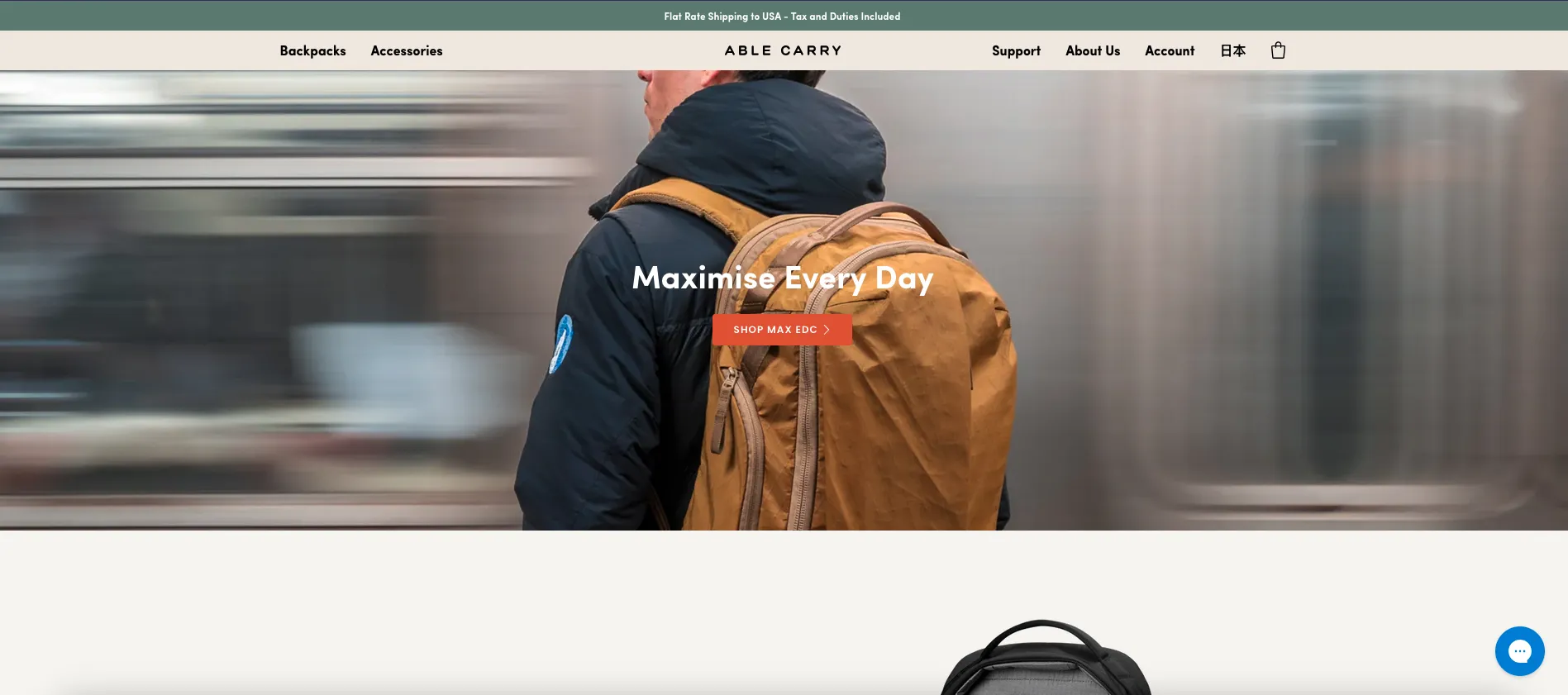
But now they have updated it to "Flat Rate Shipping to USA - Tax and Duties Included" on the top of all pages. It leads to their updated Shipping page. It was important for the user to be informed due to the recent chaos surrounding customs duties. This solves the confusion the buyers have and ensures transparency.
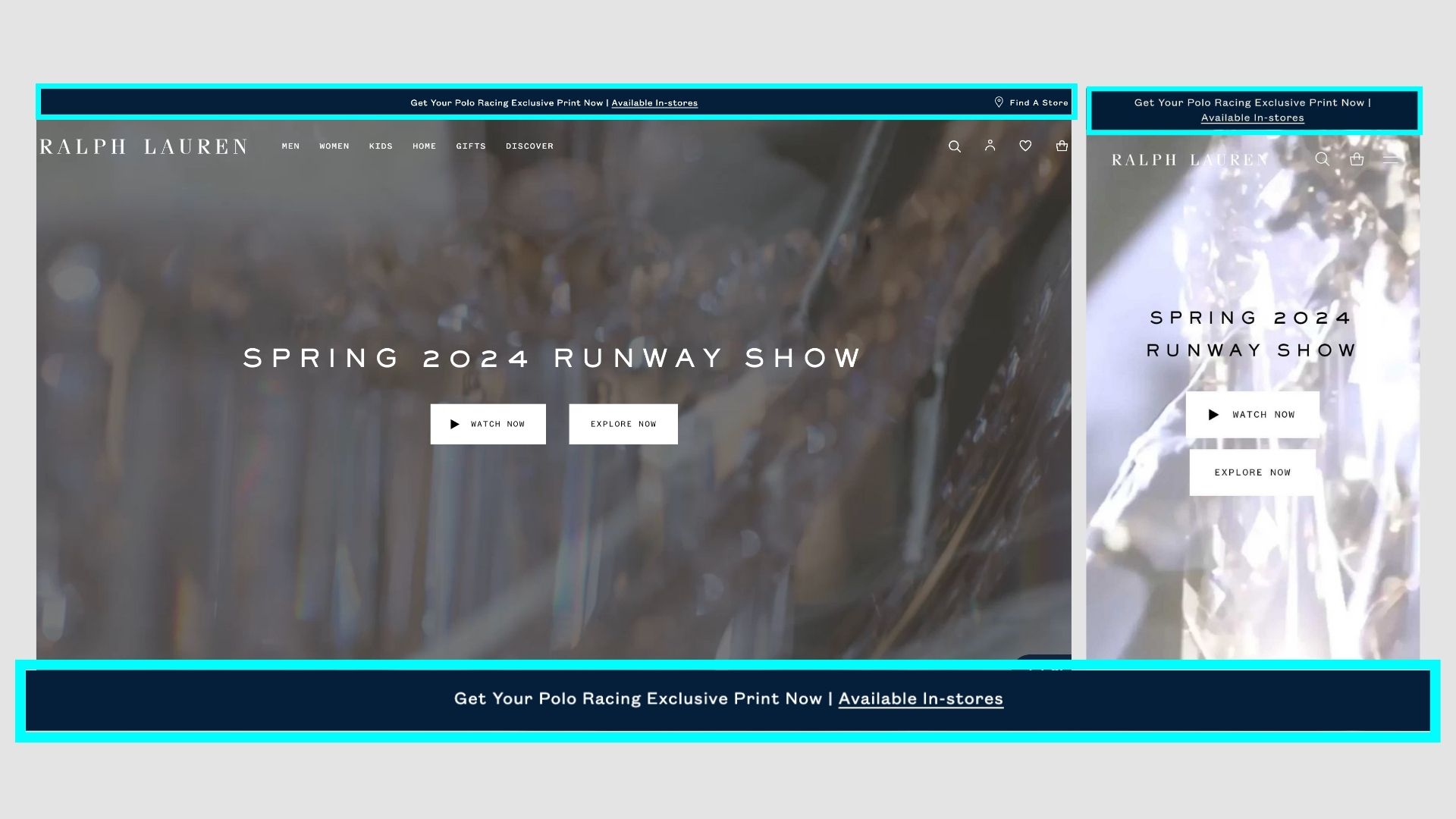
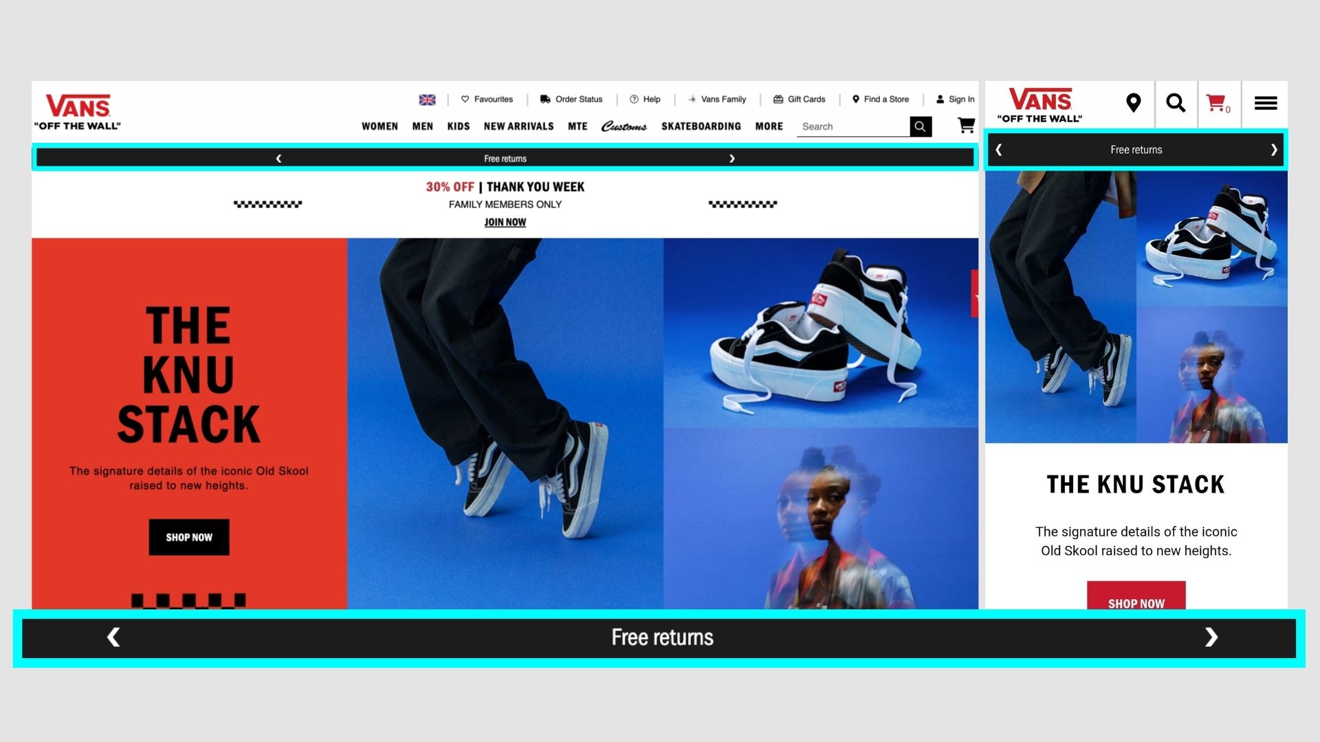
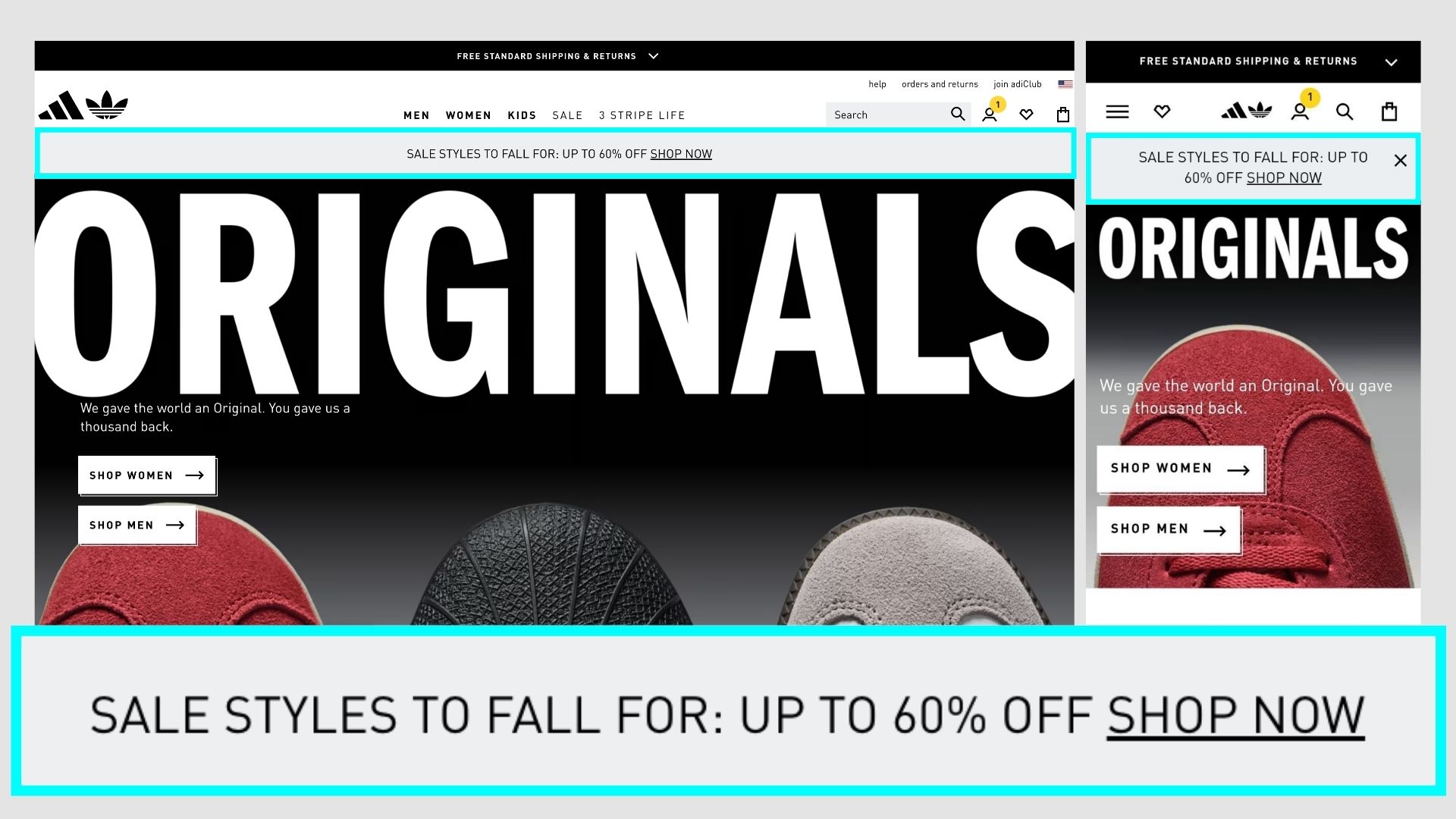
Adidas
Adidas has a simple announcement bar with the current promotions, shipping info, and also ADICLUB promotions.
They tend to test out different variations here, currently, it's promoting the Adiclub, its benefits and free returns option.
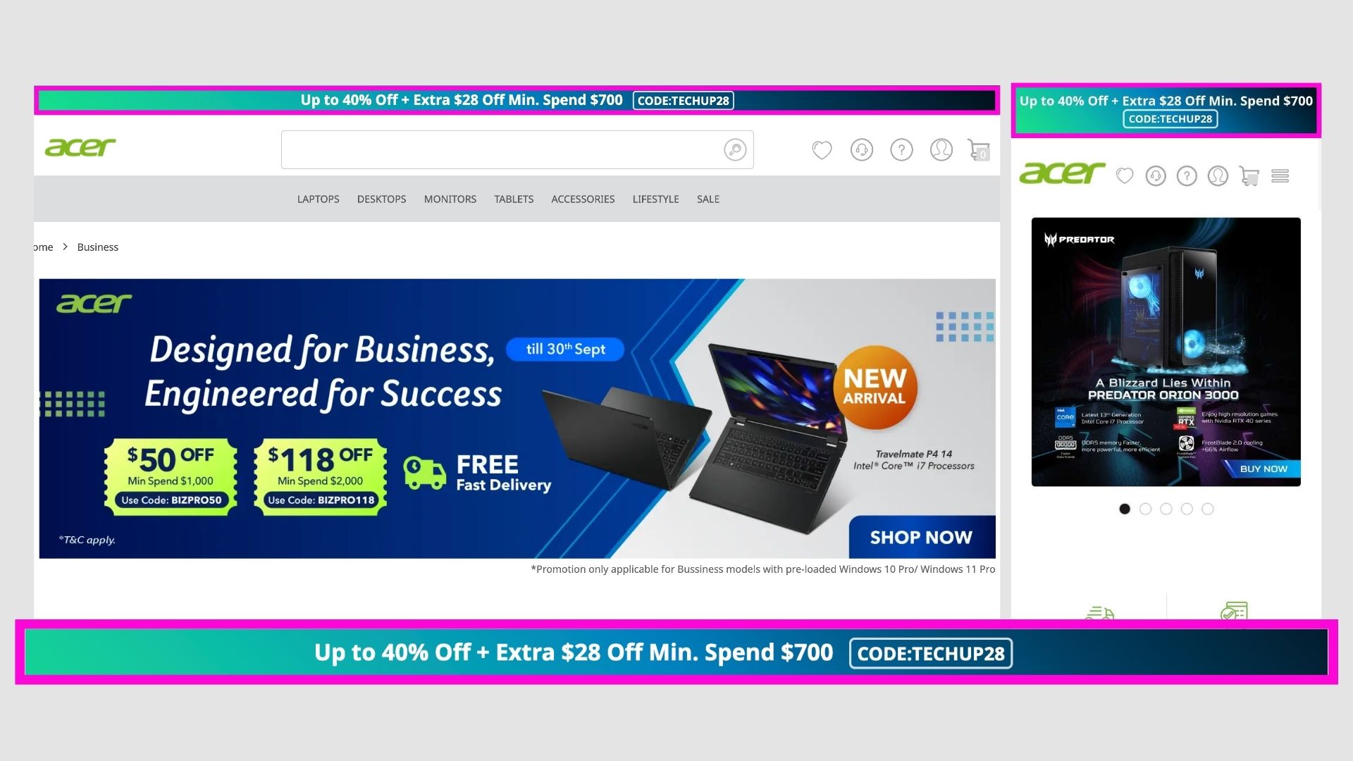
Acer
They do not always have an announcement bar normally, it's mainly used to notify users about promotions, or coupon codes.
A gradient is used to differentiate that section from others, so more attention is diverted towards it.
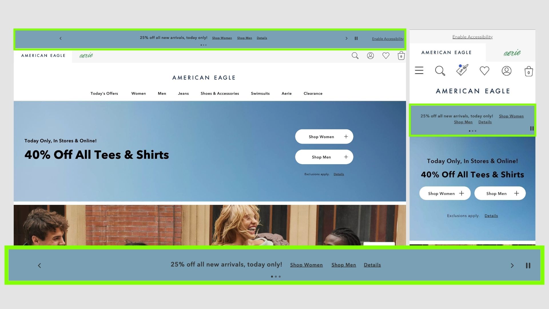
American Eagle
American Eagle has a rather simple banner in the same colour matching the website UI.
It's also interesting to see three slides within the announcement bar and separate links for different categories. Have not seen something this complex before, but it does convey more information to the users.
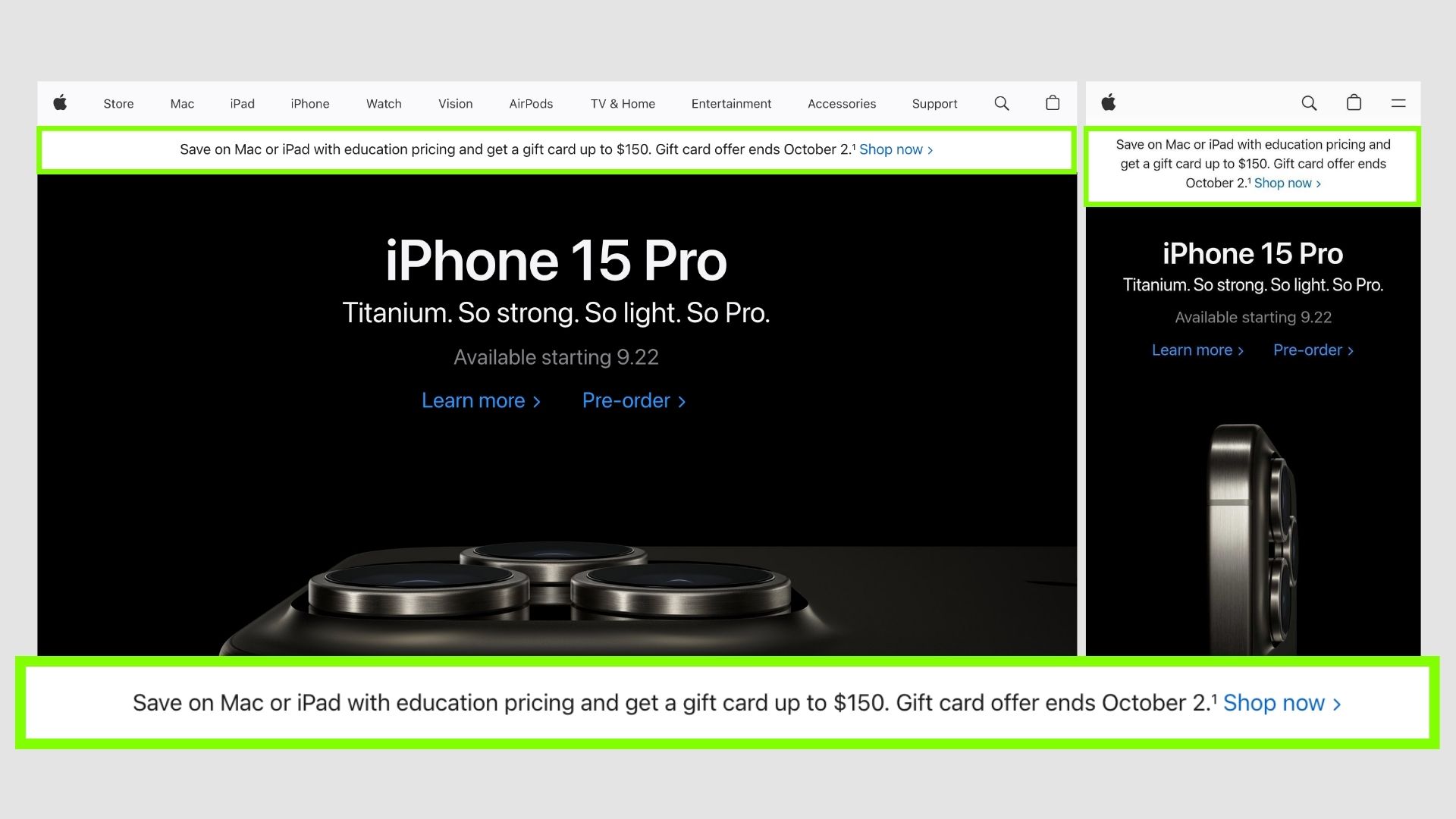
Most people including me consider Apple as the hallmark in design for almost everything they do. The same is seen here as well, a very neat and simple bar with just 1 proper CTA.
They usually include the most attractive offer of the time there, and visitors can just check it out - simply brilliant.
Apple
Most people including me consider Apple as the hallmark in design for almost everything they do. The same is seen here as well, a very neat and simple bar with just 1 proper CTA.
They usually include the most attractive offer of the time there, and visitors can just check it out - simply brilliant.
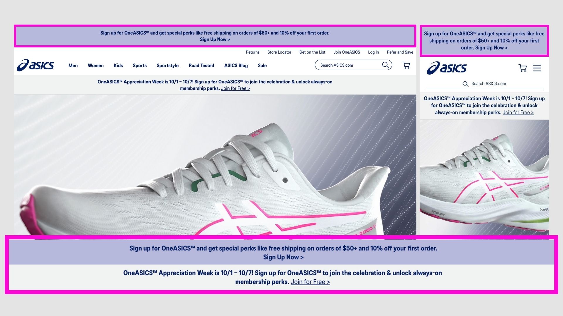
Asics
The announcement bar on Asics.com is quite prominent and informative. It also changes from time to time notifying users of the latest offers. The animation also makes it more catchy!
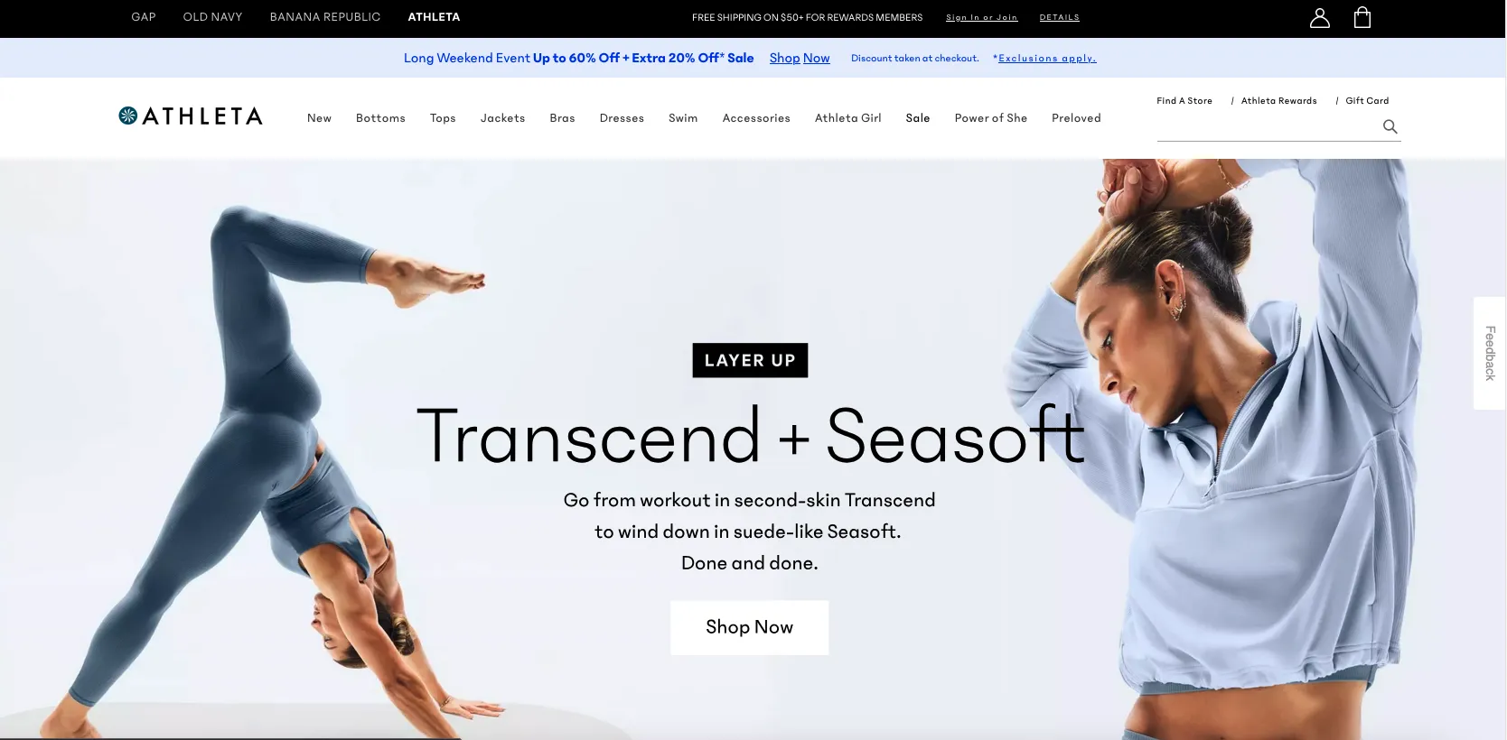
Athleta
They also try to make the banner match the colours on the websites.
On the new version, they have two bars - one to show various brands under them and details about free shipping.
Then another one below shows the promotions running on that specific website.
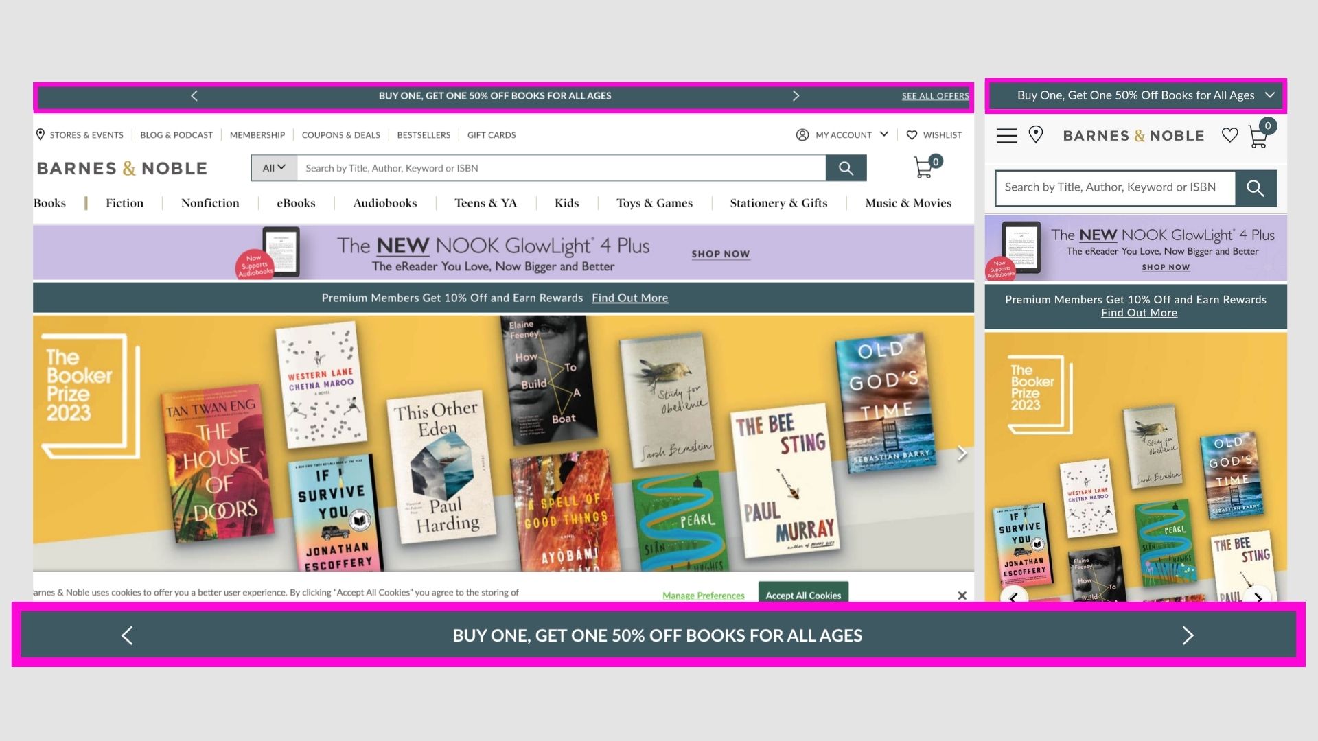
Barnes & Noble
Their announcement bar is a simple slider which automatically moves. Covers the various different offers they have or any announcements or notices.
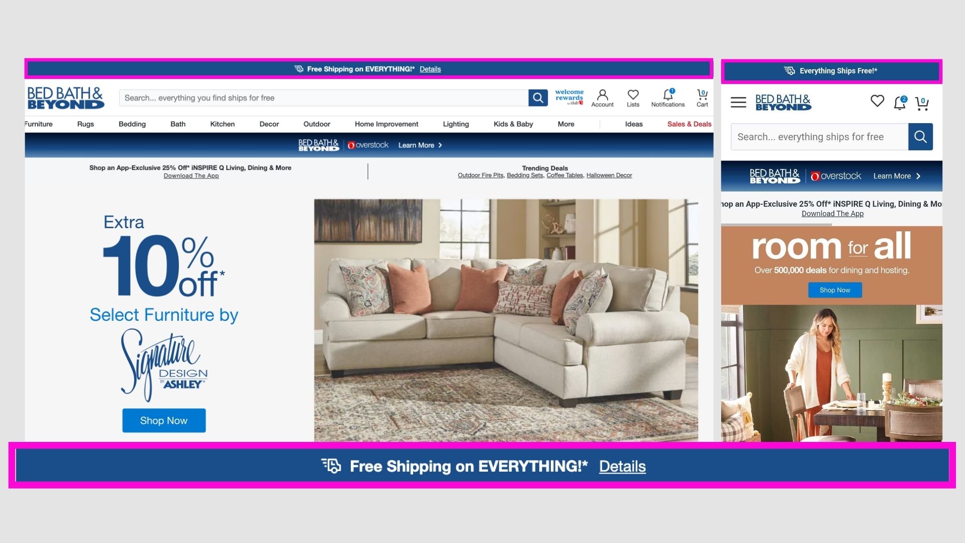
Bed Bath and Beyond
They have a pretty simple and straightforward bar with just one offer and link to know more details about it.
Sometimes for a brand - its simplicity is key!
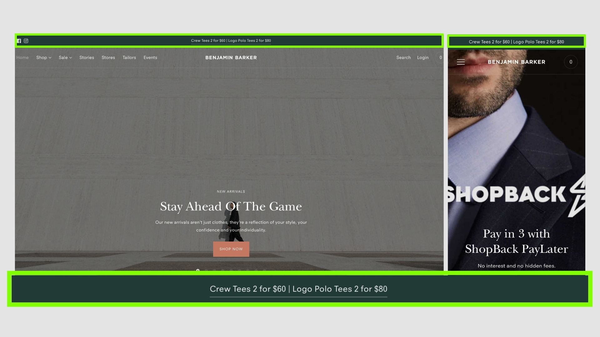
Benjamin Barker
Amazing copywriting here - there are two well-defined offers for the user.
It makes it easier to choose one and buy without much confusion.
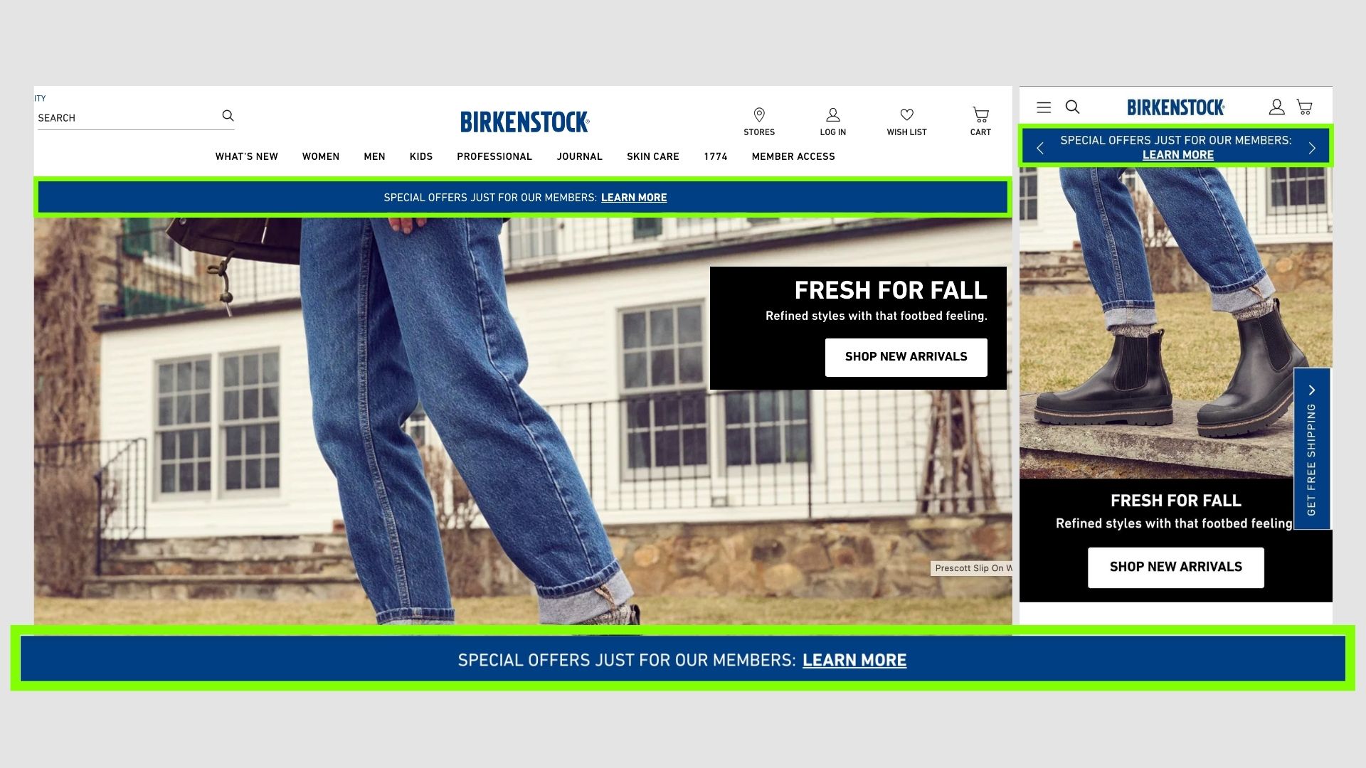
Birkenstock
A normal bar with the offer and link for more details.
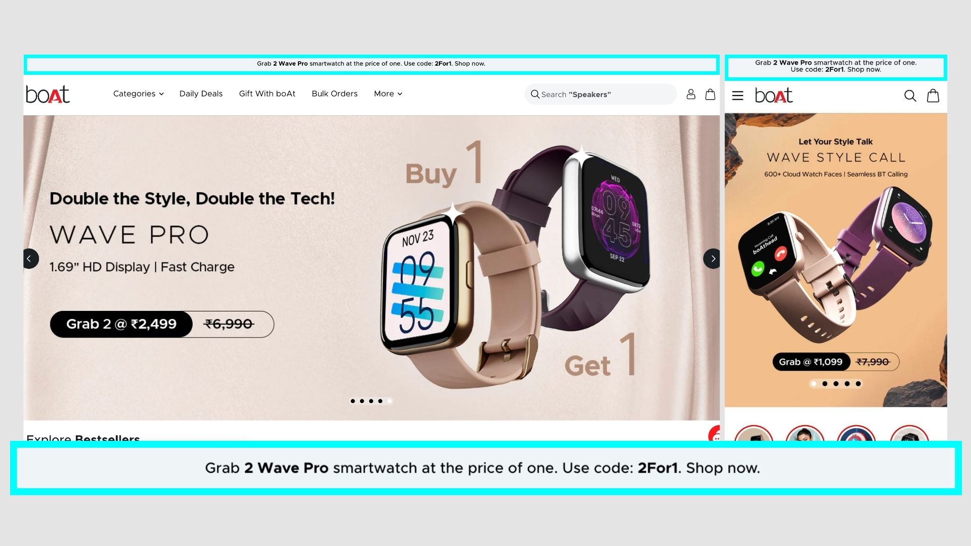
Boat Lifestyle
Boat is mainly known for affordable electronic gadgets. They are displaying a code in the bar which the users can claim some offer.
This make the user do an effort which is better for conversions.
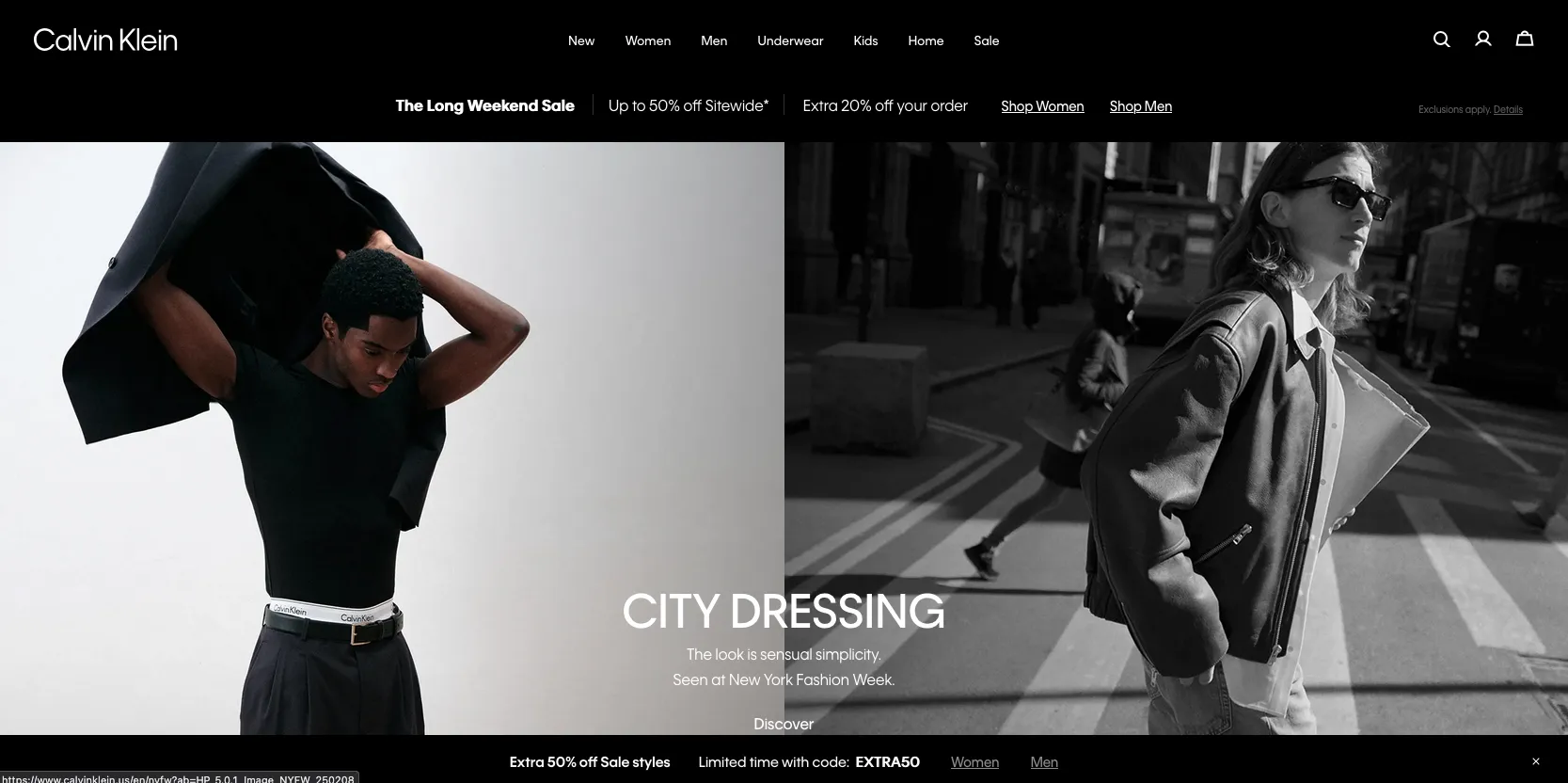
Calvin Klein
Multiple available offers of different types of products. Also links to separate sections for men and women.
They have a bar below the page too with a coupon code.
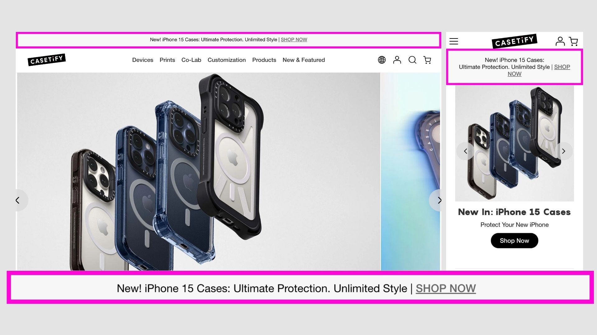
Casetify
Another amazing use case - to notify of the new cases for the newly launched products so users know its available now!
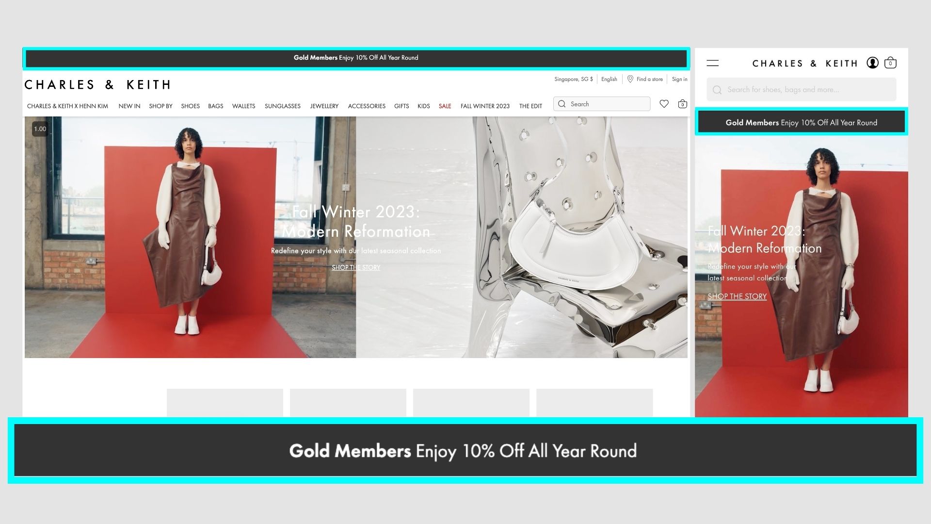
Charles & Keith
They are promoting their membership with the announcement bar, they cannot cut on the price a lot due to their premium position.
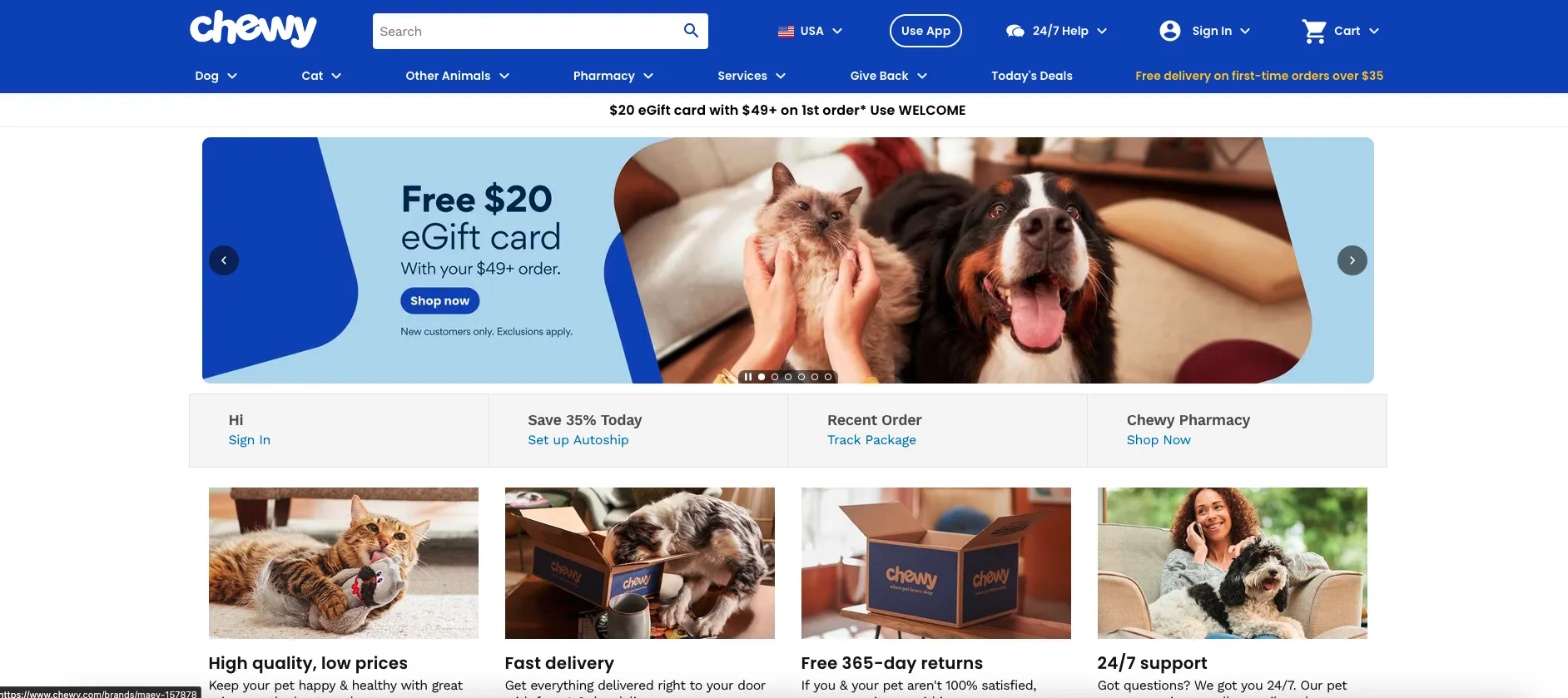
Chewy
It's a really famous brand for pet products. They have a simple announcement bar with a crazy offer to get the first order.
They are offering a 20$ gift card on purchase of 49$+ which incentivizes the user to get his first order soon, and if he likes the product, then come back for more.
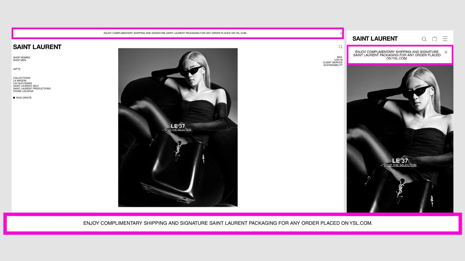
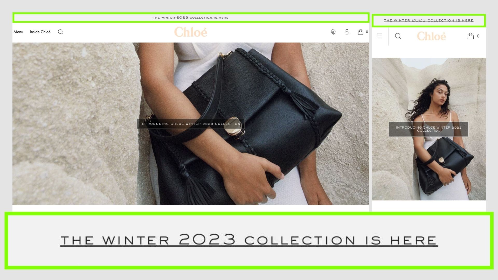
Chloe
A simple link promoting a new collection or series, for premium brands its more of exclusivity and new trends rather than pushing with offers/promotions to drive sales.
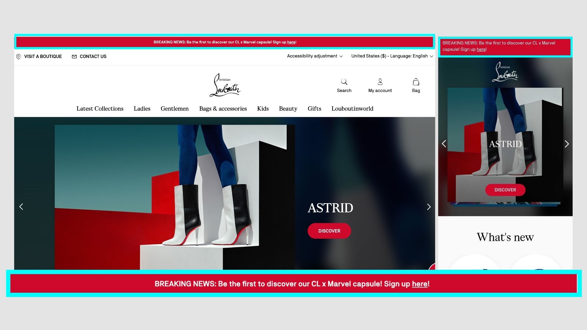
Christian Louboutin
An interesting example is red which signifies urgency, and the copy is BREAKING NEWS as if it's news.
Its actually great for driving attention to that offer/notice.
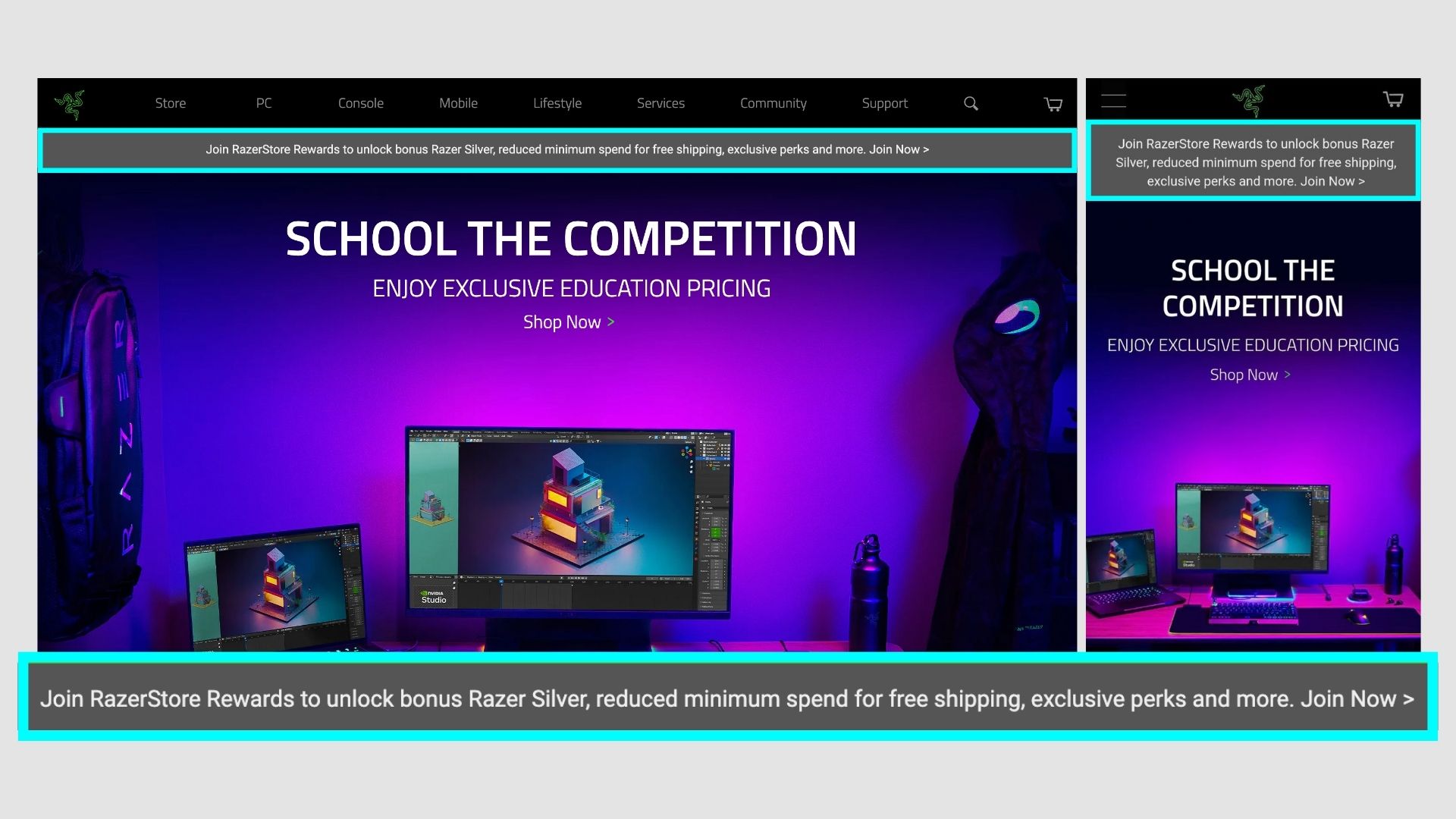
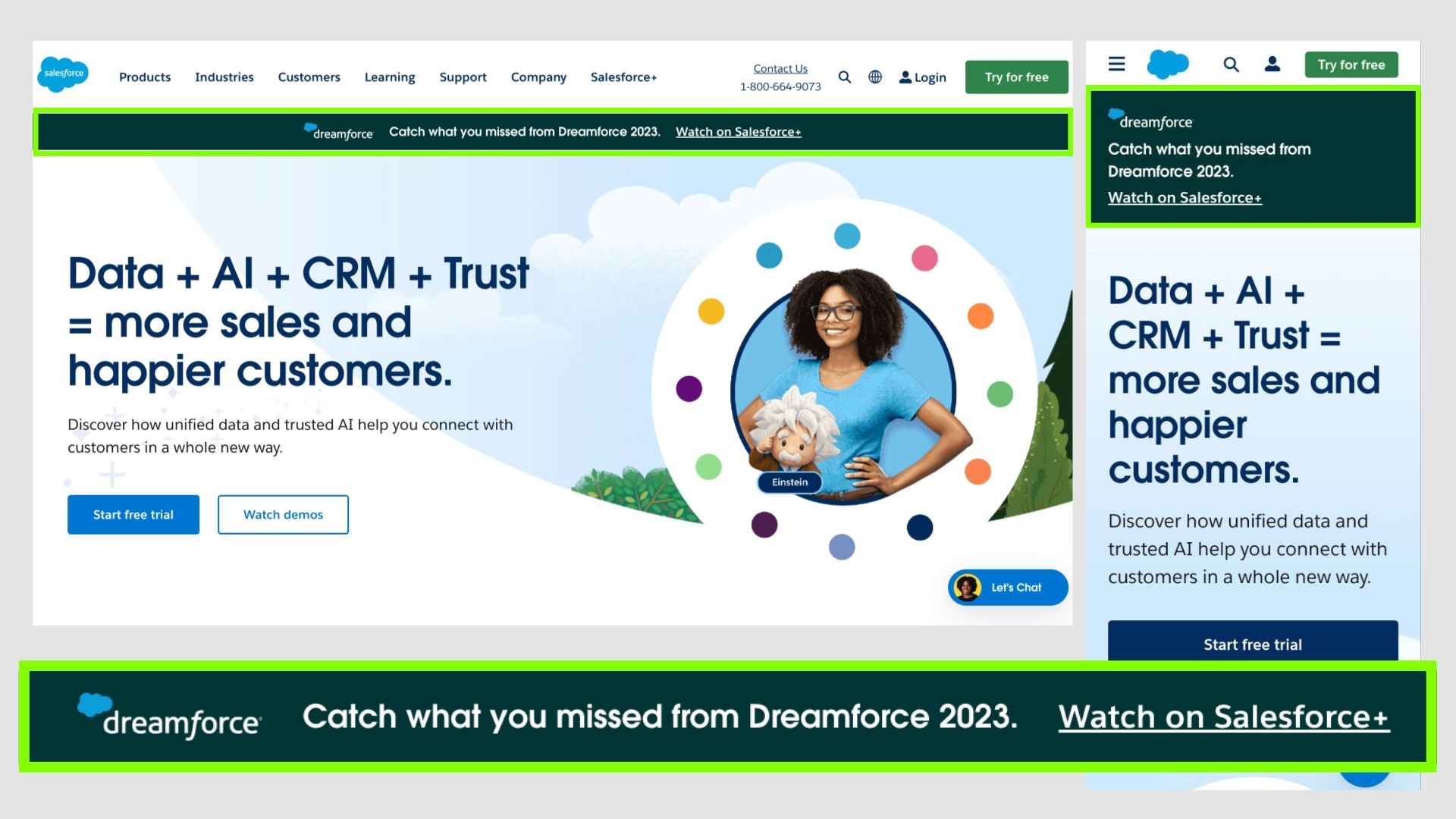
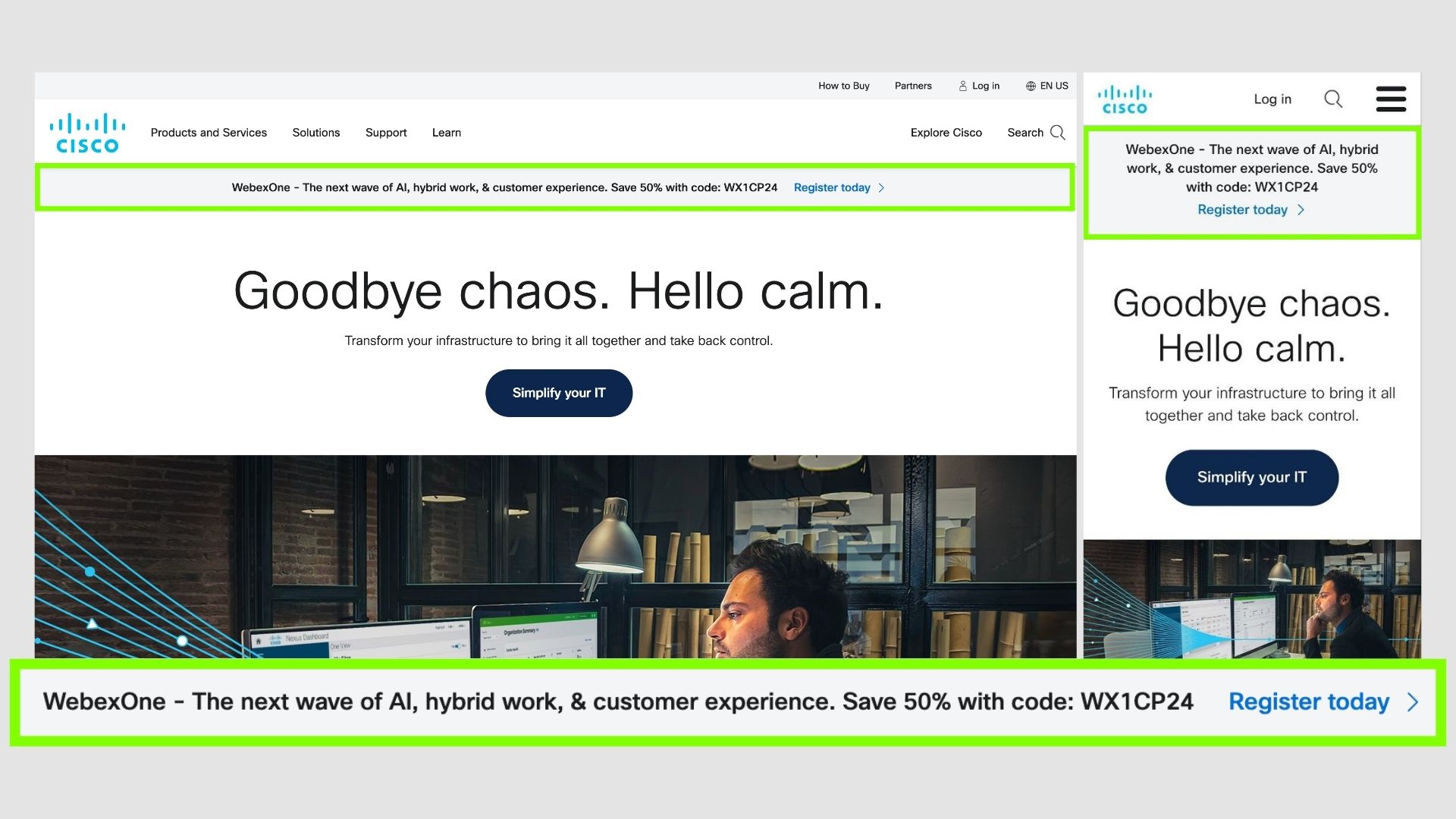
Cisco
Cisco creatively used this to promote their offers or even webinars at times.
The goal is to notify users of any latest updates or drive traffic to their desired page.
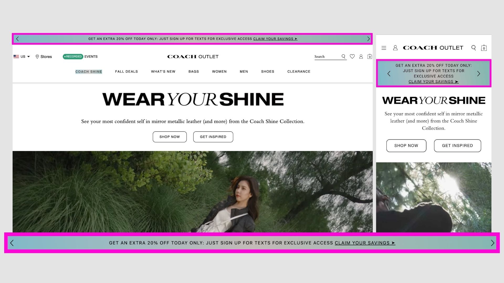
Coach
A gradient is used to differentiate from the other components.
Used to notify visitors for promotions/offers.
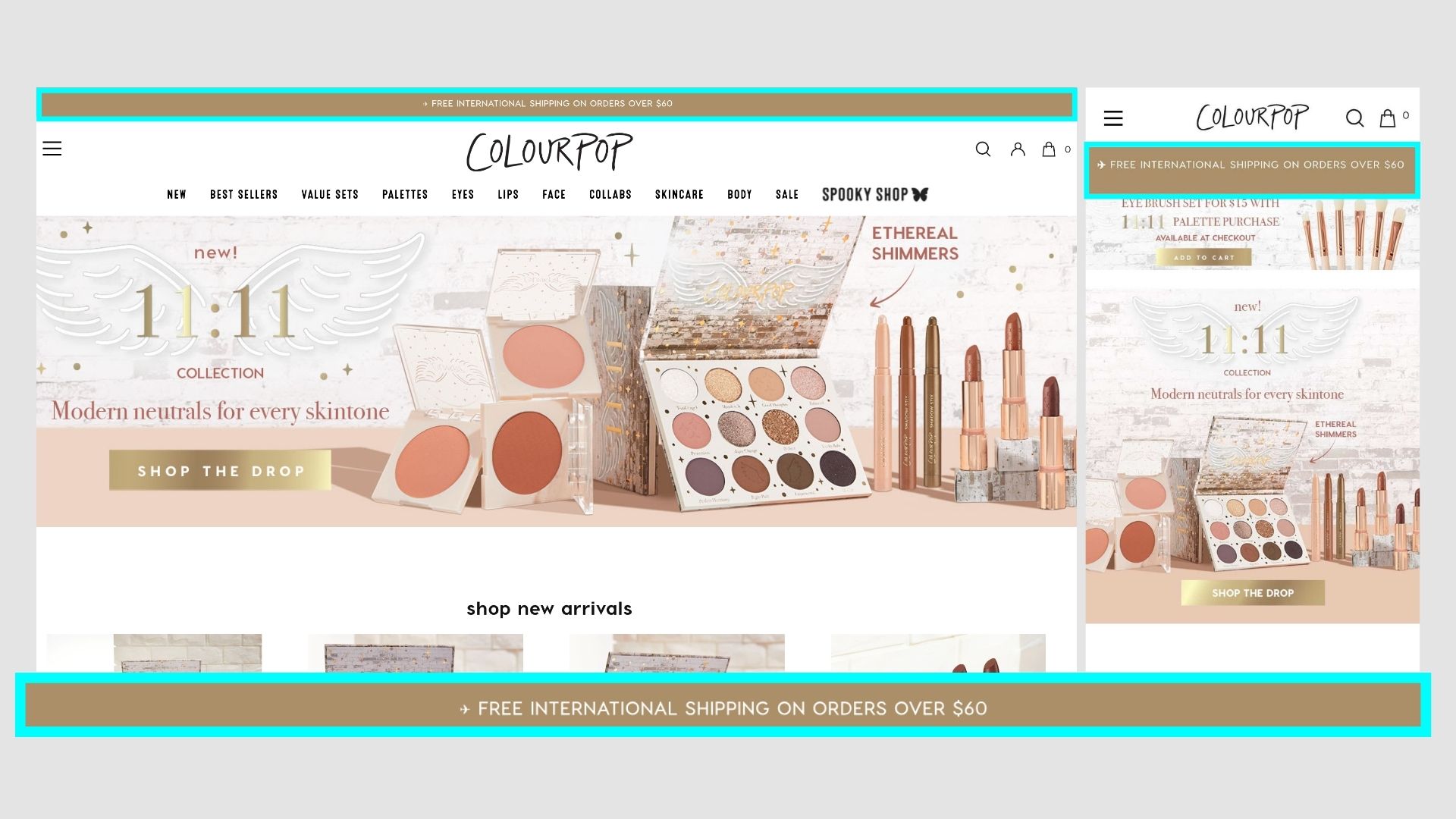
ColourPop
Simple bar for promoting free shipping on orders above $60.
Makes it definite and easier for users to purchase accordingly.
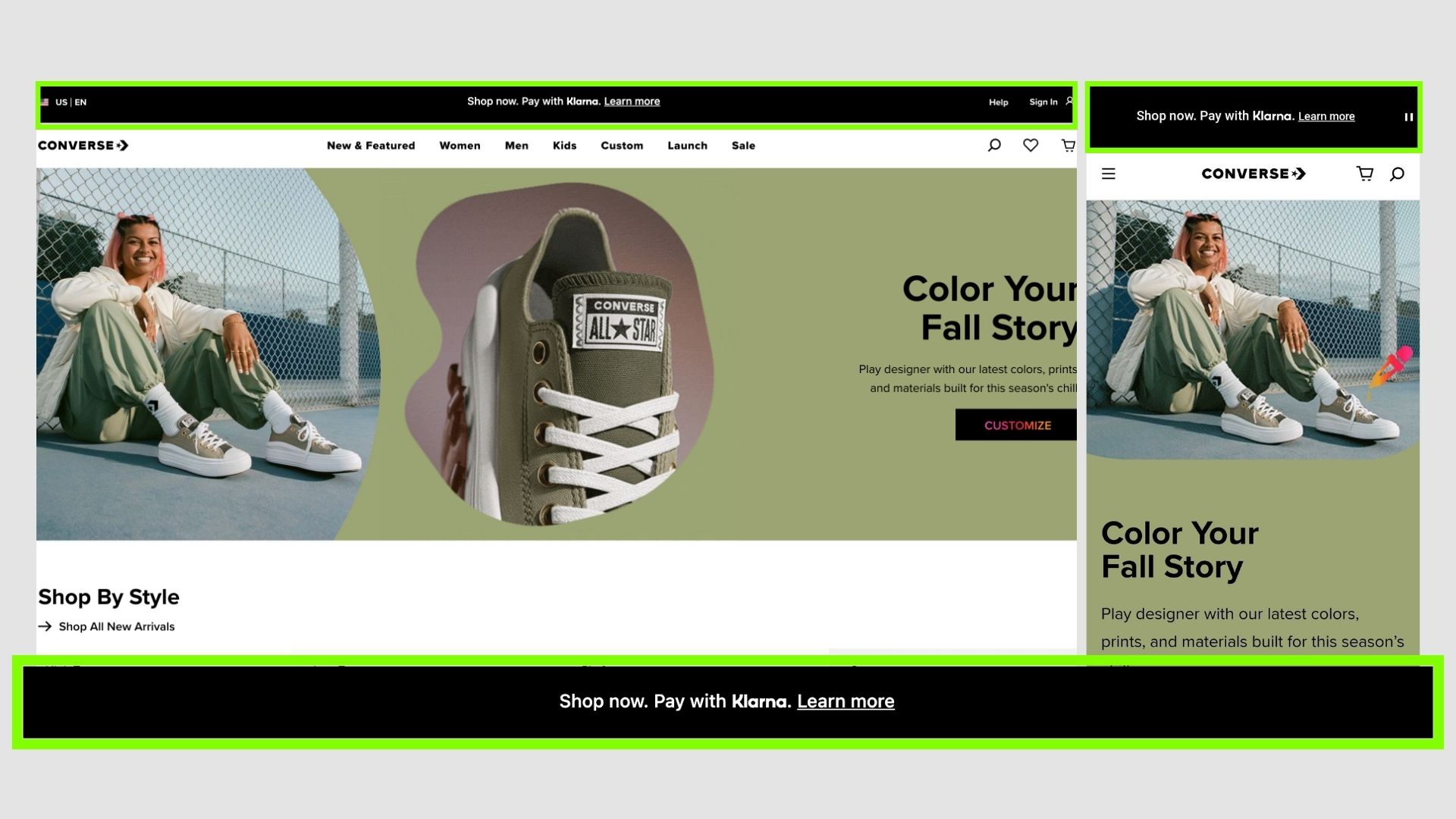
Converse
Converse promoting a new payment aggregator Klarna which helps you pay in 4 interest-free payments, in full, in 30 days, or over time.
This can be a promotion or partnership but a good way to introduce a new brand by getting signals from a popular one.
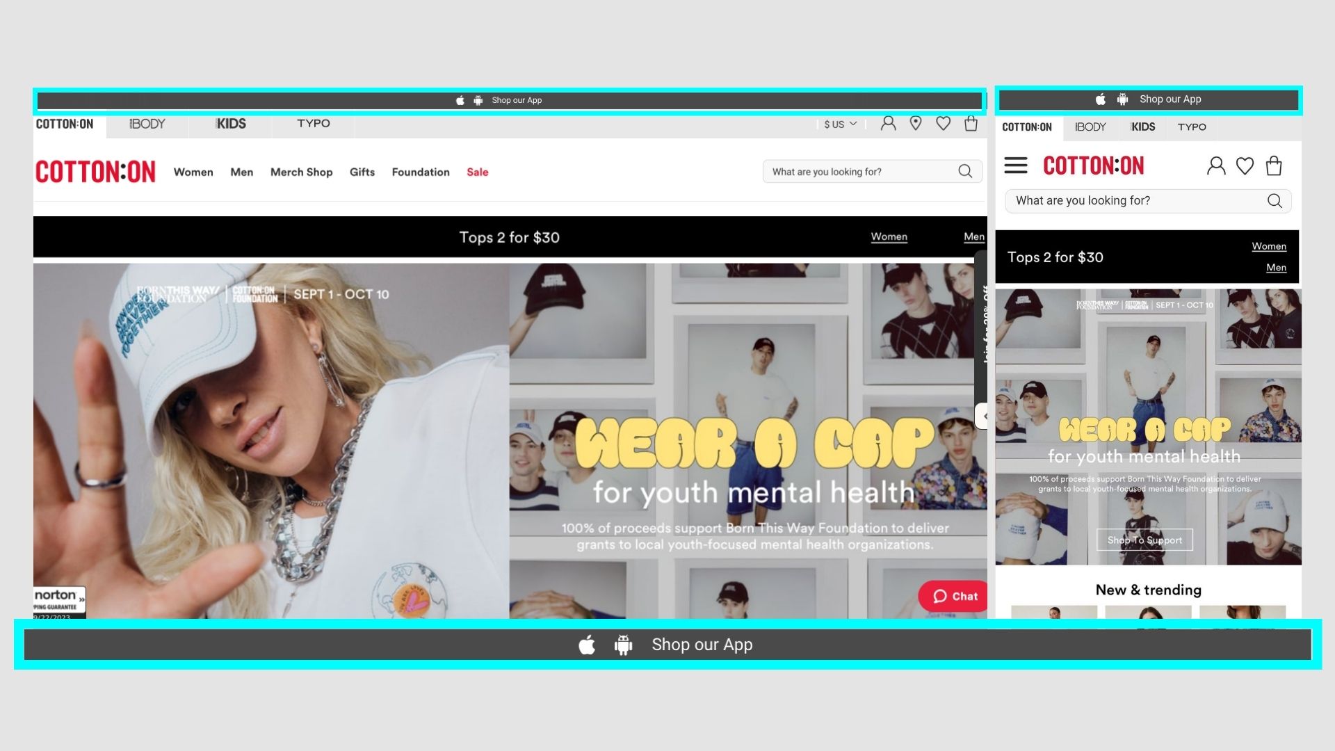
Cotton On
A simple reminder to shop on their app and links to the respective channels.
Maybe if they could give any incentive to do so, they might see a better conversion.
Ex: FREE Delivery on 1st order via App
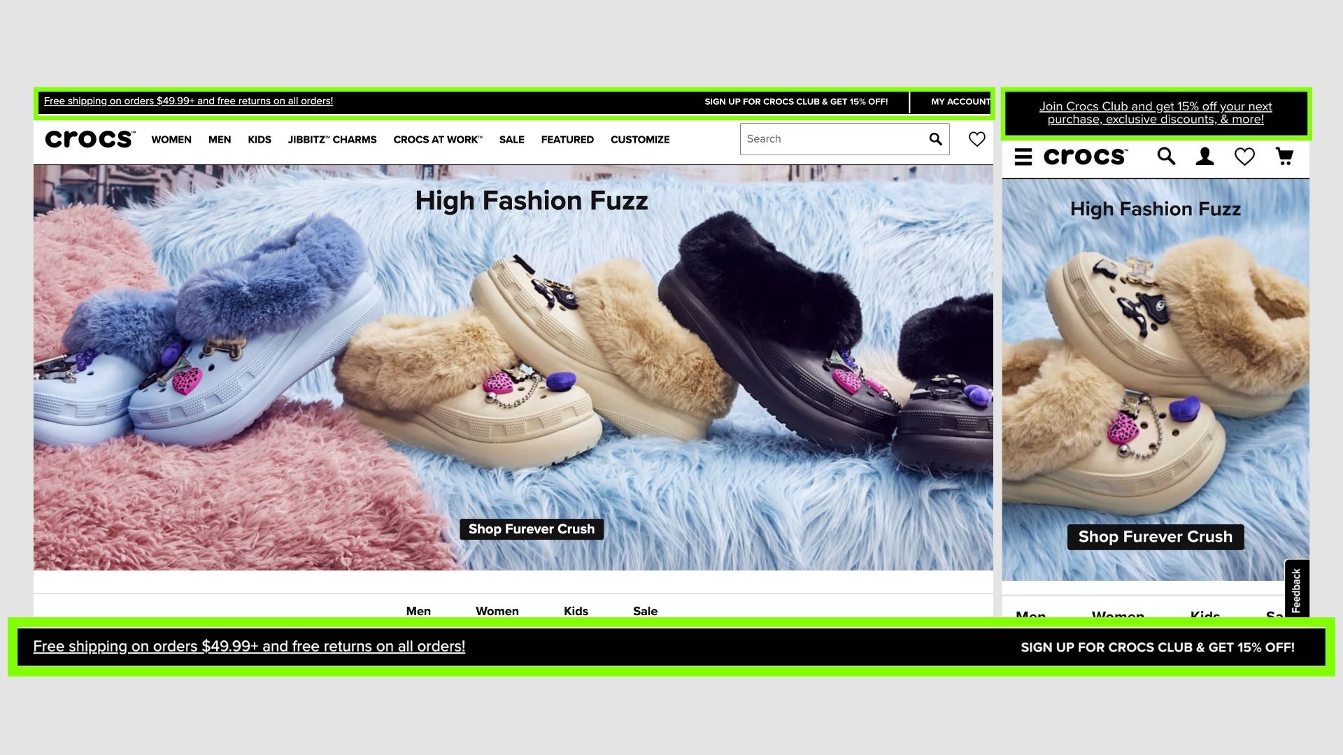
Crocs
Multiple offers in a single tab - a bit confusing but this helps users choose the best offer according to their requirements and do accordingly.
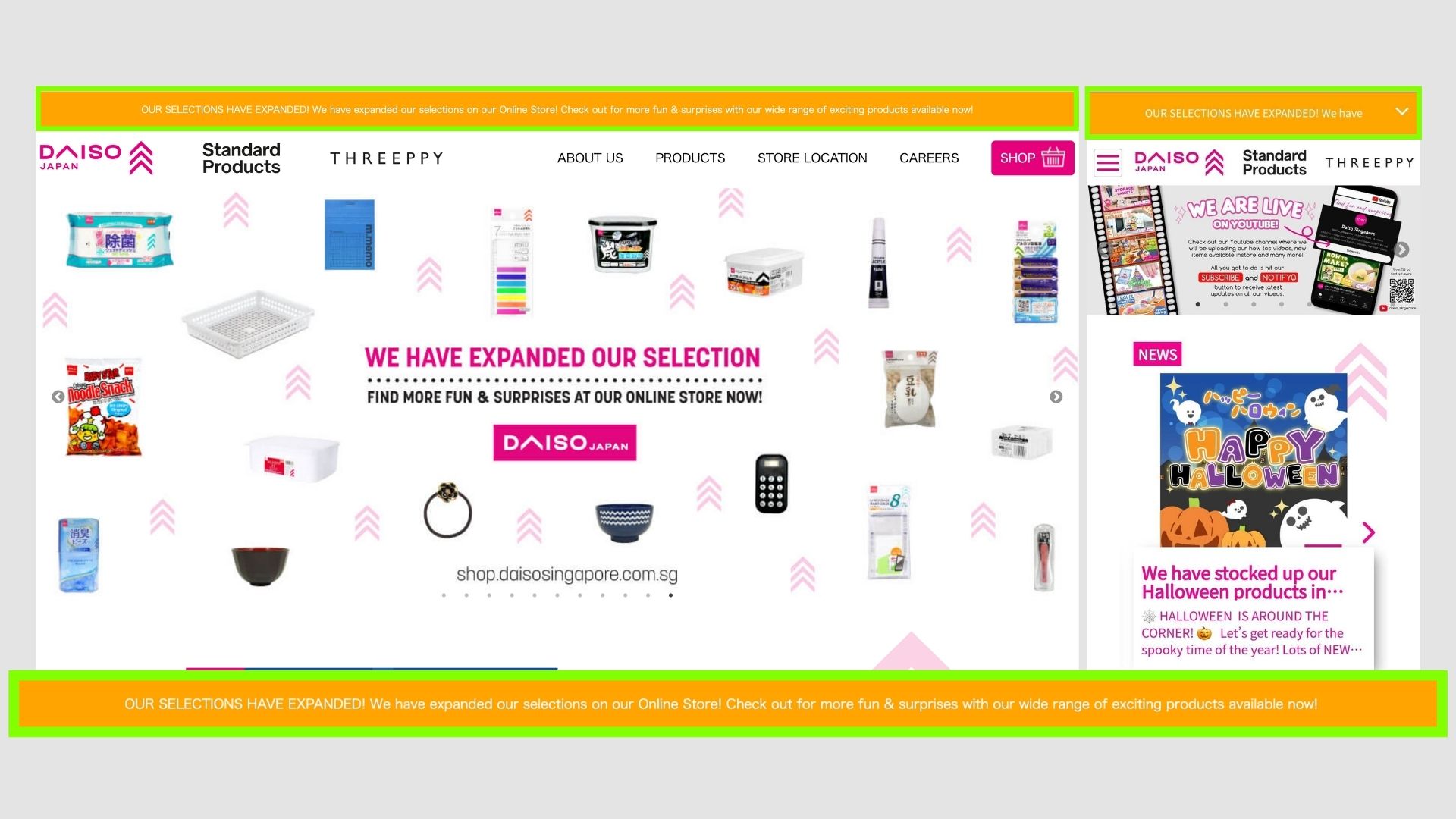
Daiso
Its acts more like an announcement bar updating users of the new products or changes within the online store.
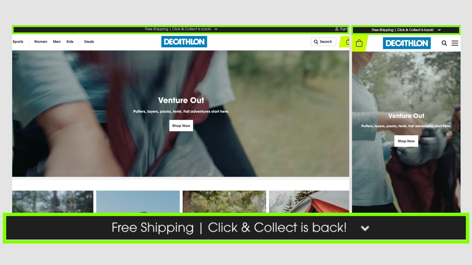
Decathlon
A really simple one, with two definite offers.
Users know that there is Free shipping + the Click and Collect Offer is back
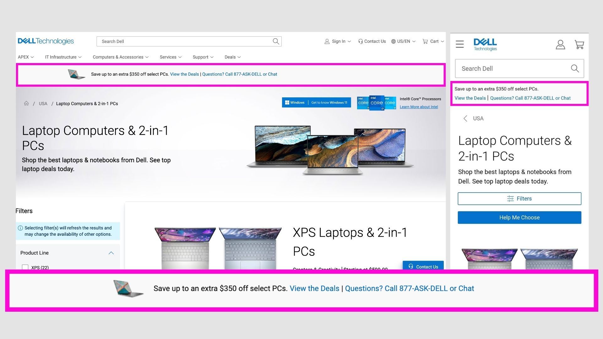
Dell
They have a small image of the product and the offer and then links to it.
Pretty good if you want to promote certain products on sale.
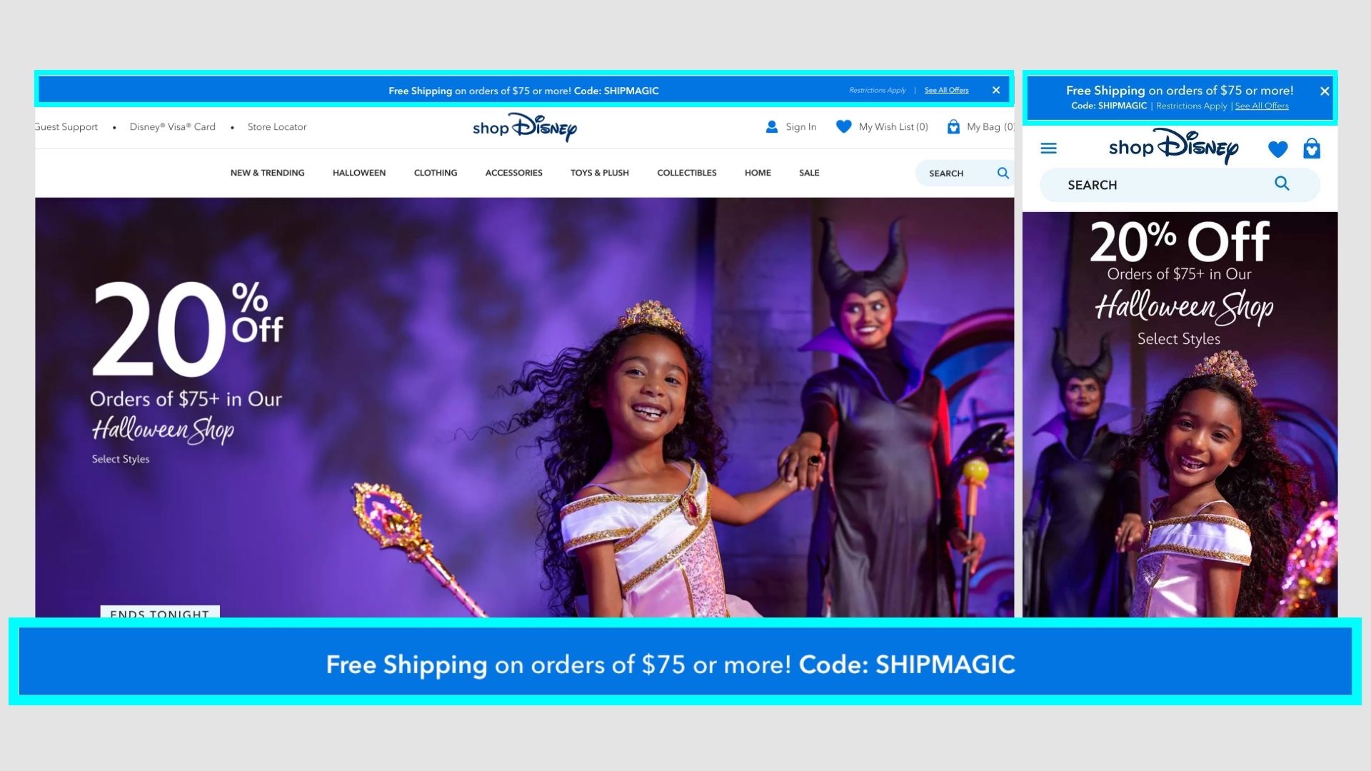
Disney
They don't need promotions for their products, so promoting free shipping and showing the coupon code the users can redeem on checkout.
Also in brand colours.
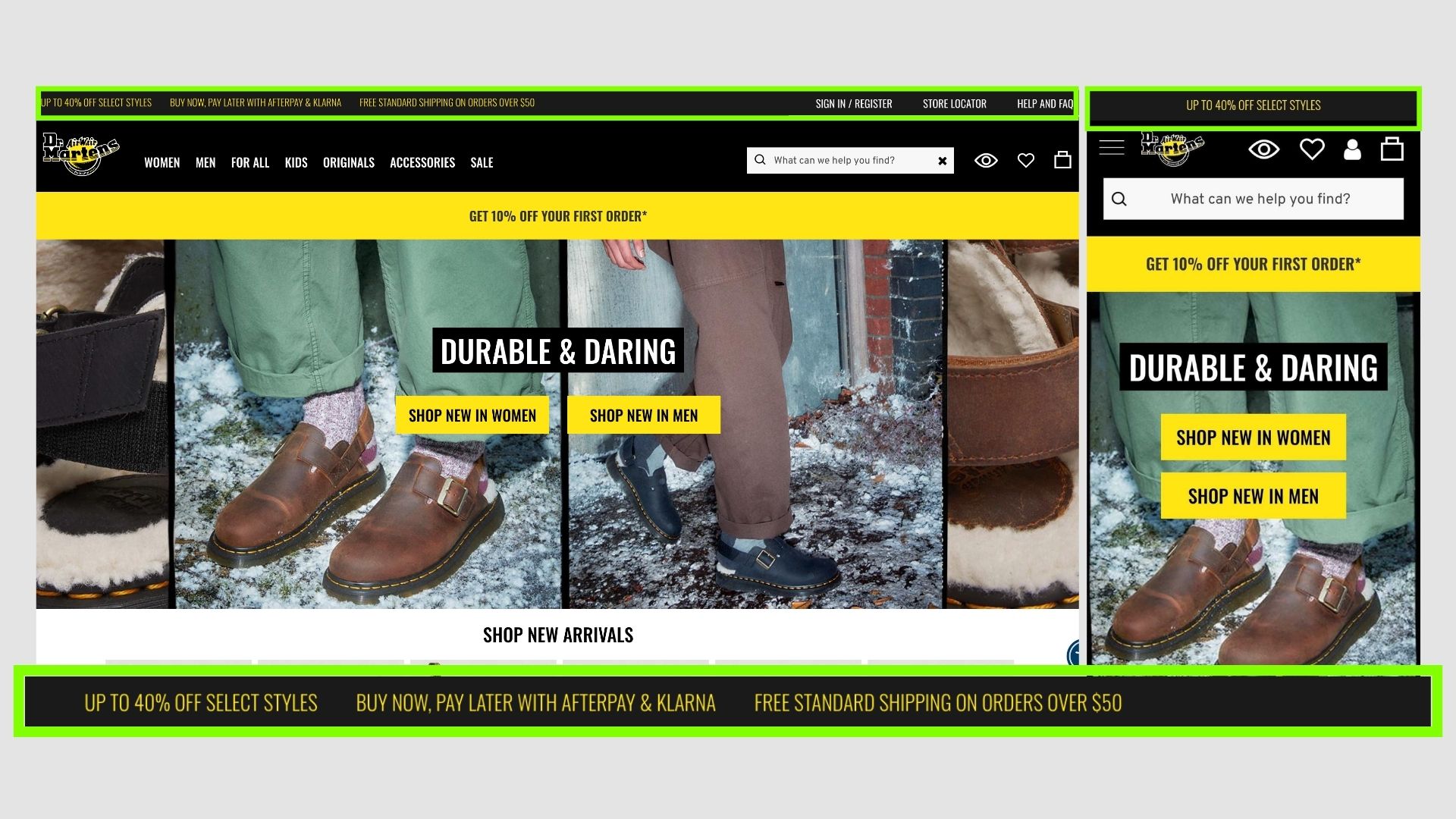
Dr Martens
Another clever illustration of showing different available offers, it changes from time to time.
But it has a pretty good contrast with colours and good options to choose from.
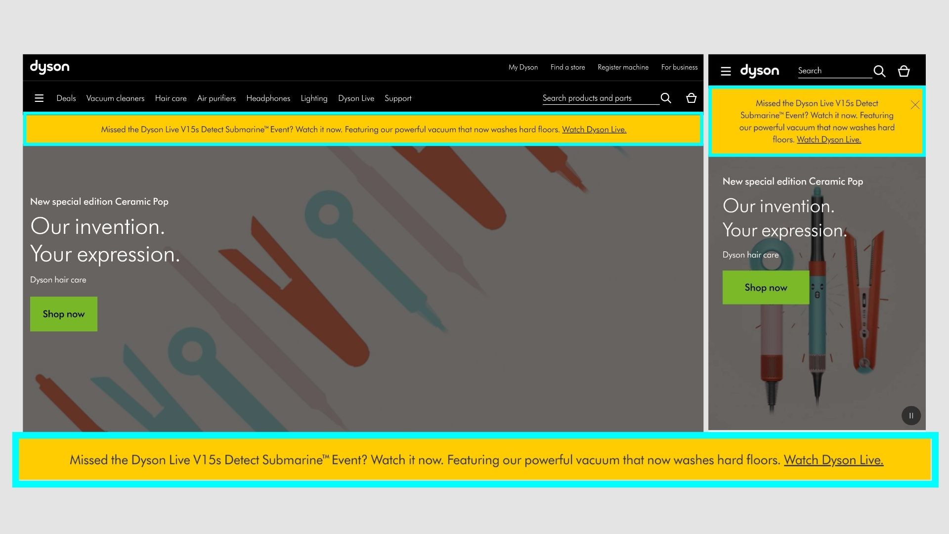
Dyson
No pushy promotions, just awareness for new products with videos/text.
Its more of updating users of the new products in the range, updations or something similar.
The yellow colour stands out on both desktop and mobile.
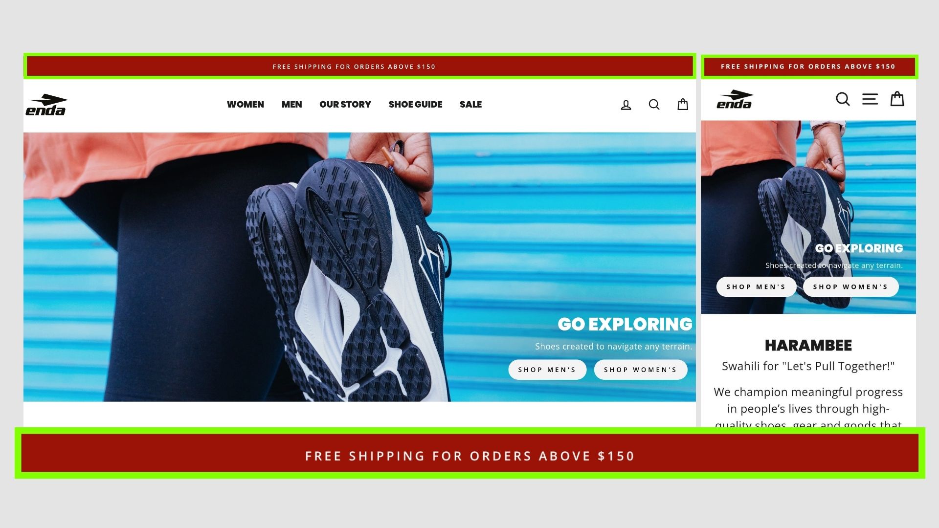
Enda Athletic
A very simple offer to get FREE shipping, added in a contrast colour to make it distinguished.
Would be great to also add a small CTA.
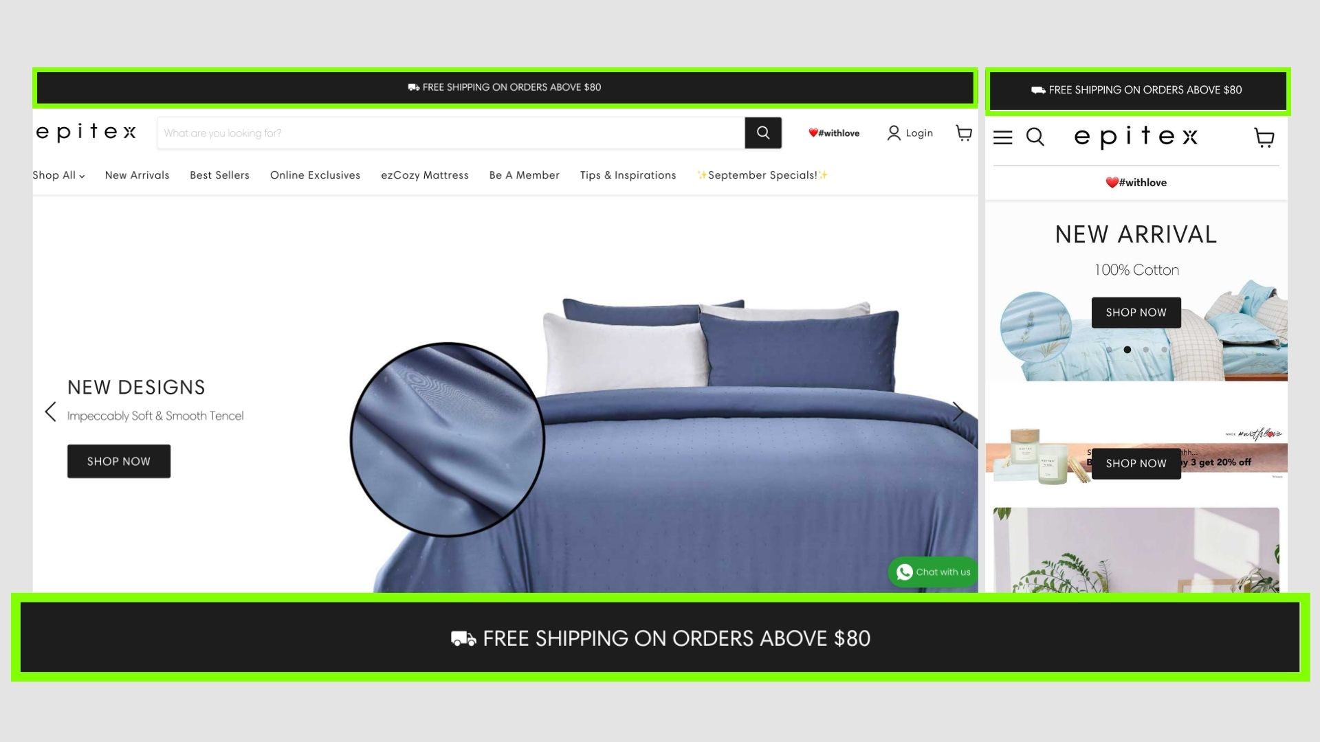
Epitex
Same as the previous one, but in brand colours to match the website.
The goal of these announcement bars is to just showcase about this shipping offer, its very common on e-commerce sites now.
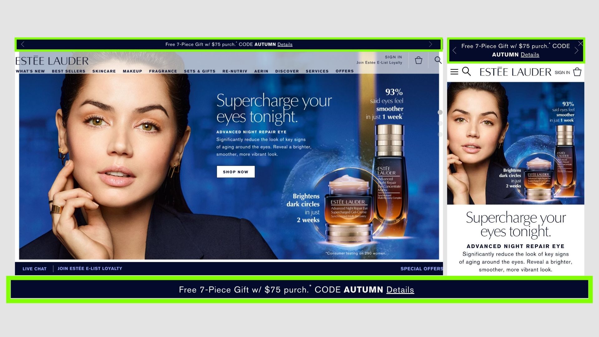
Estée Lauder
This would probably have more conversion and attention as this is an offer they have, also displaying the code to activate it.
So customers would voluntarily try to also claim this offer once they see this.
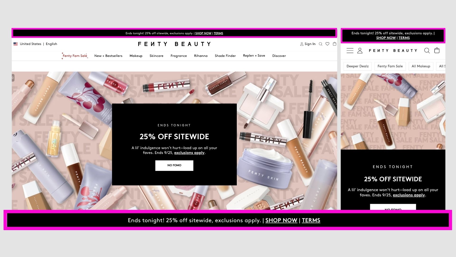
Fenty Beauty
A FOMO is created that the offer is only till tonight and the offer is mentioned, increases FOMO sales.
Also has links to the shop page also the terms, brilliant!
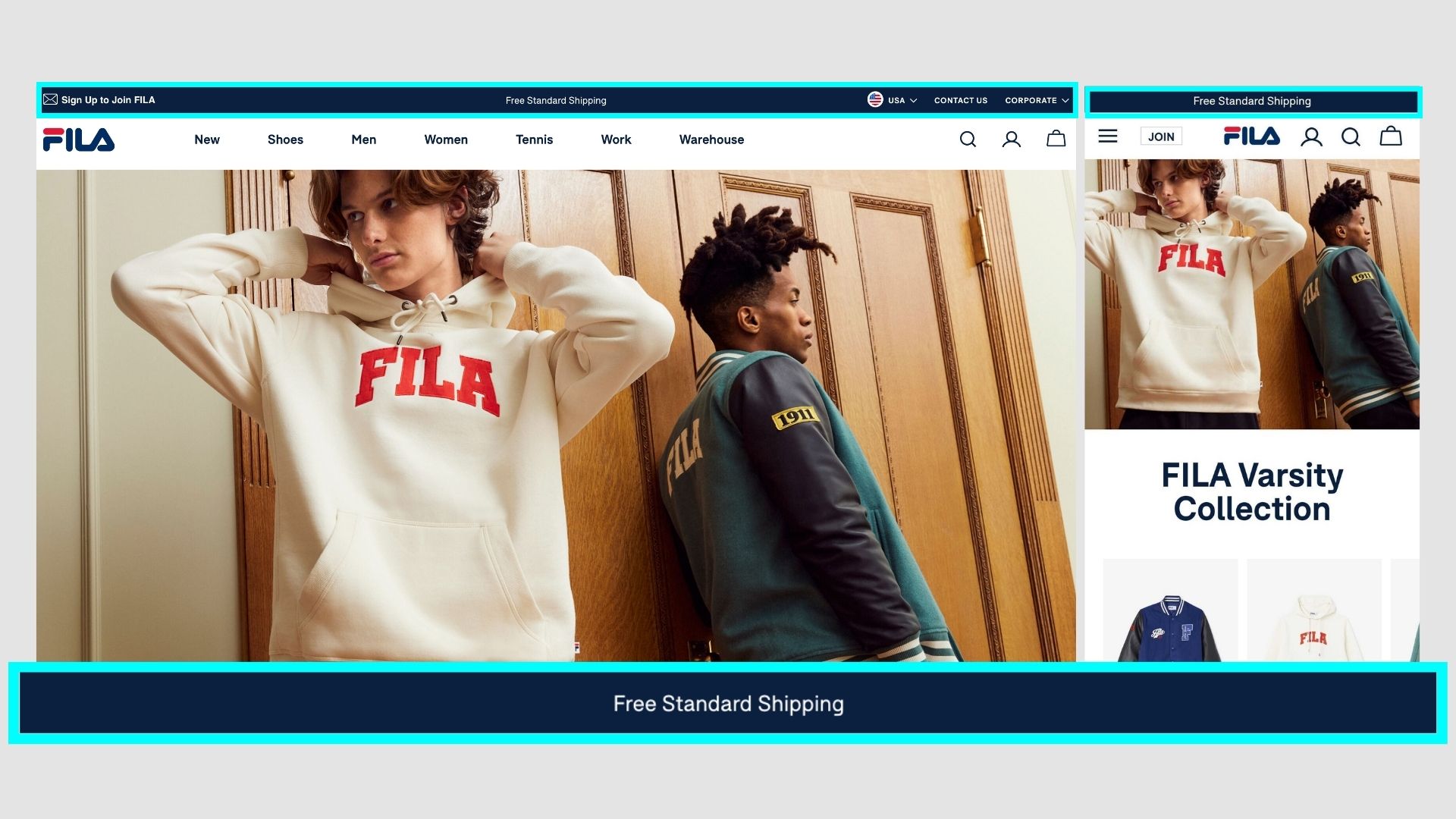
Fila
A very generic bar, but works for big brands like Fila where the product is not that expensive and people can buy it without any free shipping constraints.
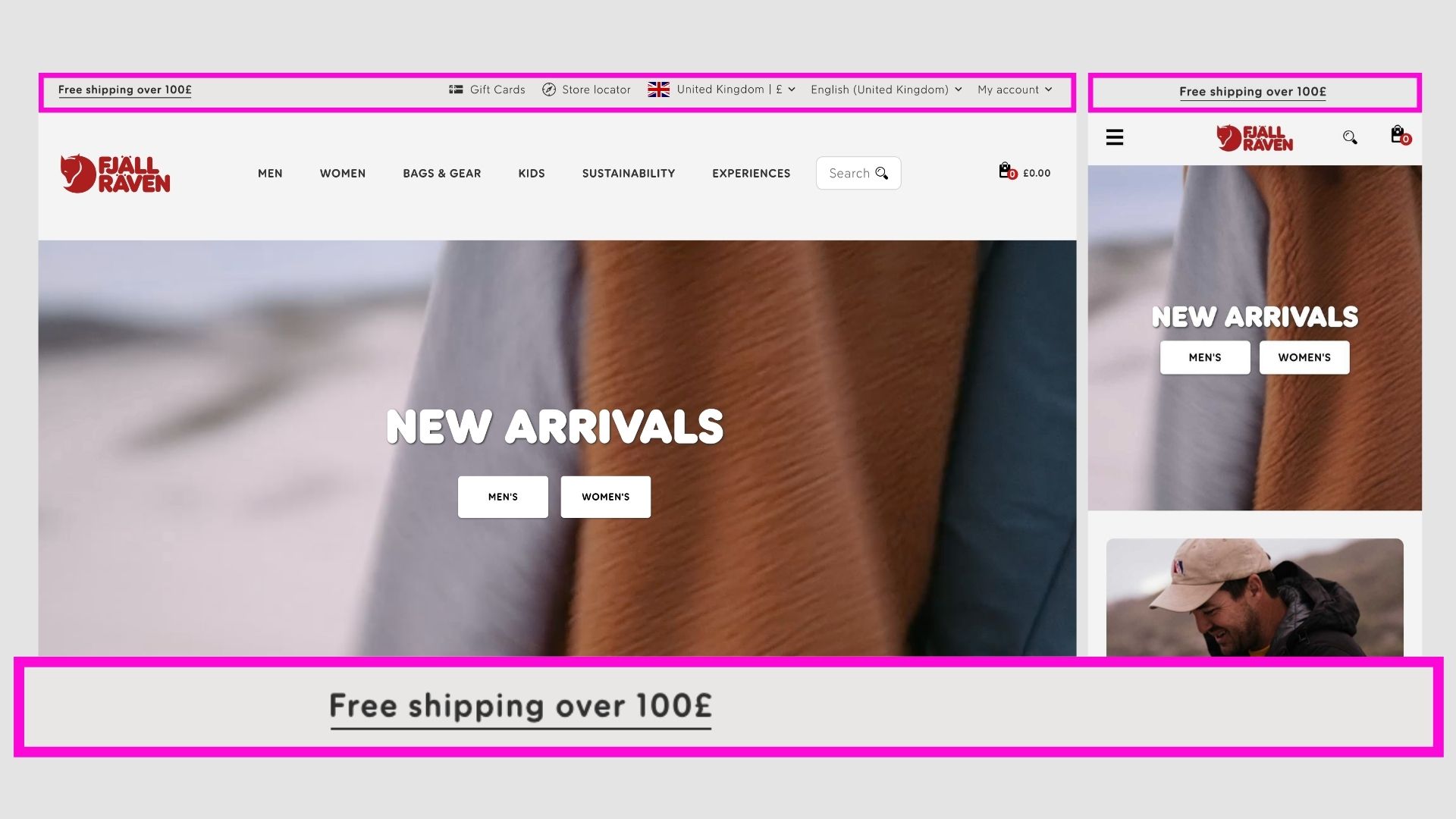
Fjällräven
Free shipping announcement bar, in almost the same brand colours. And is a simple hyperlink.
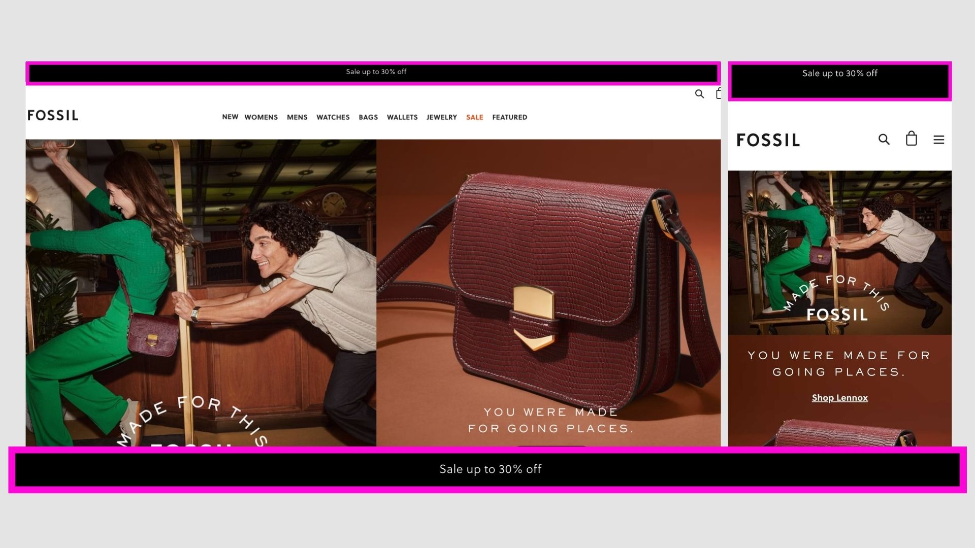
Fossil
Positioning their sale they have at the moment in brand colours. Would be great to also include the link to the offer page.
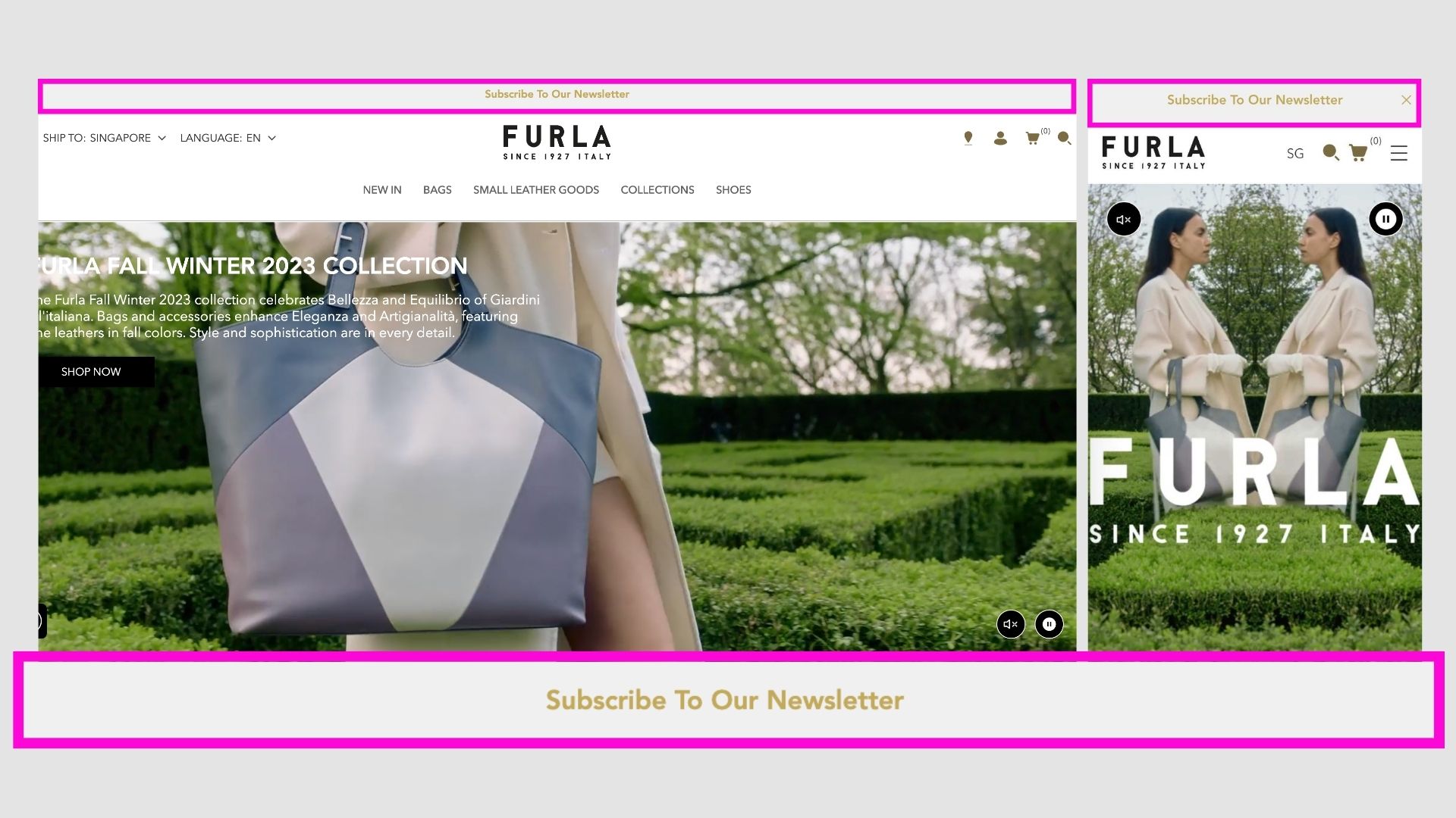
Furla
This is not particularly a good example, as just saying "Subscribe to Newsletter" does not have any value to the user.
Unless they have some insane value or information on their newsletter, why would someone sign up just to get their marketing emails?
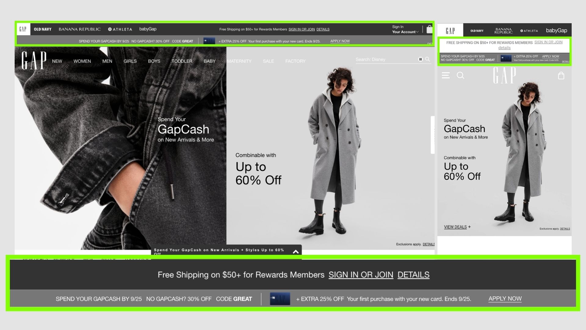
G.A.P
Multiple offers are portrayed for the user to take whatever is best for them or combine all of them.
Looks amazing in the brand colours but still keeps it distinctive.
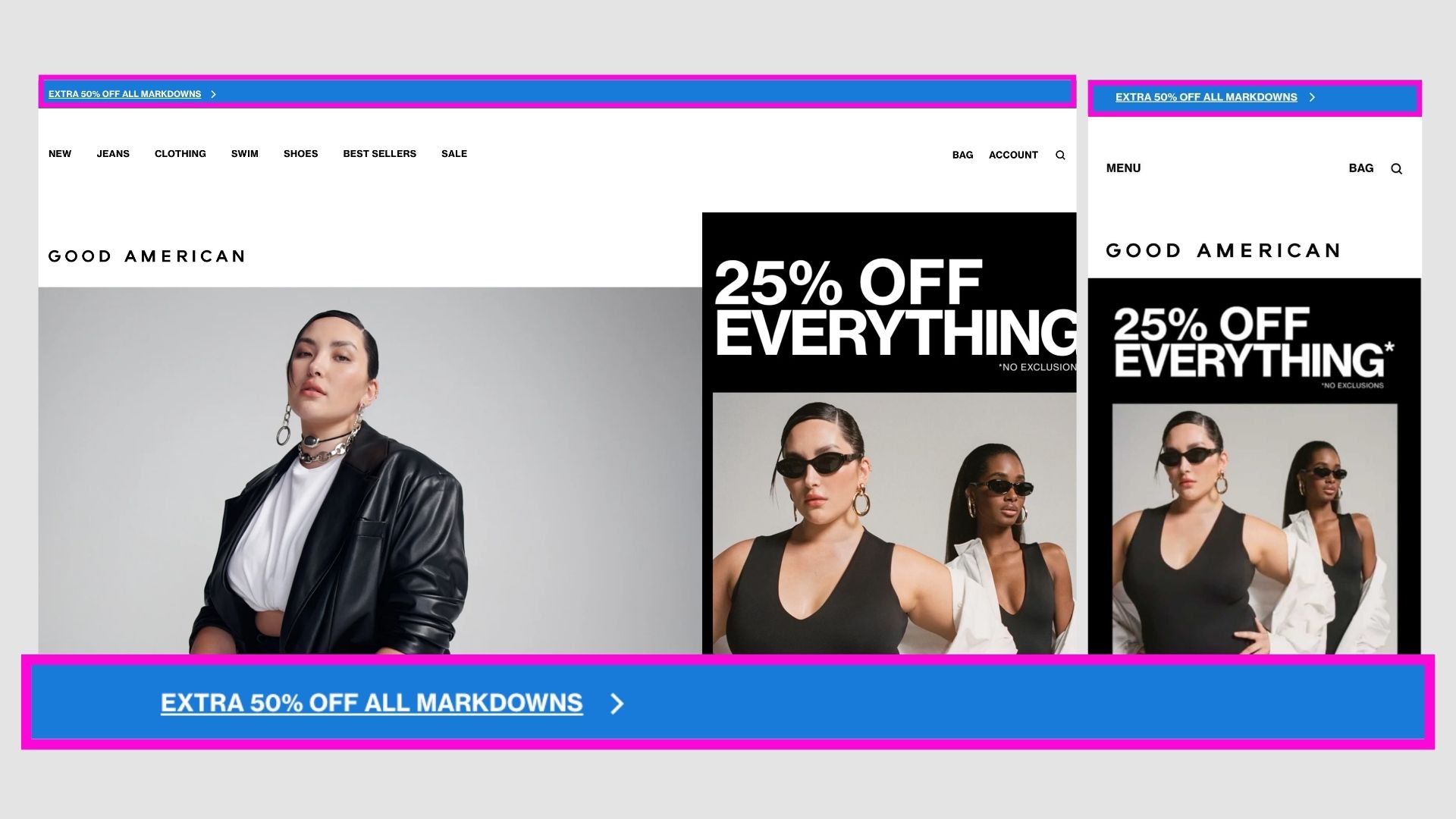
Good American
A very high contrast bar to scream out the offer!
Might work because the colour is so attention-grabbing and user gets information about the sale.
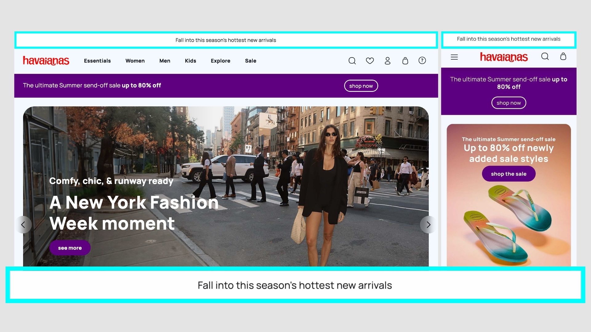
Havaianas
One of the very few announcement bars with no button or link, its just says what the latest update and the rest can be figured out by the user itself.
Can work for brand which have higher customer loyalty and demand for new products.
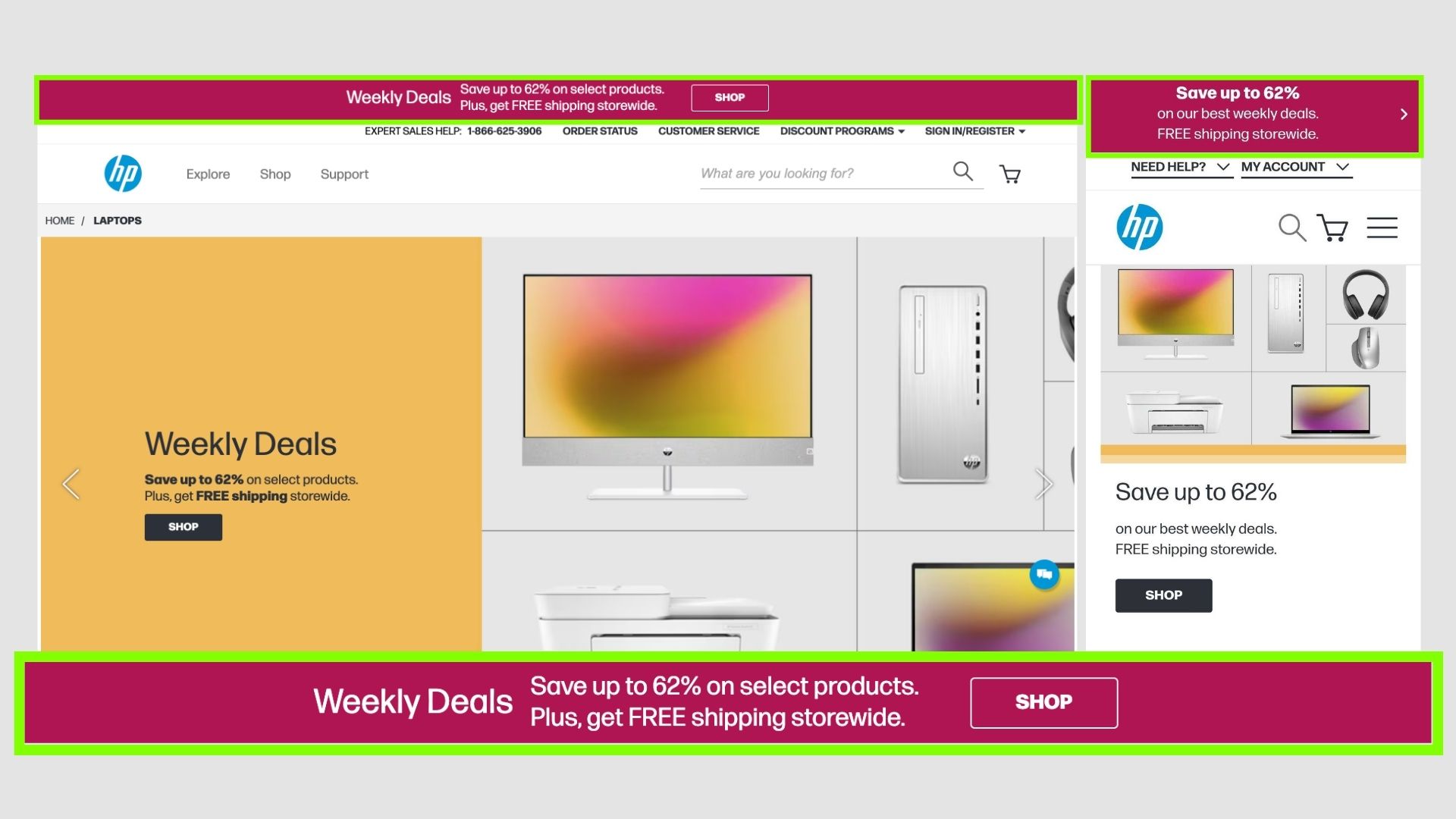
HP
HP uses a separate colour to showcase the deals. They have a good headline, subtitle and also a CTA - SHOP.
This works because its already a reputed brand, so an offer is like a cherry on the top.
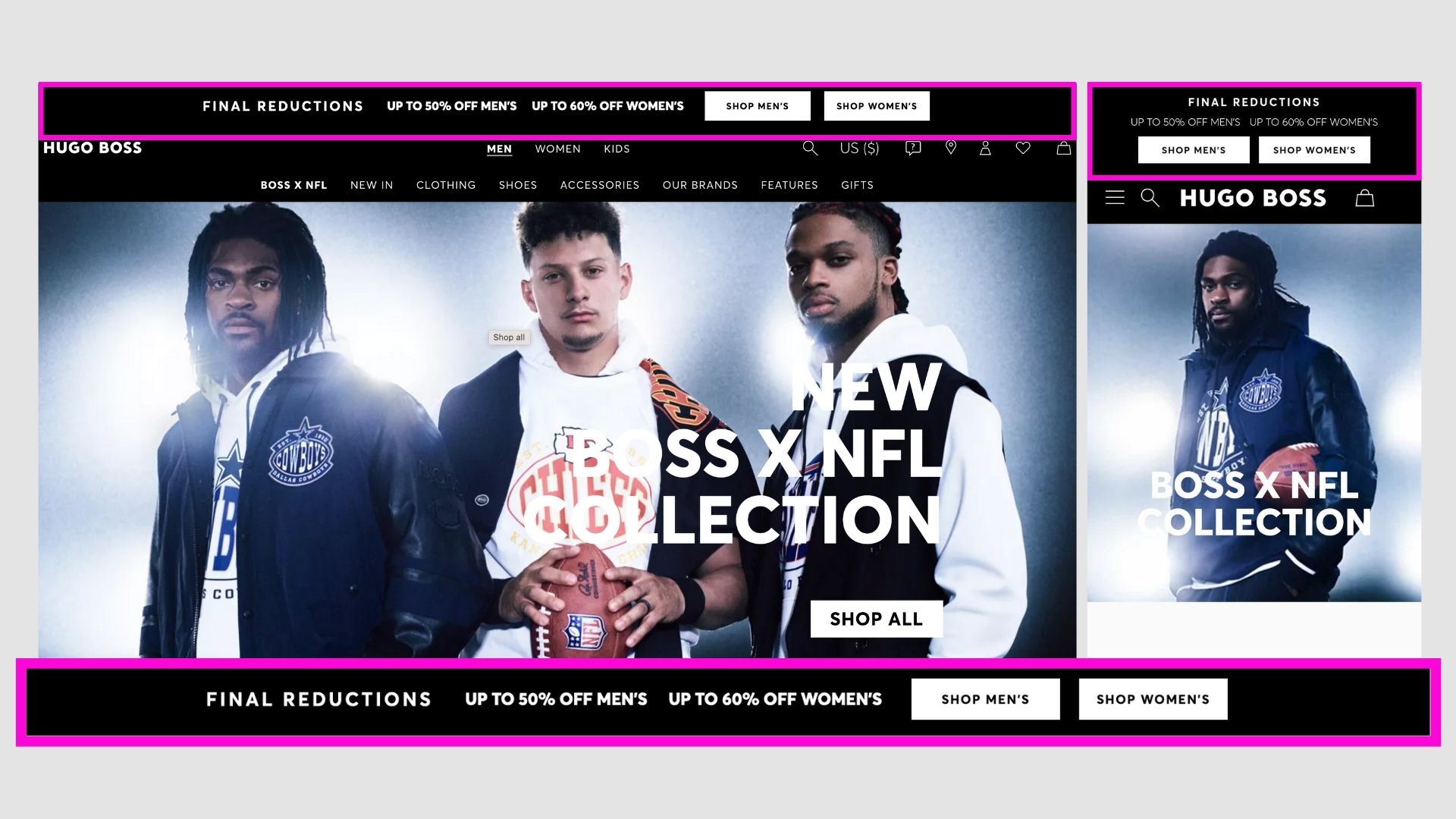
Hugo Boss
Matches really well with the website design, and also shows that there are offers for both men and women.
Also did a great job by placing two CTAs - so it can go to the respective sections.
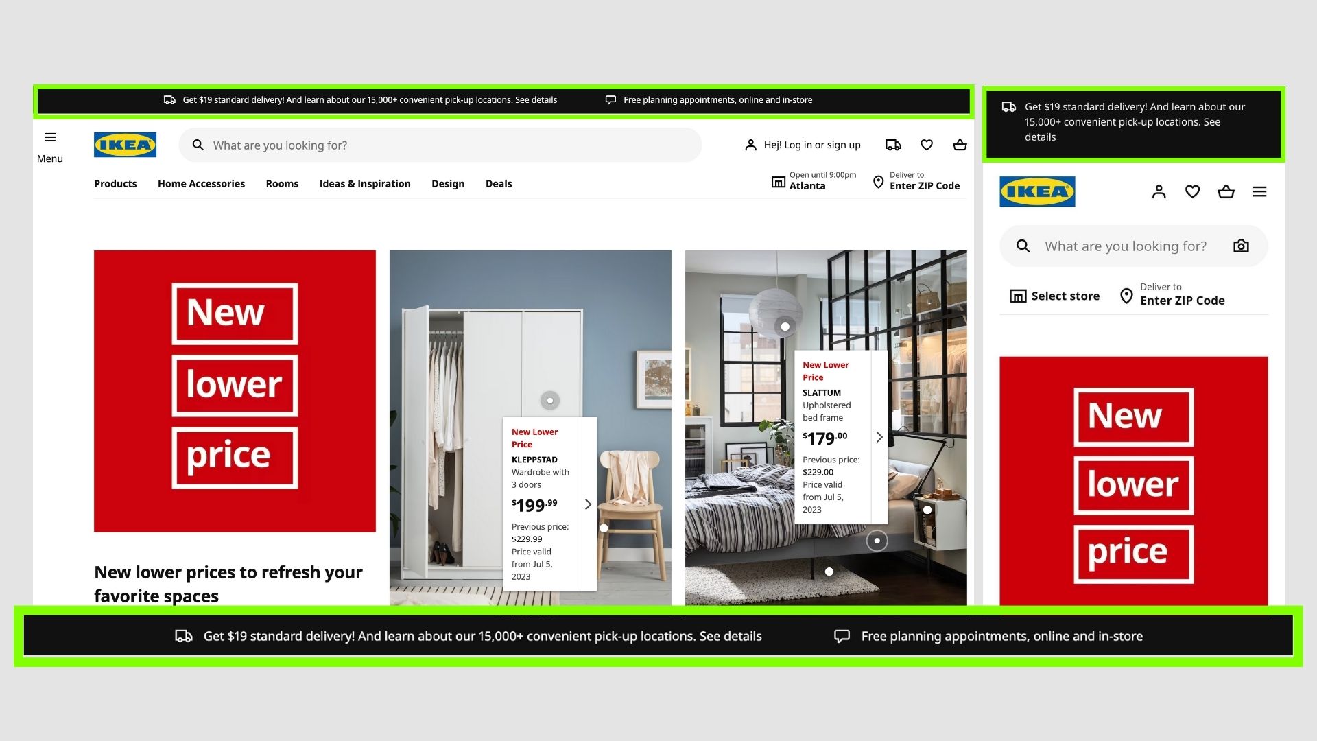
Ikea
They use it to present various offers or notifications. A simple clean layout.
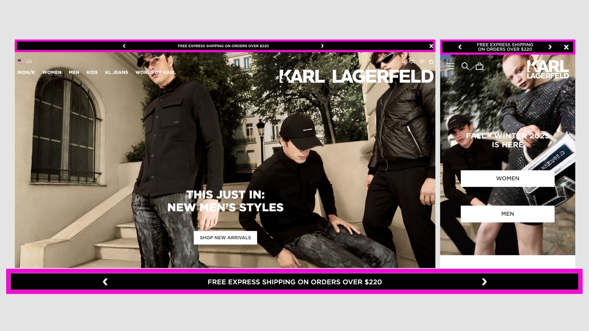
Karl Lagerfeld
Also in brand colours with a single offer of free express shipping in a slider, but have more of them when you click next or it goes automatically like a slide show.
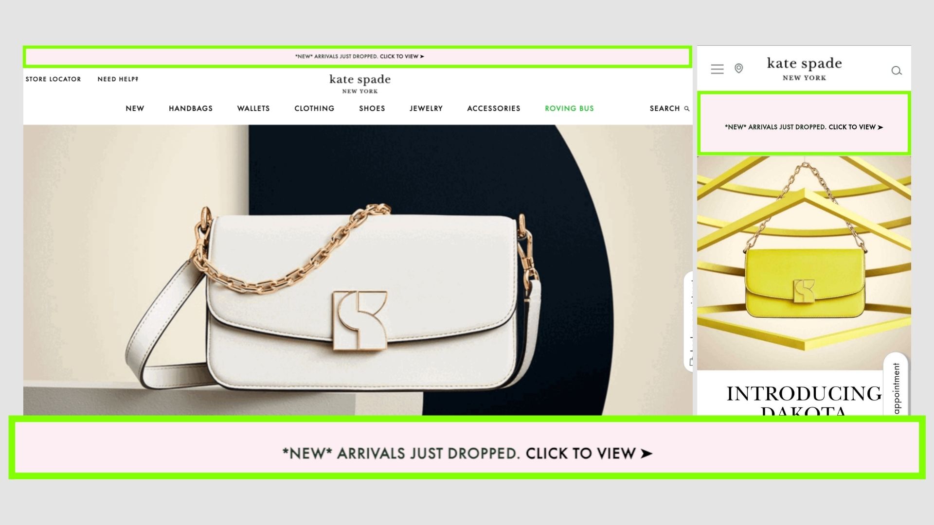
Kate Spade
Also matches the website theme, notifying users of new arrivals and CTA to go to that page.
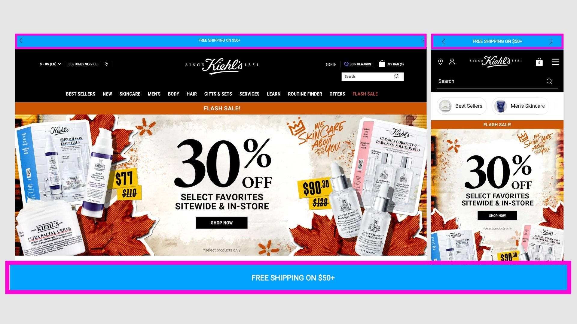
Kiehl's
They use a contrast colour to get attention and then showcase the free shipping and its criteria.
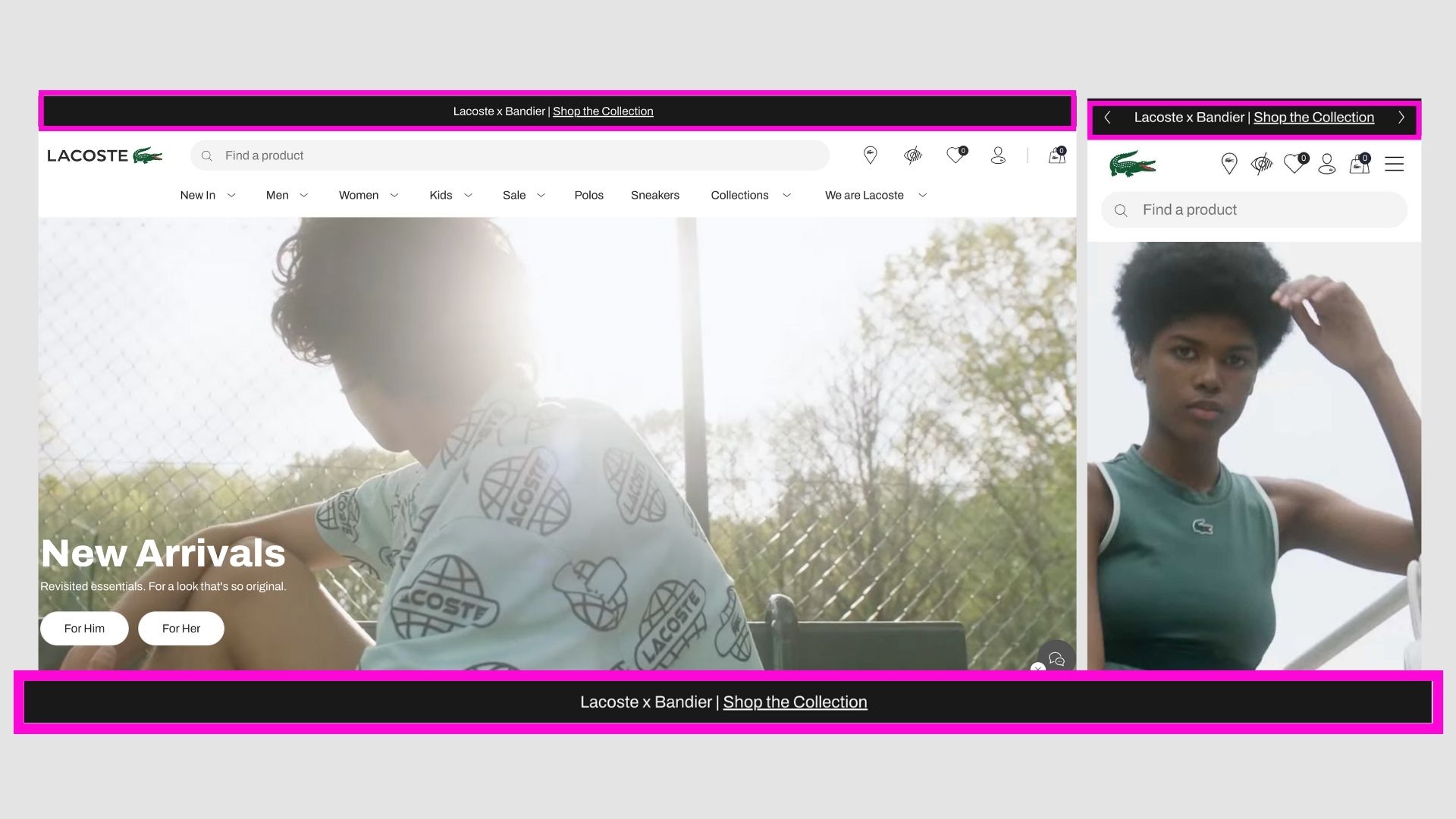
Lacoste
They use it to promote various sales/offers etc. Always a single offer and CTA inthe hyperlink.
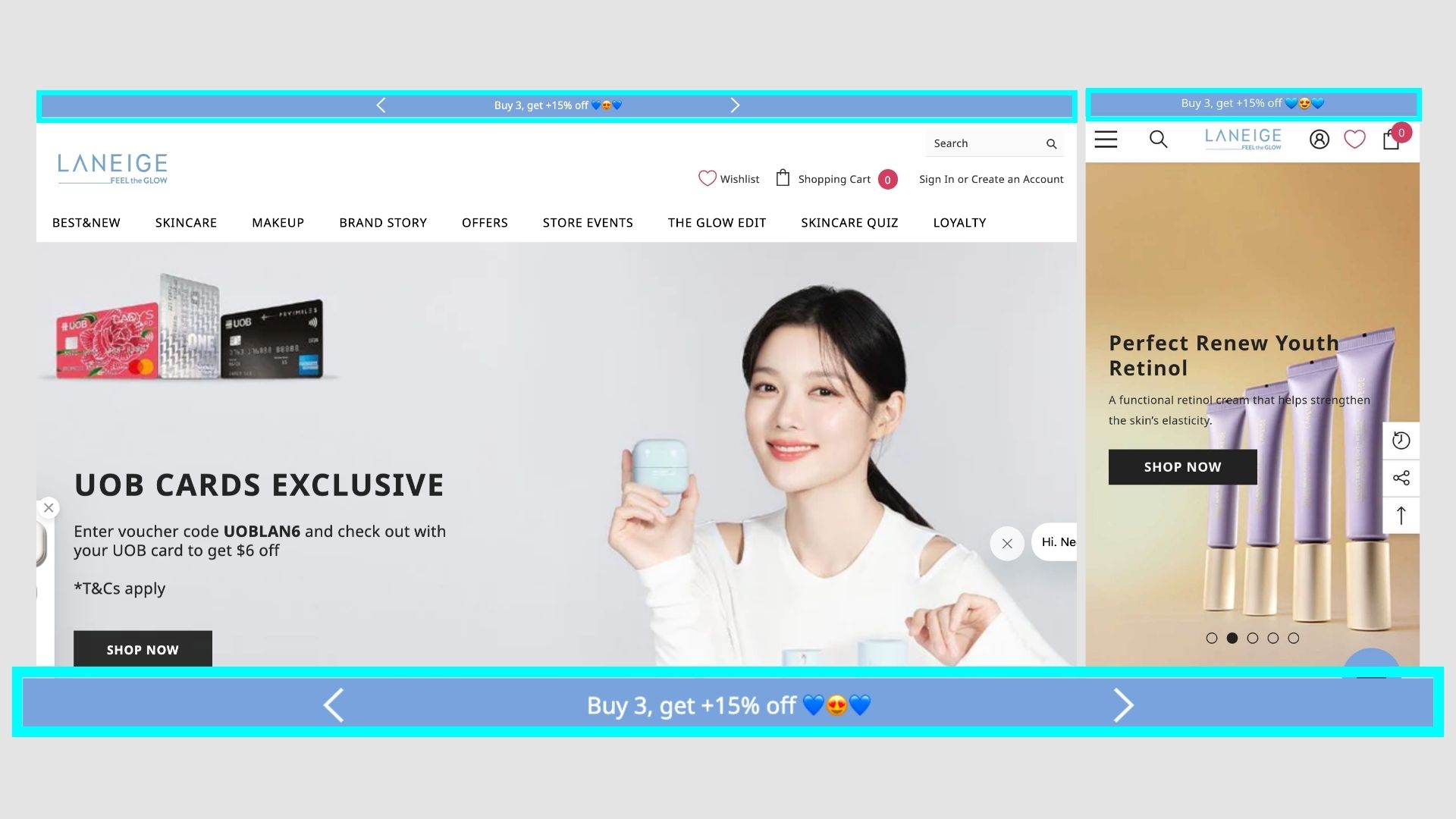
Laneige
A blue bar to showcase an irresistible offer - plain and simple.
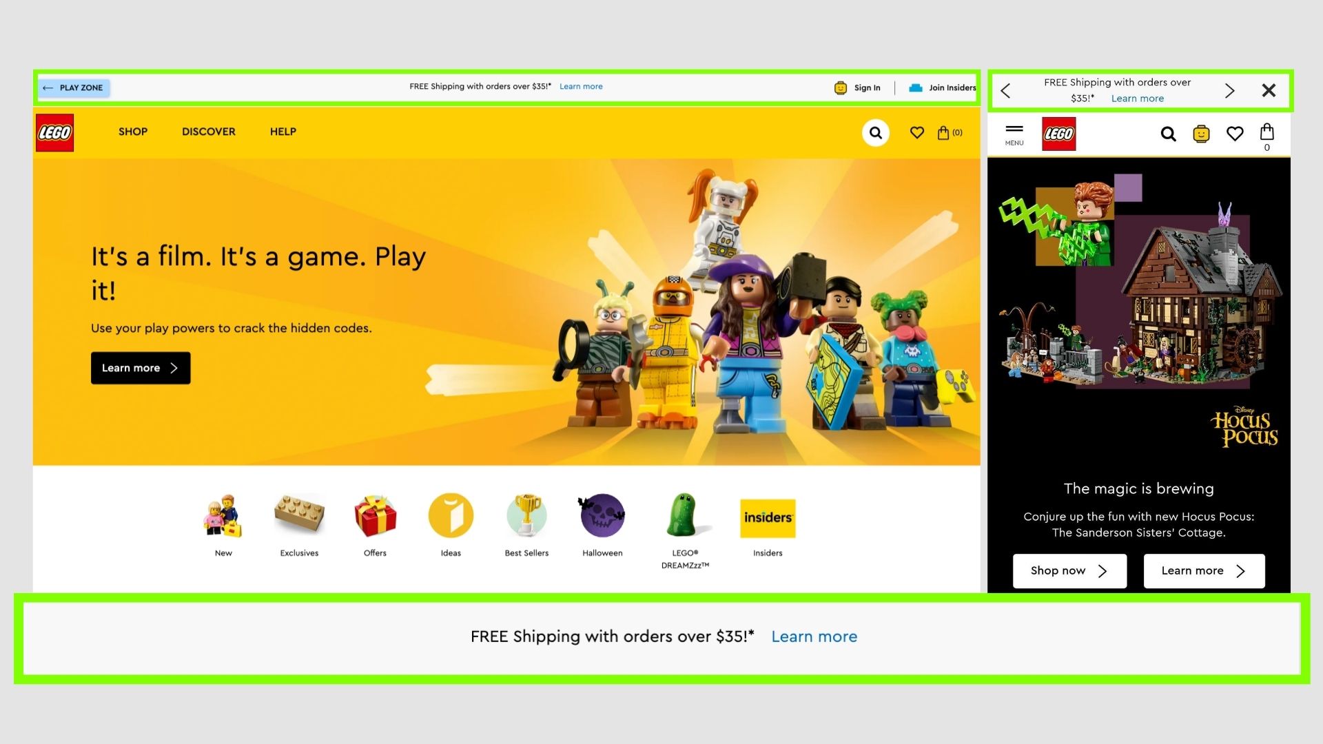
LEGO
Lego already had an amazing brand and positioning, just giving that extra pinch - FREE Shipping to take it off. Amazing one.
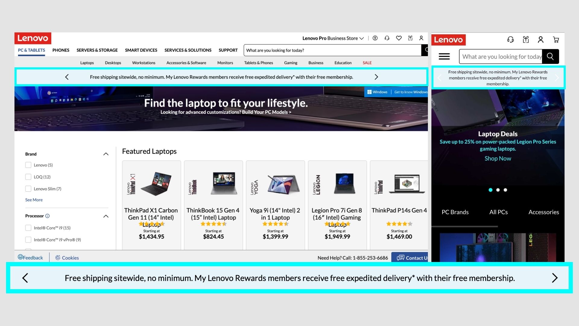
Lenovo
Many independent ecommerce stores offer free shipping on achieving some criteria, but Lenovo says no minimum. Pushes sales for lower ticket items online directly from manufactures which covers the costs for it.
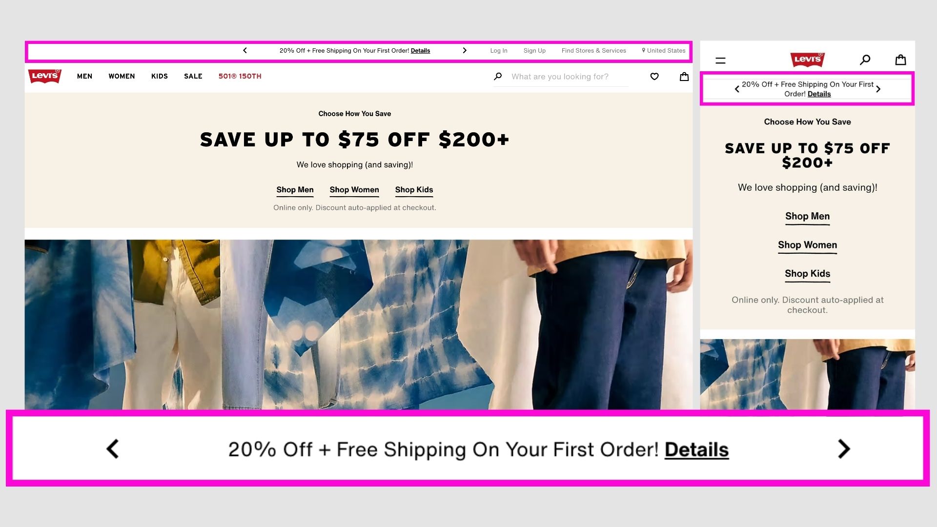
Levi's
Promoting first sales from new users with an amazing intro offer. Presented neatly with a hyperlink to more details.
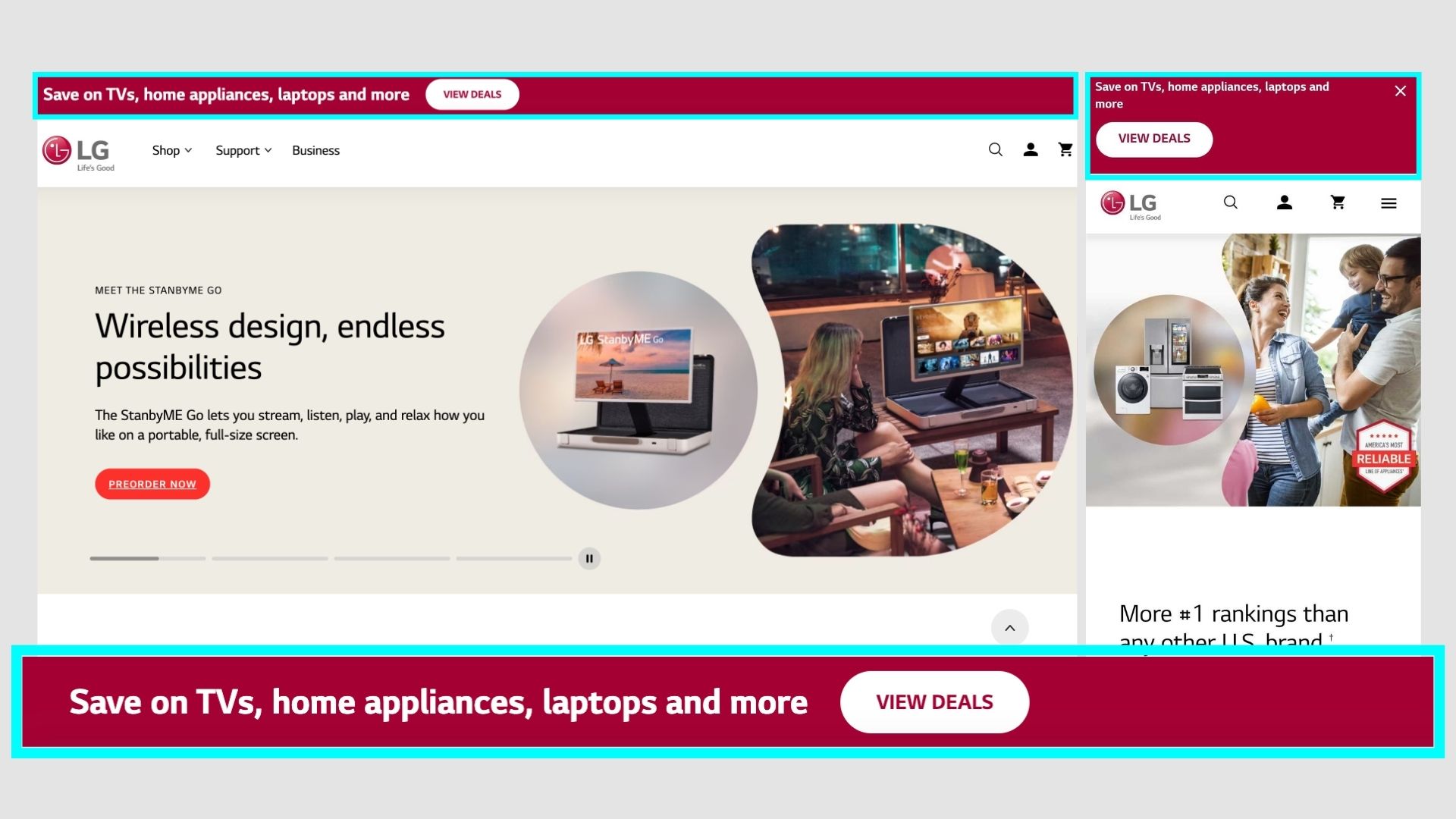
LG
Similar to Amazon showing the best deals and offers for products directly from the app. Promotes implusive purchases or to just browse through the website.
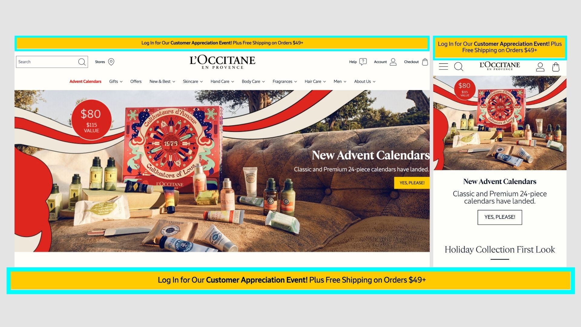
L'occitane
Promoting their event and giving prompts to log in.
Log in = get customer data to remarket.
Brilliant!
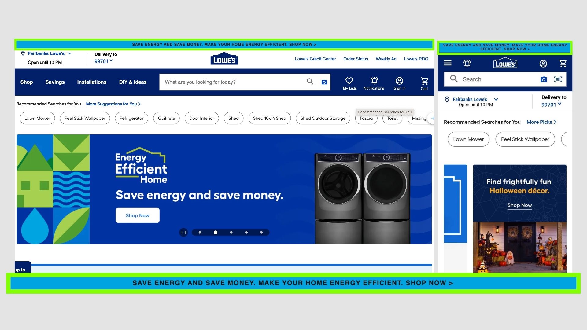
Lowe's
Not even promoting an offer/sale. Just giving the use of the product and a CTA.
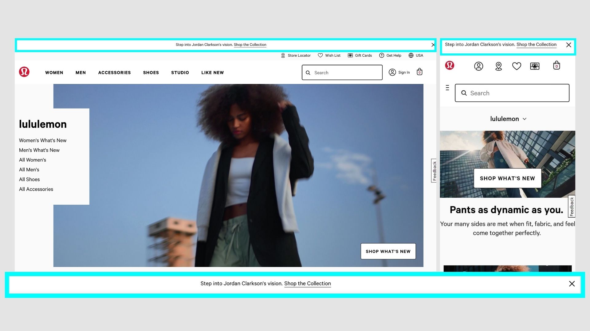
Lululemon
Introducing a new collection, with a hyperlink. Clean design.
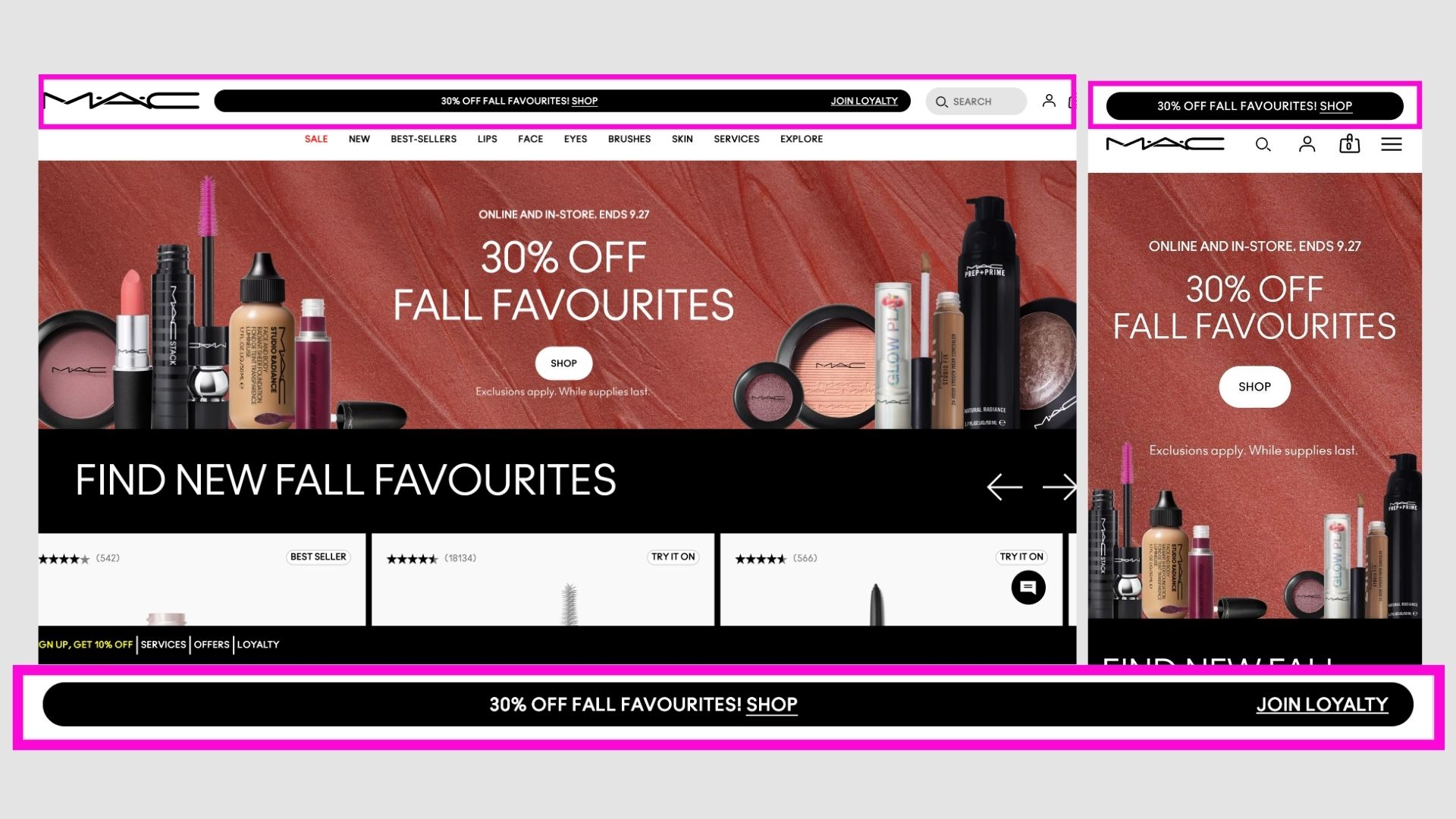
M.A.C Cosmetics
Almost like a big button in black, showcasing the offer and two CTAs.
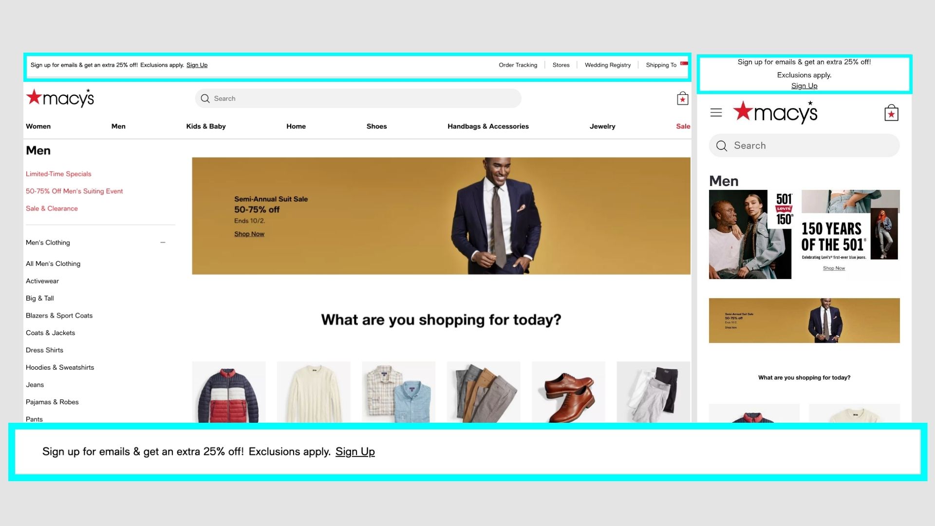
Macy's
Promoting the email newsletter to get additional offers.
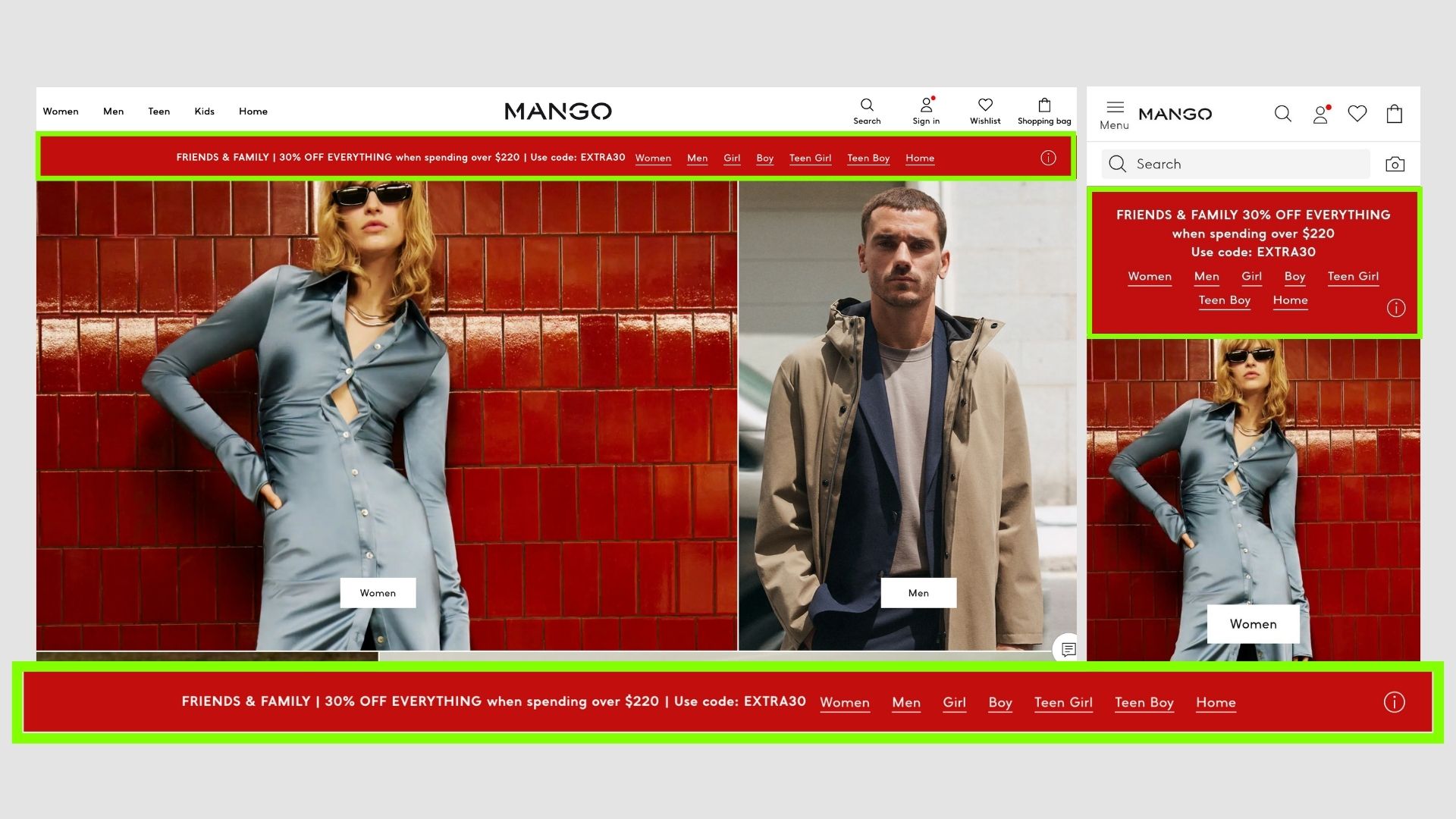
Mango
A very big red announcement bar with a lot of links. Might get confusing due to the multiple CTAs.
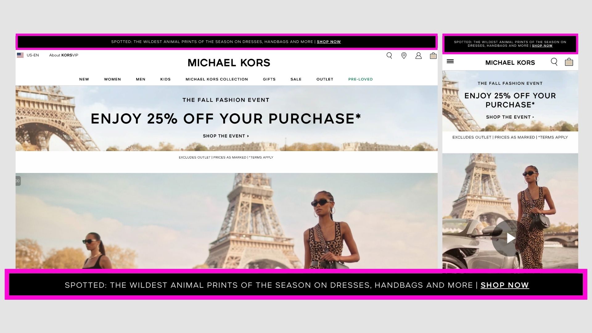
Michael Kors
More of an ad of the brand and a link to the collections page.
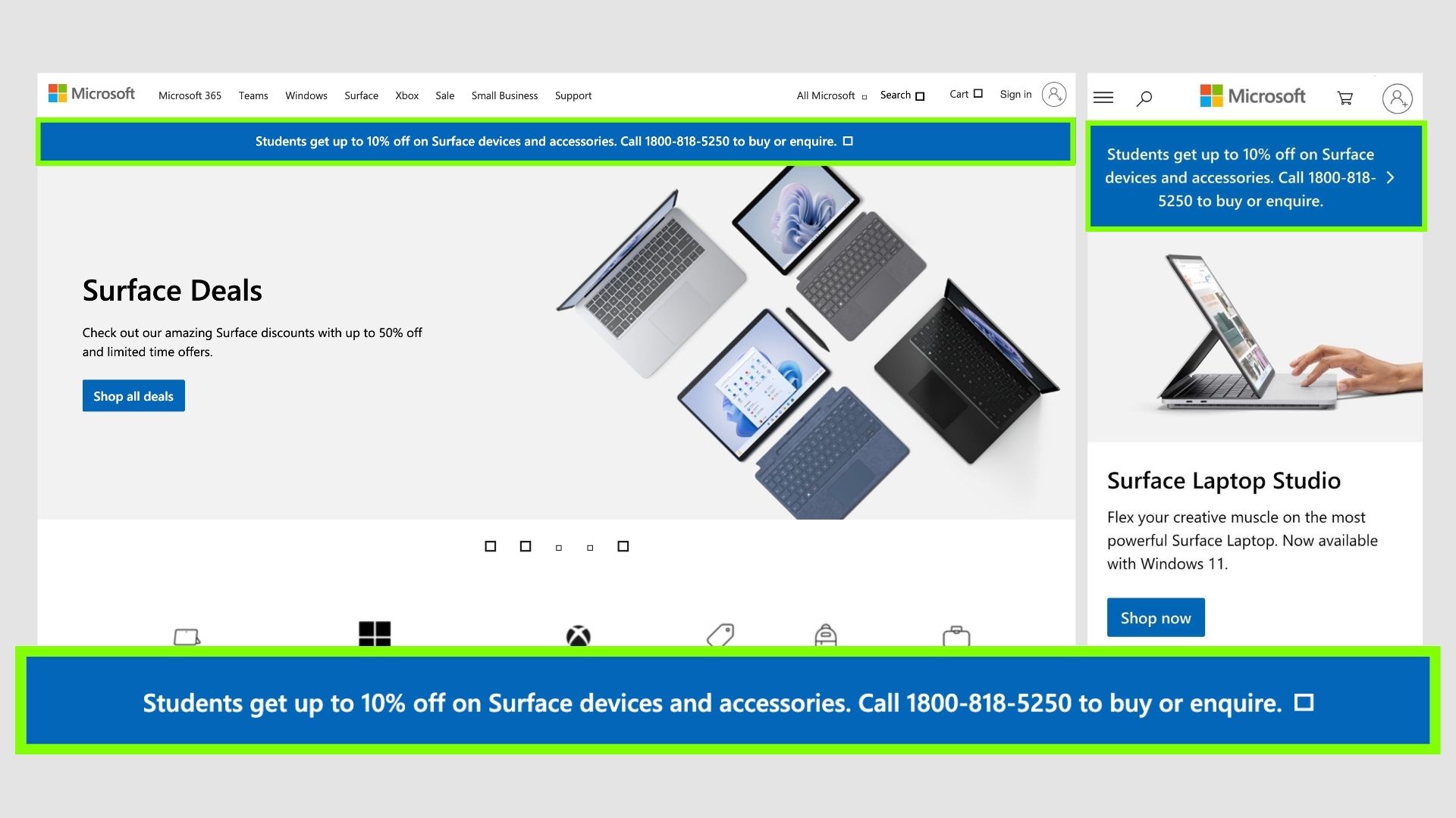
Microsoft
Promoting student discounts using the bar. The CTA is a simple call, so they can also get data from this.
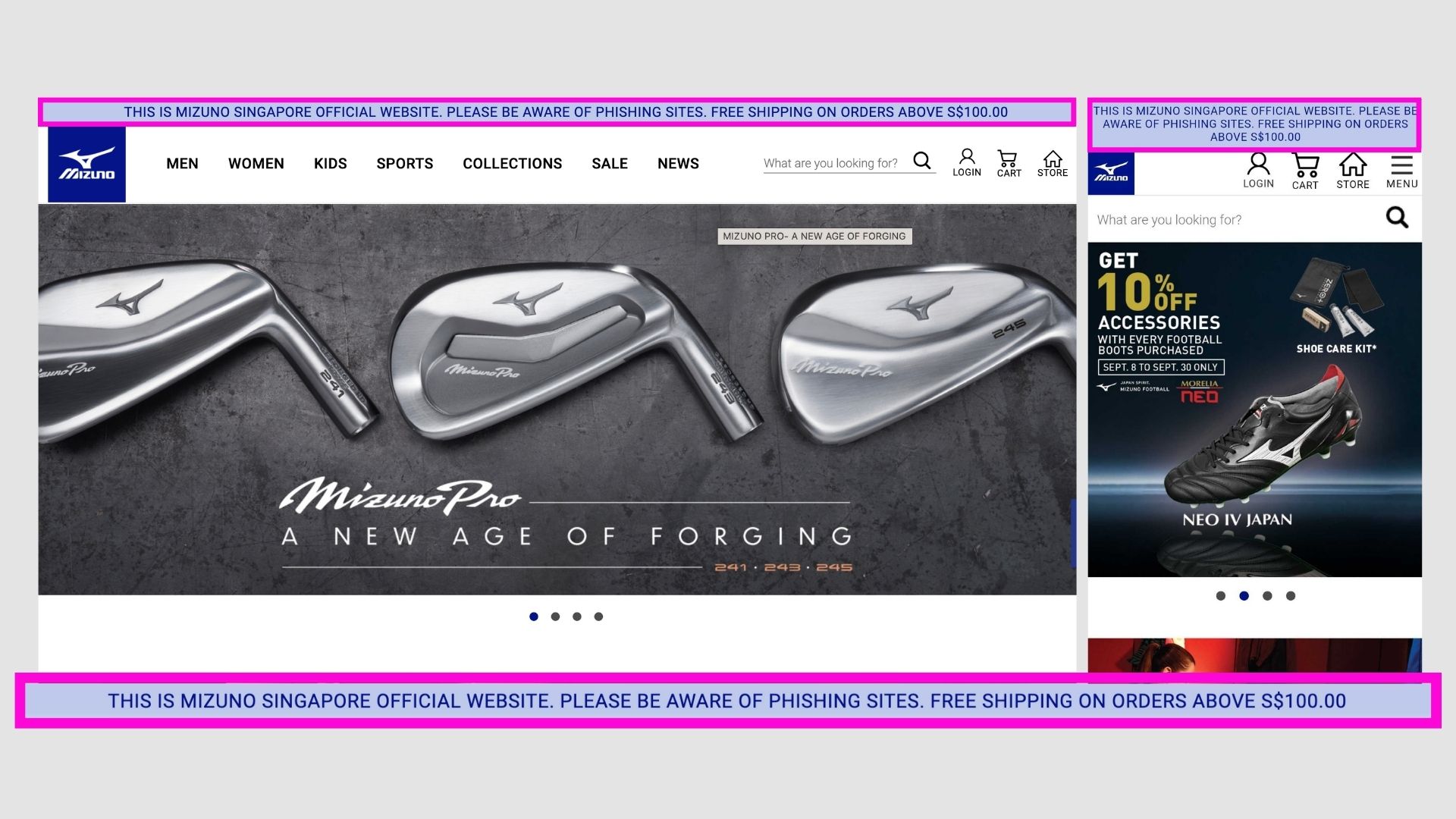
Mizuno
A disclaimer notifying users of phishing websites. Establishing this as the official website and they can be rest assured.
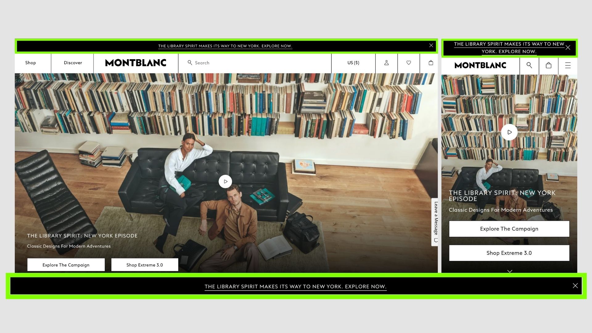
Mont Blanc
Simple text about the brand with a CTA.
New Balance
Introducing a new collection, but it would be most probably understood by the OGs, with a simple CTA.
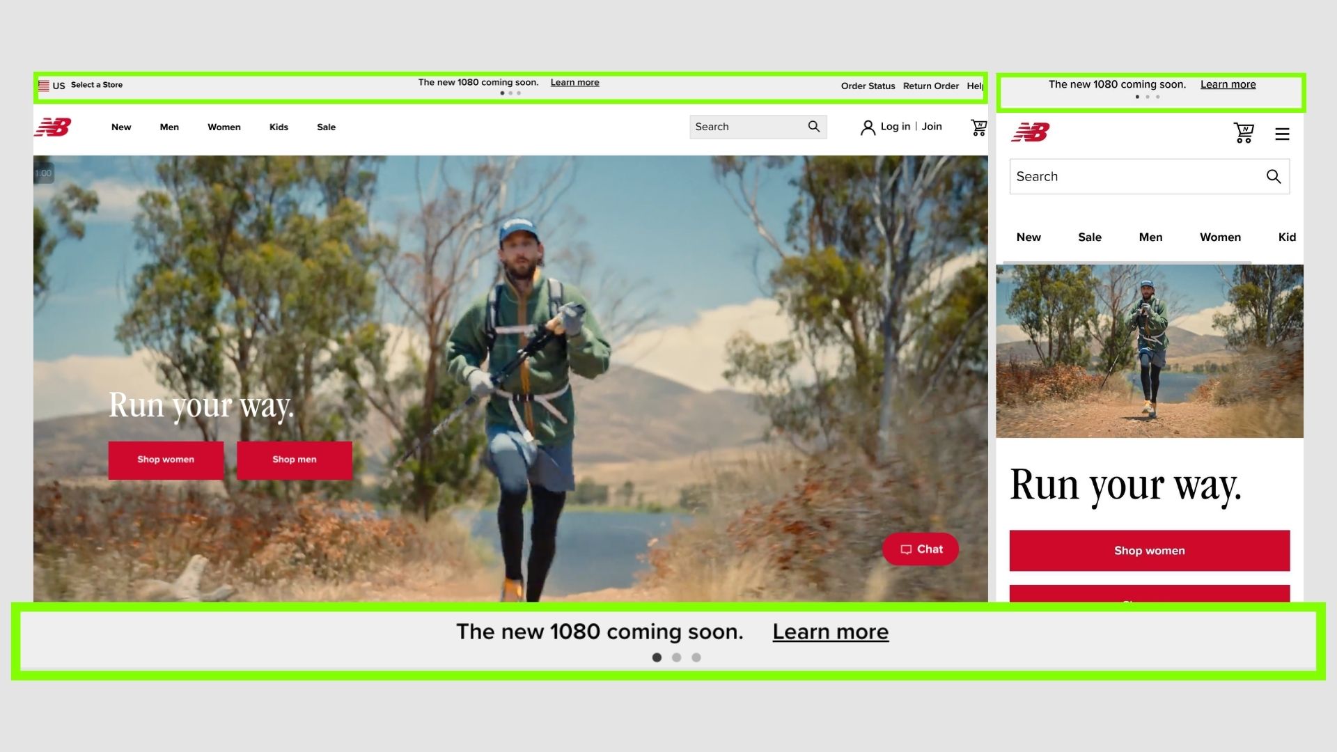
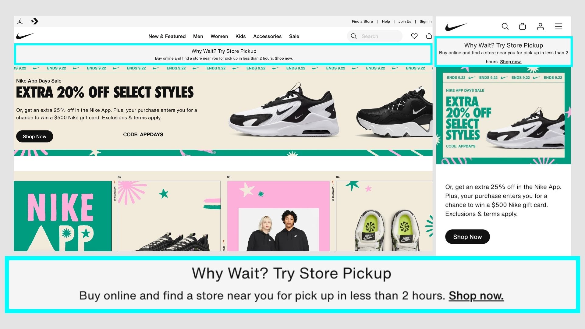
Nike
Genuis!
This is a problem most online shoppers face because of the transit time, it is as simple as buying it online and taking it away from the nearby store.
Like fast book, ironic.
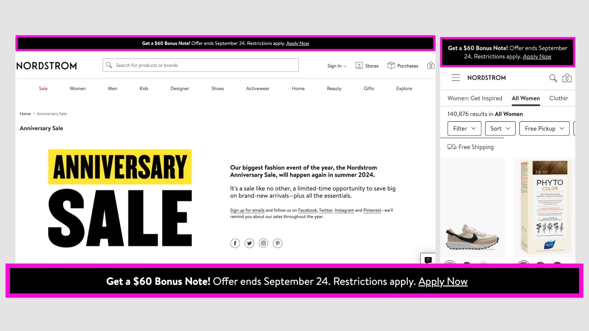
Nordstrom
Looks very aligned with the brand and also gets lot of attention due to the BONUS text. Good one.
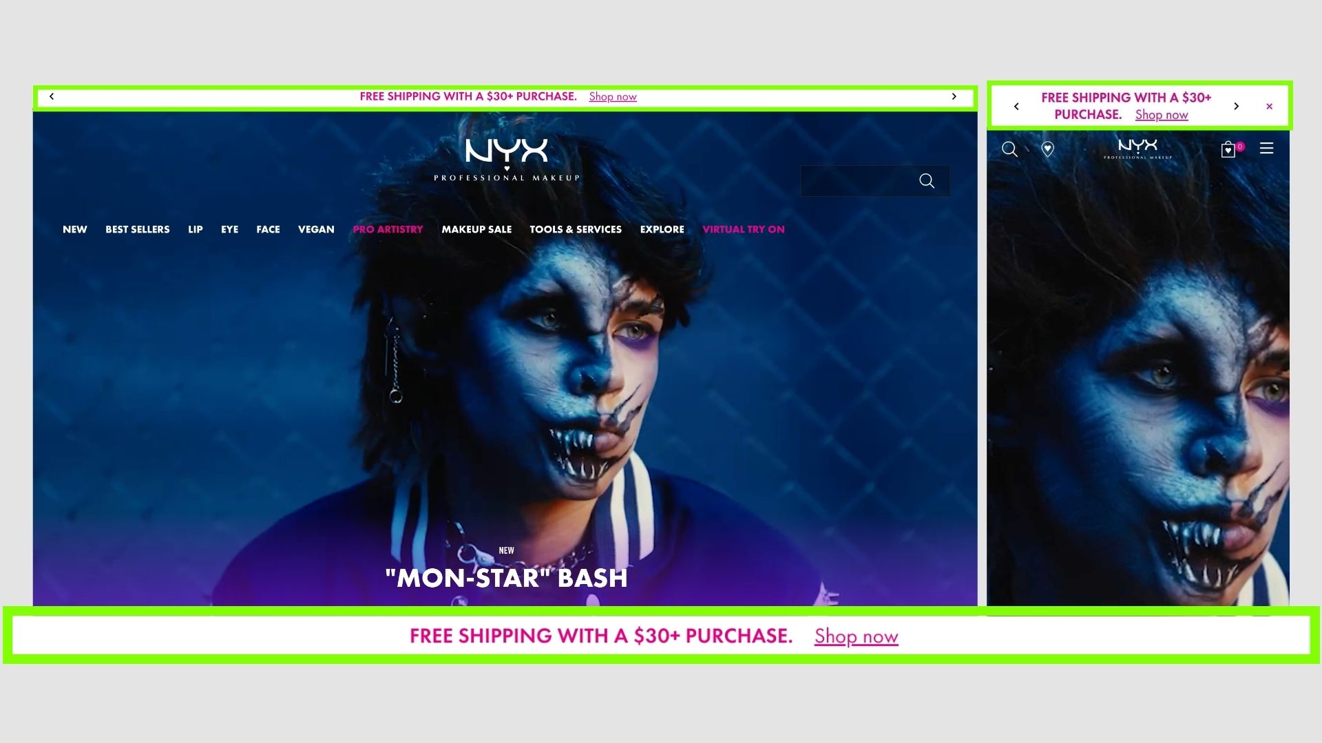
NYX cosmetics
An ok ok, one informing users of the free shipping.
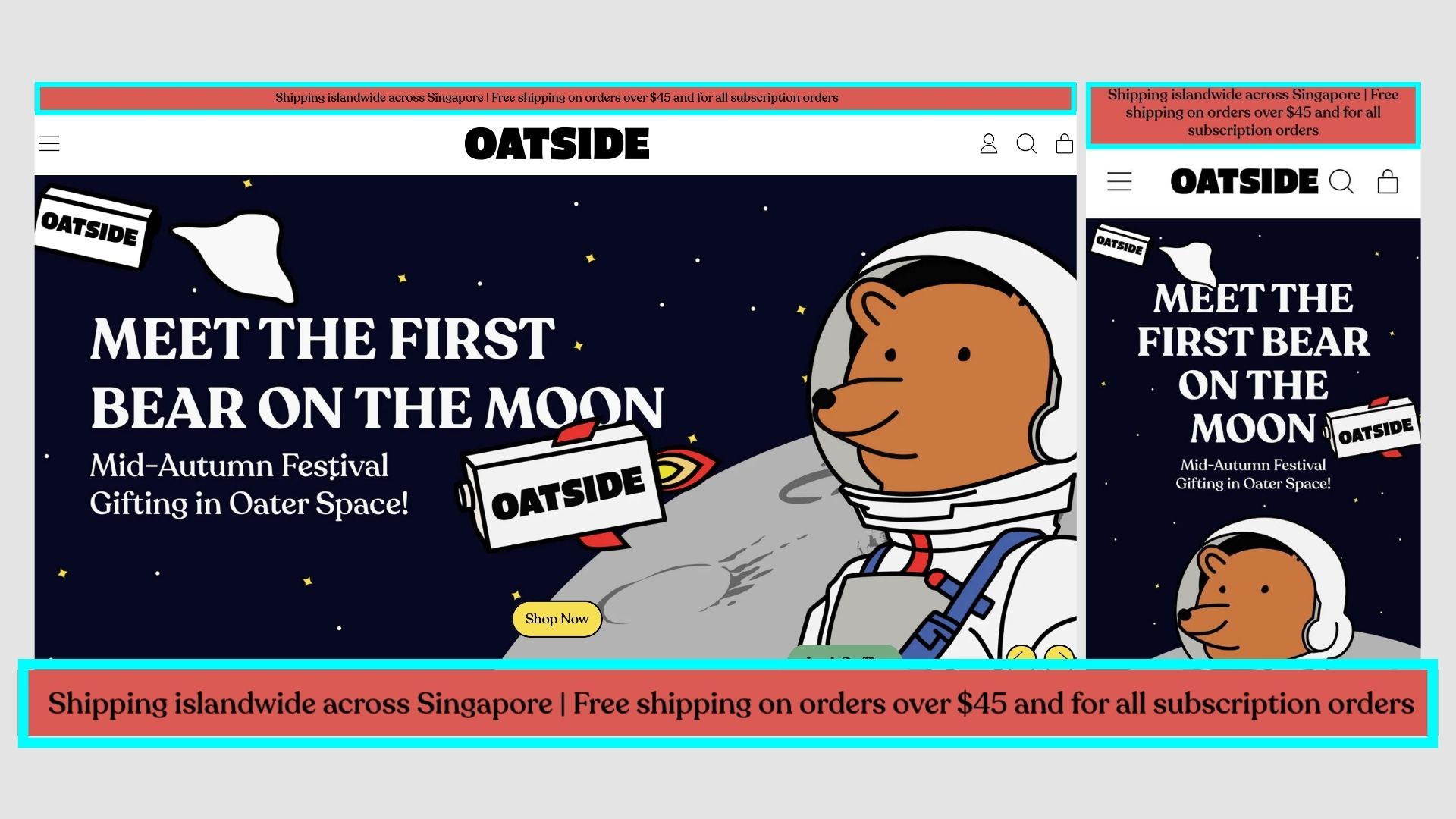
Oatside
A very playful and fun far to align with the brand positioning. Not the best offer, but good design.
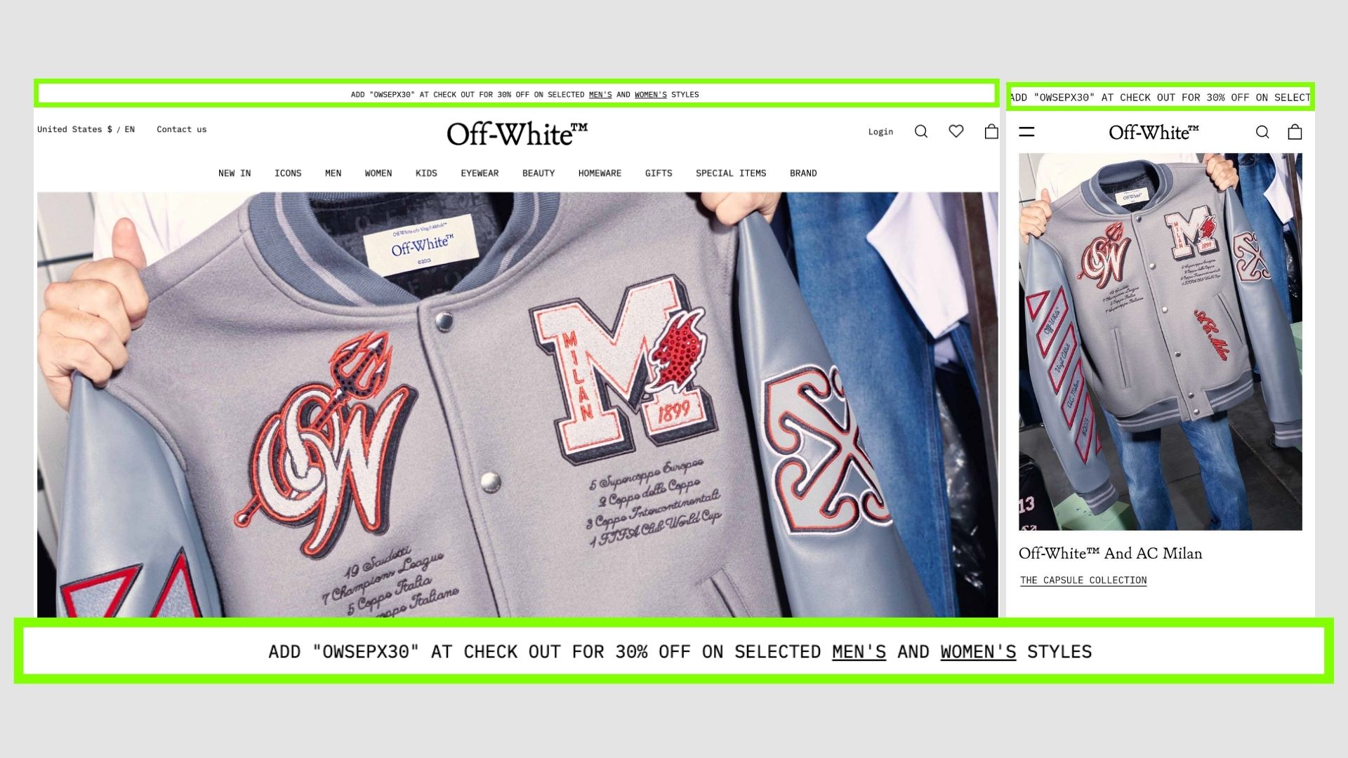
Off White
Again, following brand colour notfying users of the offer.
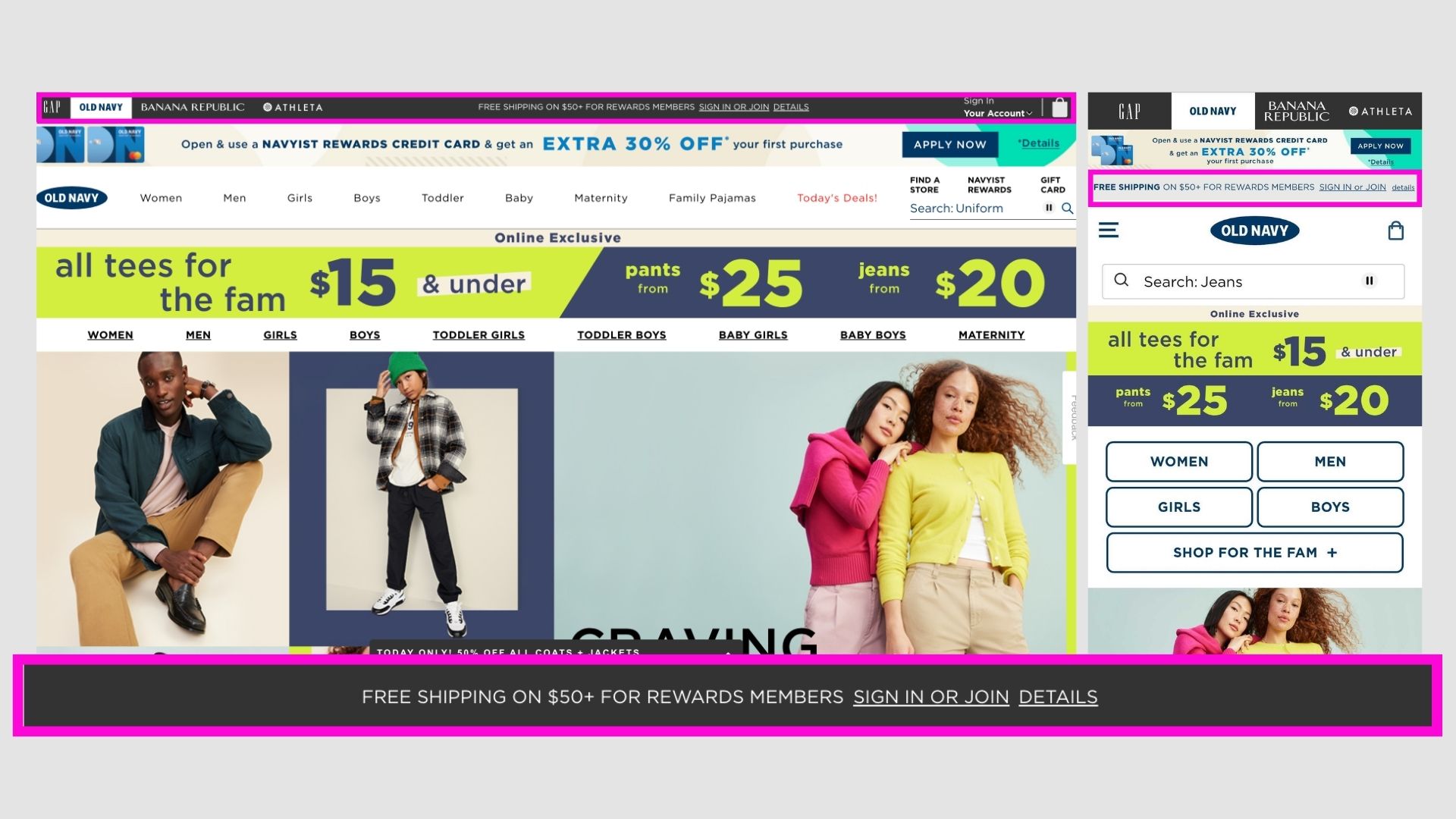
Old Navy
Free shopping banner for members.
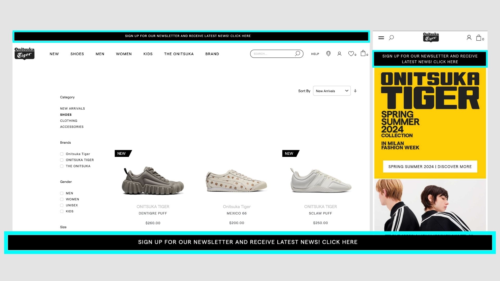
Onitsuka Tiger
Newsletter signup banner in black.
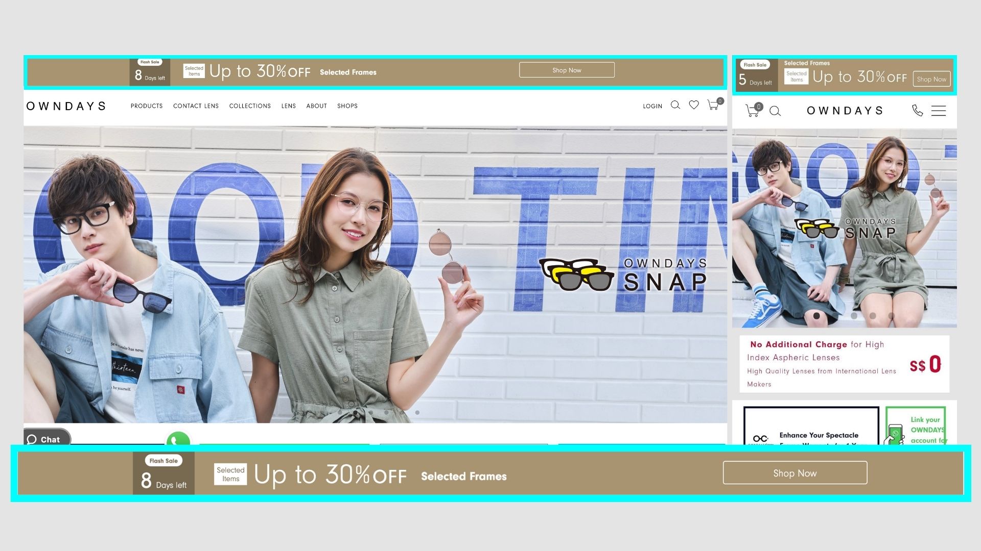
Owndays
Slightly bigger than normal bars, so it strikes out. Big enough on all sizes.