Nike website design analysis
Creating an ecommerce website means considering the website’s overall design, from the aesthetics to navigation and accessibility. These aspects are crucial for providing a seamless shopping experience.
We find a lot of time being wasted (to the tune of months) on trying to get an e-commerce website design inspired by a big brand to come up with a website that looks like a worse copy of the original inspiration. What gets lost in this e-commerce store design project is the need to understand not just how a website looks but also how it works.
Nike.com is known for its strong brand identity and well-designed website, getting ~60 million visitors monthly, as estimated by Ahrefs. We analyze the Nike website to find website design tactics that SMEs can use to build a high-converting website.
Intuitive Navigation
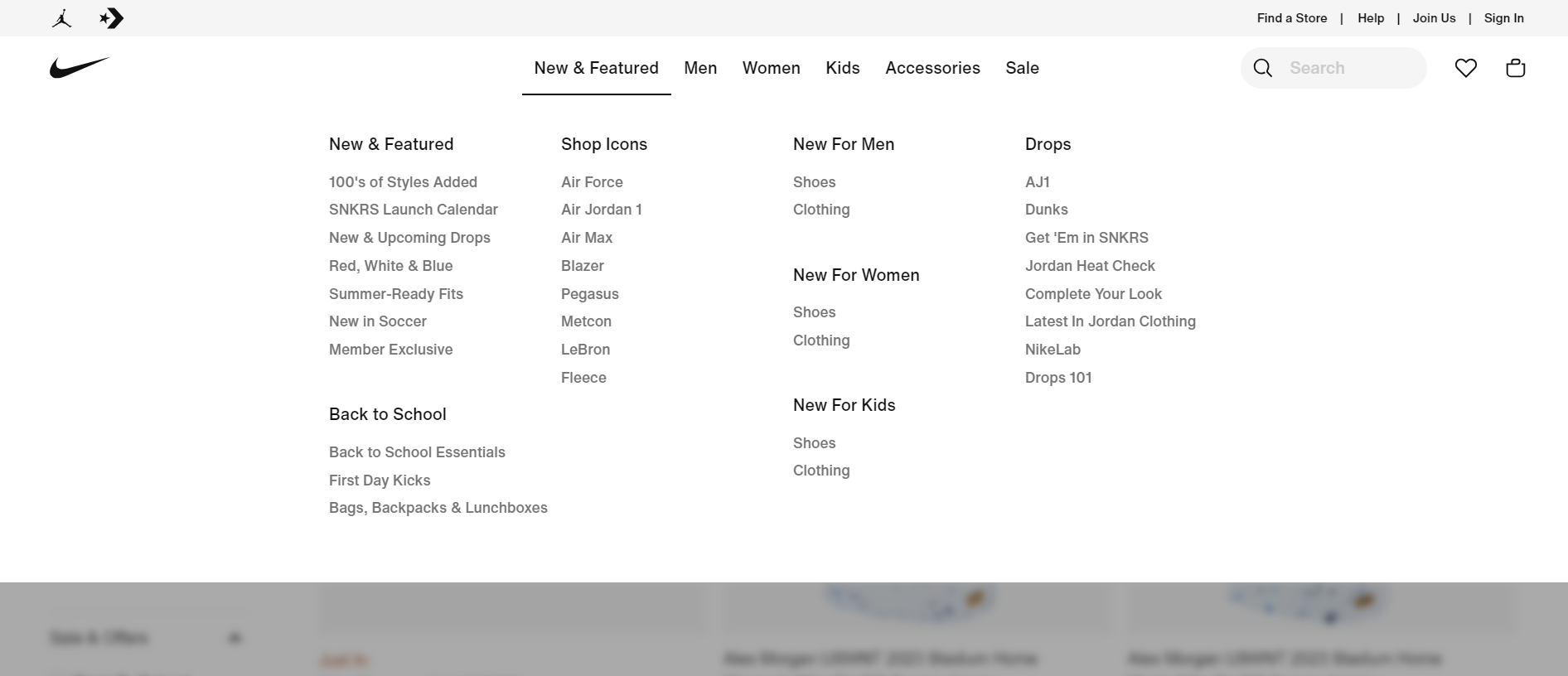
A well-designed website typically has intuitive navigation, making it easy for users to find what they're looking for. Clear menus, search functionality, and well-structured categories can help users navigate the site efficiently.
For an SME website, that means:
- Stick to 4–6 top-level menu items
- Use words your customer actually understands
- Highlight your main product or service
Nike's Typography & Color scheme
Nike has been using Helvetica Neue since its inception in 1957. The company uses the same font across the Nike website for all their marketing materials.
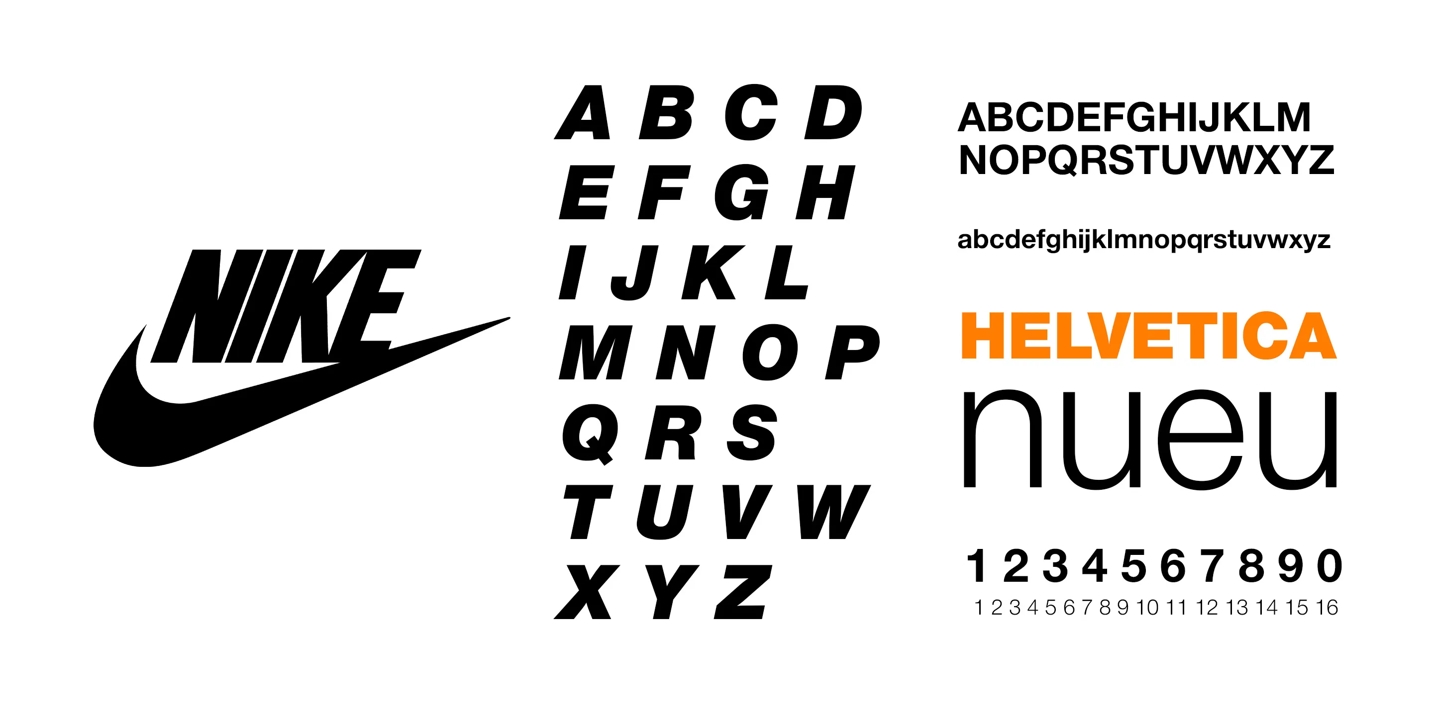
Their website mainly consists of black and grey tones, with a focus on emphasizing products while browsing through it.
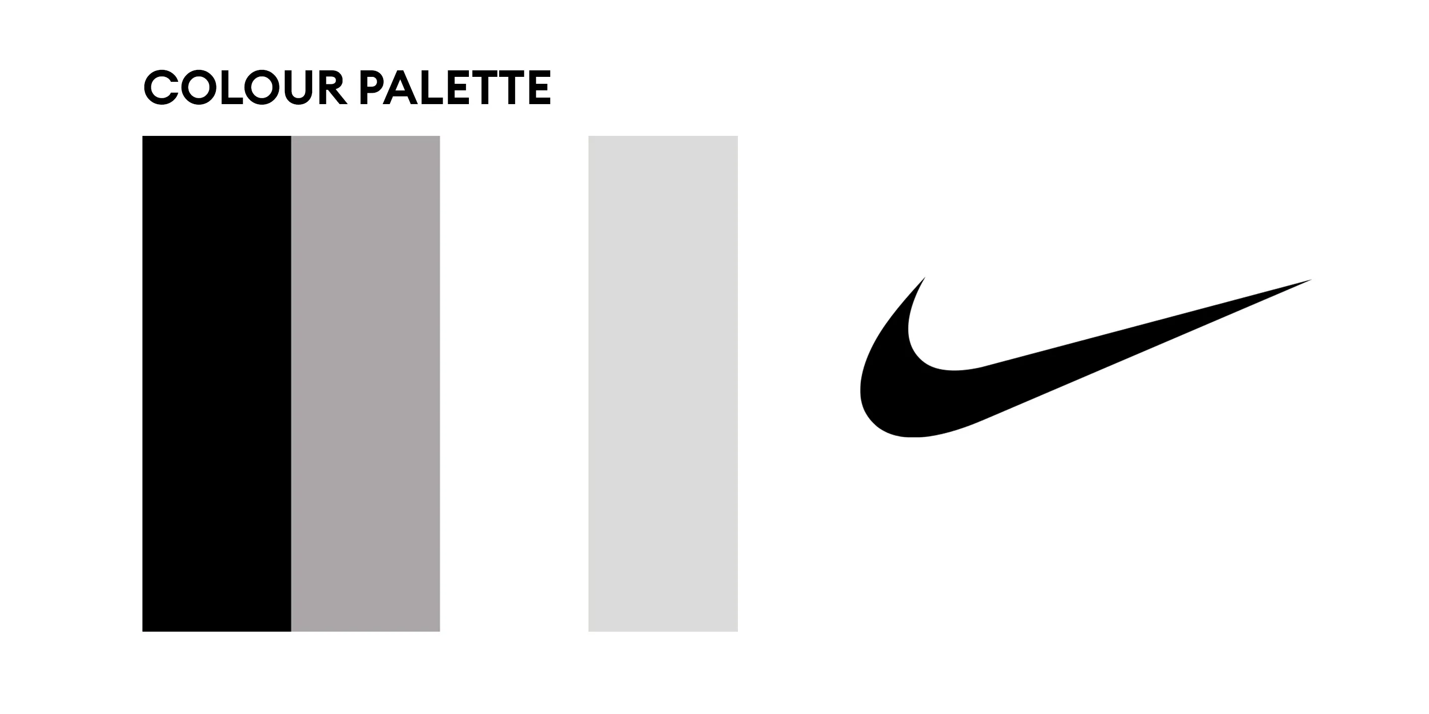
You don’t need a designer to do this — just pick:
- 1–2 fonts you’ll use everywhere
- 2–3 brand colors (text, background, highlight)
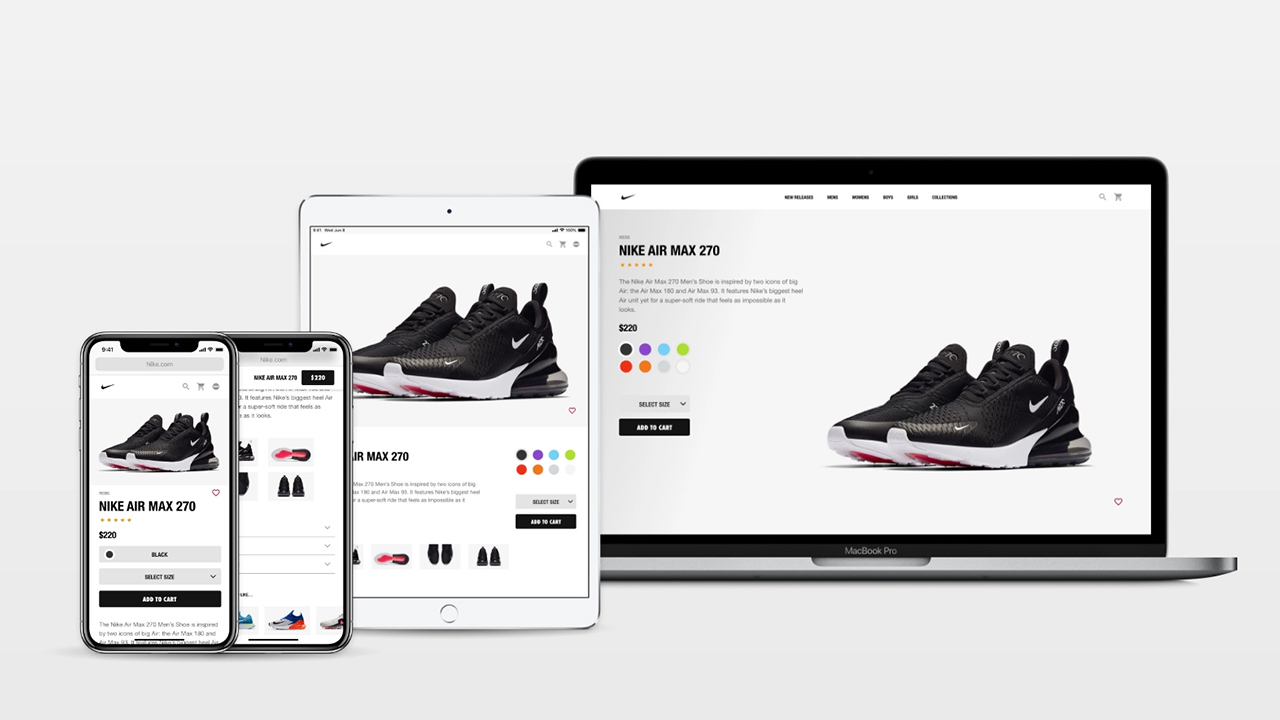
Minimalistic Layout
Clean and minimalistic layouts can help focus attention on the products and content. Effective use of white space, clear navigation menus, and organized content can enhance the overall user experience. Also note how Nike uses a light grey figure background color to make sure the products pop out well.
A clutter-free design puts focus on your product, not on flashy animations or busy backgrounds.
- Use white space
- Use fewer elements per section
- Use large product photos (like Nike does)
Responsive Design
Mobile UI
With the increasing use of mobile devices, it's crucial to have a responsive design that adapts to different screen sizes. This ensures that the website functions well on various devices, providing a seamless experience for users.
As an SME, you can’t afford to lose mobile users. Here’s what to check:
- Do buttons work on smaller screens?
- Is the text readable without zooming?
- Is your popup too big on mobile?
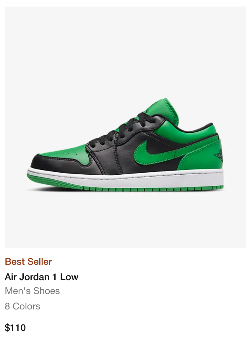
Nike product photographs
One such tactic that caught our eye are the product photographs. For example, let's have a look at this Air Jordan 1 Low 's product photograph. Like any other product photo across the entire website, this shoe's listing too has the shoe in focus due to the light grey background.
A study on visual simplicity showed that clean product backgrounds improve focus and purchase intent.
Not just art but also science
This is not just a pleasant aesthetic, but also has a scientific basis. According to a 2016 paper titled - Visual Complexity and Figure-Background Color Contrast of E-Commerce Websites : Effects on Consumers' Emotional Response, people prefer simple interfaces. Simplicity can significantly influence consumer attitude, consumer attention, and purchase intention and lighter backgrounds with products being featured have a positive impact on conversion rates.
Nike Figure-Background Color
In case you would like to use the Nike figure-background color for product photos on your online store, here is the color code
HEX : #f6f6f6RGB : 246, 246, 246CMYK: 0, 0, 0, 4LAB: 97, 0, 0HSL : 0, 0, 96XYZ: 88, 92, 100LUV: 97, 0, 0HWB: 0, 96, 4
Find a Store
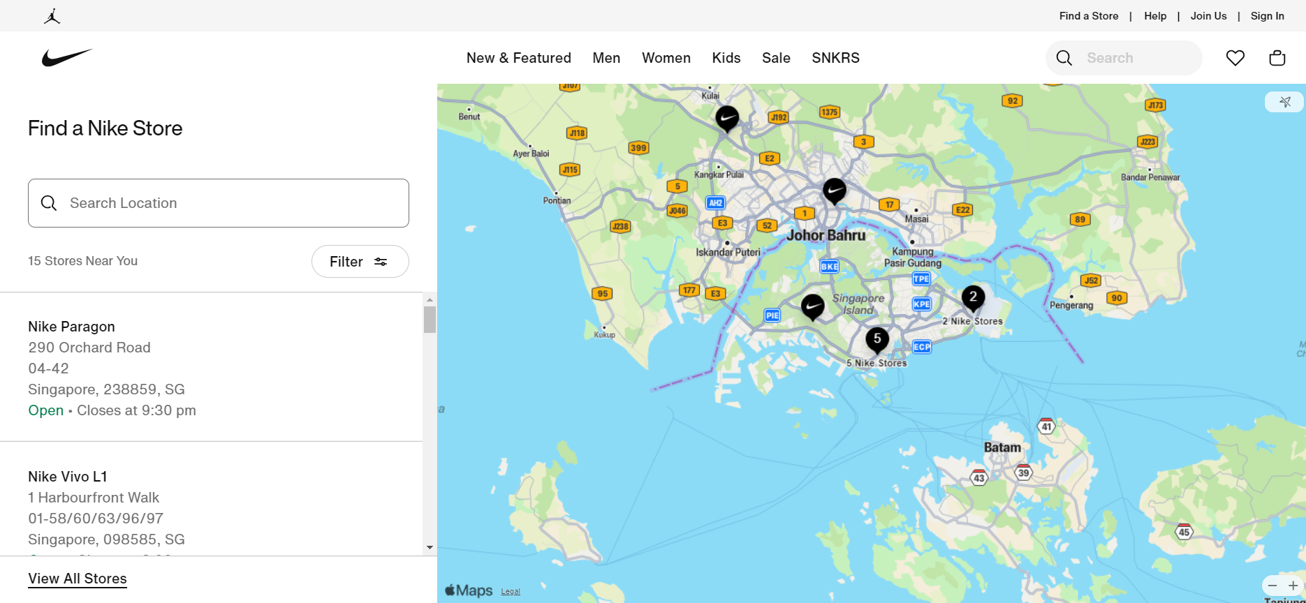
Nike provides a store locator tool that enables users to find nearby Nike retail stores. Users can search based on their location and get information on store hours, contact details, and directions. This fits in well with an omnichannel commerce strategy for brands selling both offline and online, like Nike.
As an SME, especially if you serve a local area, this is huge. Add:
- A “Find us” or “Visit us” section
- Click-to-call or WhatsApp buttons
- Business hours and address (helps with local SEO too)
Nike sale collection
When you think of "How to increase revenue?" as a seller, the first thing that comes to mind is likely running a storewide sale. And yes, that is indeed a good tactic to implement. However, how can you differentiate your online store from the hundreds and thousands of others? See what Nike does:
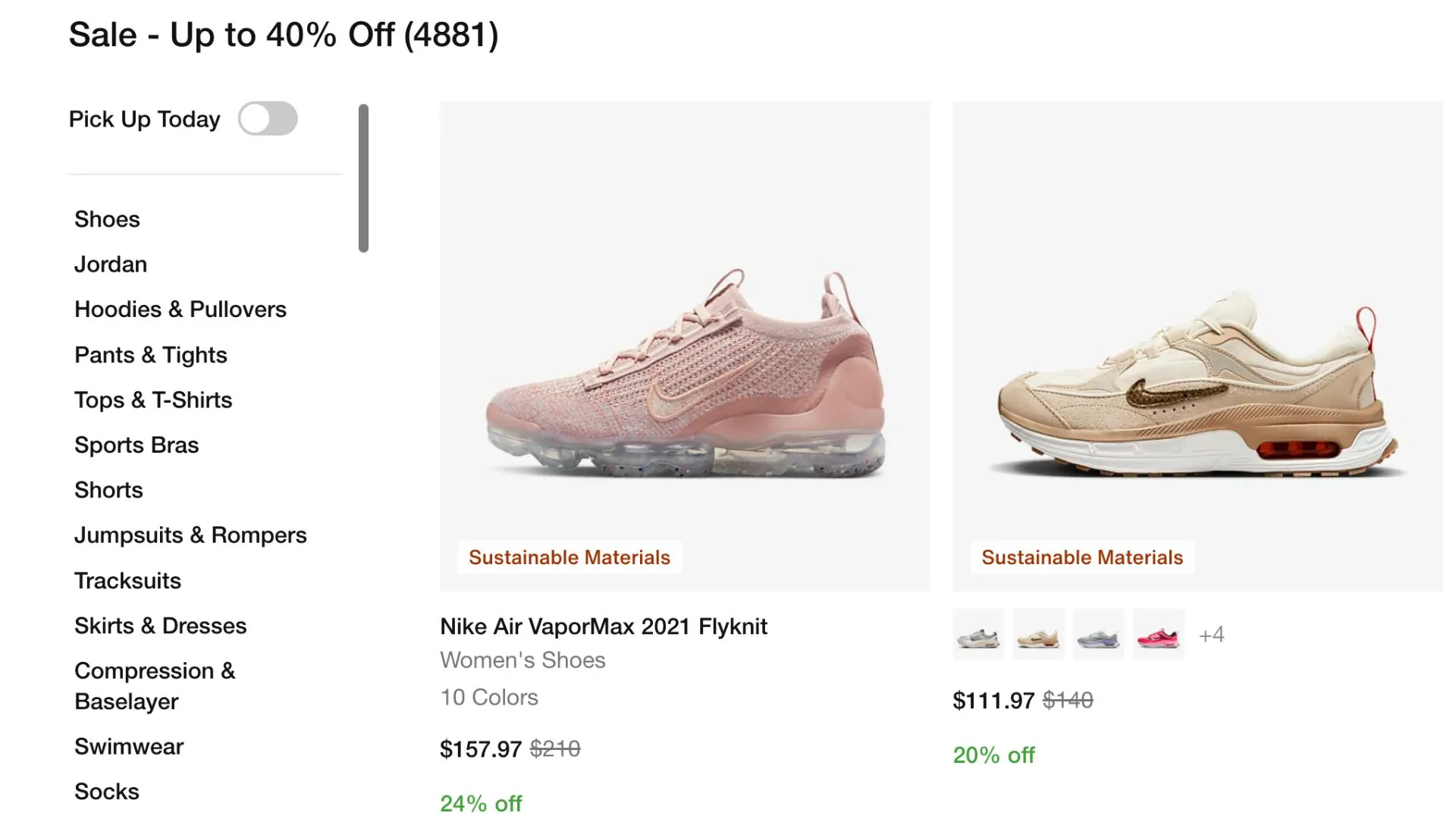
In addition to offering sales with attractive discounts, Nike also groups discounted items together on a dedicated sales collection page on their website. A sale collection improves the browsing experience for customers, especially bargain hunters, as it makes discounted products more visible. This, combined with the discounts, is an effective way to convert initial attention into a long-lasting buying habit among customers who are looking for an easy way to buy discounted apparel.
Nike compare at price tactic
To unload goods that are either now out of season or simply slow-moving and shift to the appropriate holiday selection, Nike promotes sales by adding discounts.
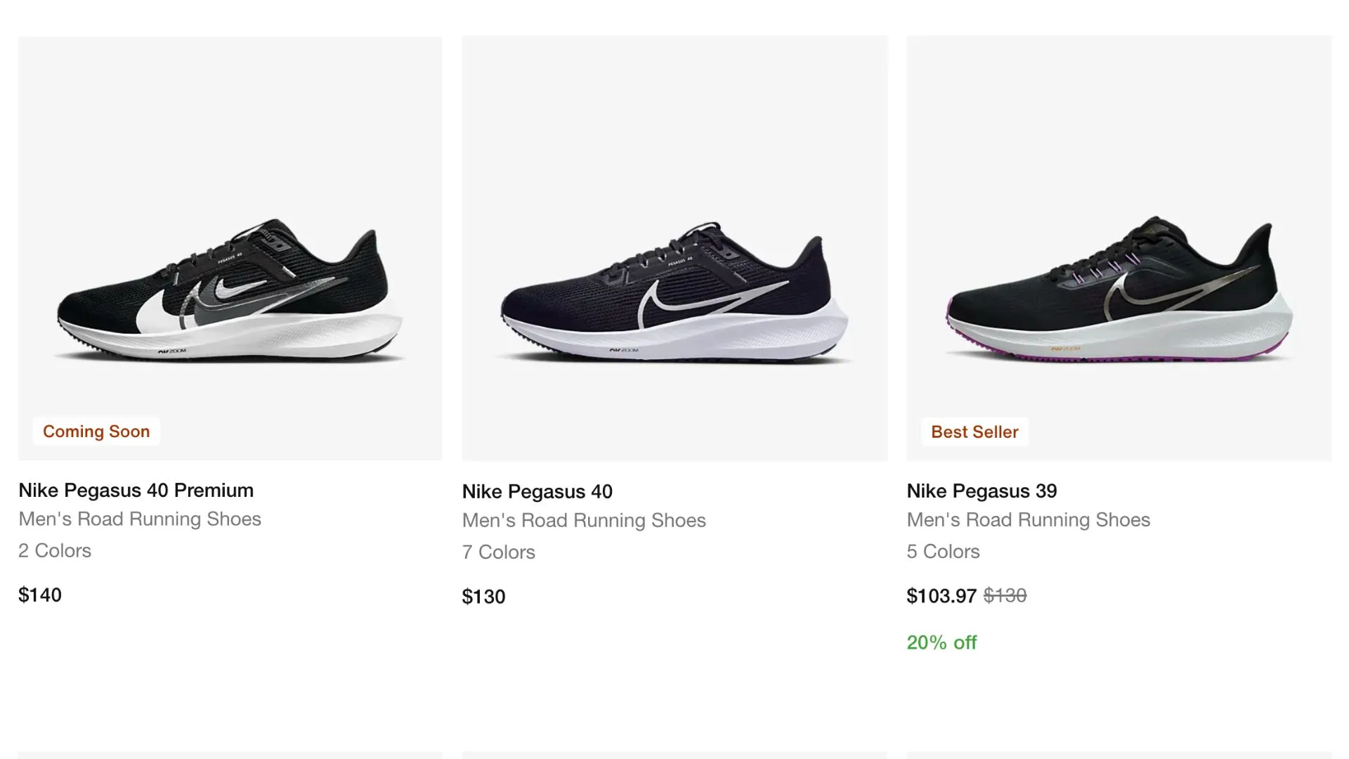
For instance, notice how sports shoes such as the Nike Pegasus with multiple series and variations often have attractive discounts on the older model or less popular colours? That is Nike clearing their deadstocks!
In addition to displaying 'compare at' prices, Nike also utilizes the power of percentages by showing the percentage discount in green on product listings. It is a powerful tool to help convey perceived value.
Power of Percentage
Customers prefer to see the amount they save in percentage terms rather than in dollar terms. Put yourself in their shoes; doesn't the phrase "41% off $58" communicate much more value than "$24 off"? The discount is the same, but the language used to communicate its value makes all the difference.
Exit-intent popups
The right exit-intent popup can help you keep visitors on your site for longer periods of time when visitors decide to bounce, but it can come across as annoying if not done well. When they’re used at the right time, exit intent popups are an effective strategy for increasing conversions.
If you’re using exit popups:
- Keep them short and sweet
- Don’t show them immediately
- Offer something useful (like a discount or checklist)
As seen in the video, Nike waits for a certain period of time after a visitor has browsed their website before showing the exit intent pop up. There are only three things to fill out, and they’ve limited the choices so that visitors can complete it faster with minimal effort.
Don’t Copy Big Brands — Learn From Them
You don’t need a Nike-level budget to apply Nike-level thinking. You can learn about how they did it and create your own version.
Focus on:
- Simple navigation
- Clean, consistent design
- Conversion-boosting tactics like better photos, smart pricing, and helpful popups
And always ask: “Is my website helping a customer take action, or just trying to look pretty?”
At Konigle, we provide you with a AI Digital employee that helps you do all this from website creation, updations and much more.