October 4, 2023
What Makes a Good Website for SMEs?
A website that is optimized for organic traffic, has solid SEO fundamentals, publishes content often, has marketing automation built in, has no agency lock-in and focuses on performance rather than looks is what makes a website good. Konigle is one
What makes a website good ?
What if I told you there was a way to get leads and or sales for your business 24x7 and 365.25 days a year, even when you and your employees were sleeping?
The way to get these leads and sales profitably is to build a website for your business that is optimised for organic traffic. That is, to attract visitors who discover your website from search engines, who may be interested in your product or service. This is what makes a website good.
Essential components for a good website
- Solid Fundamentals
- Clarity
- Optimized CMS
- Marketing Automations
- No agency lock-in
- Performance
- Responsiveness
- Security
- Contact Information
1. Solid fundamentals:
Lots of website builder platforms exist that help you build websites, but few truly excel at making it easy to have solid SEO fundamentals without getting into code.
One example of such a website builder is Konigle. It uses AI (just like ChatGPT) to help make websites technically strong.
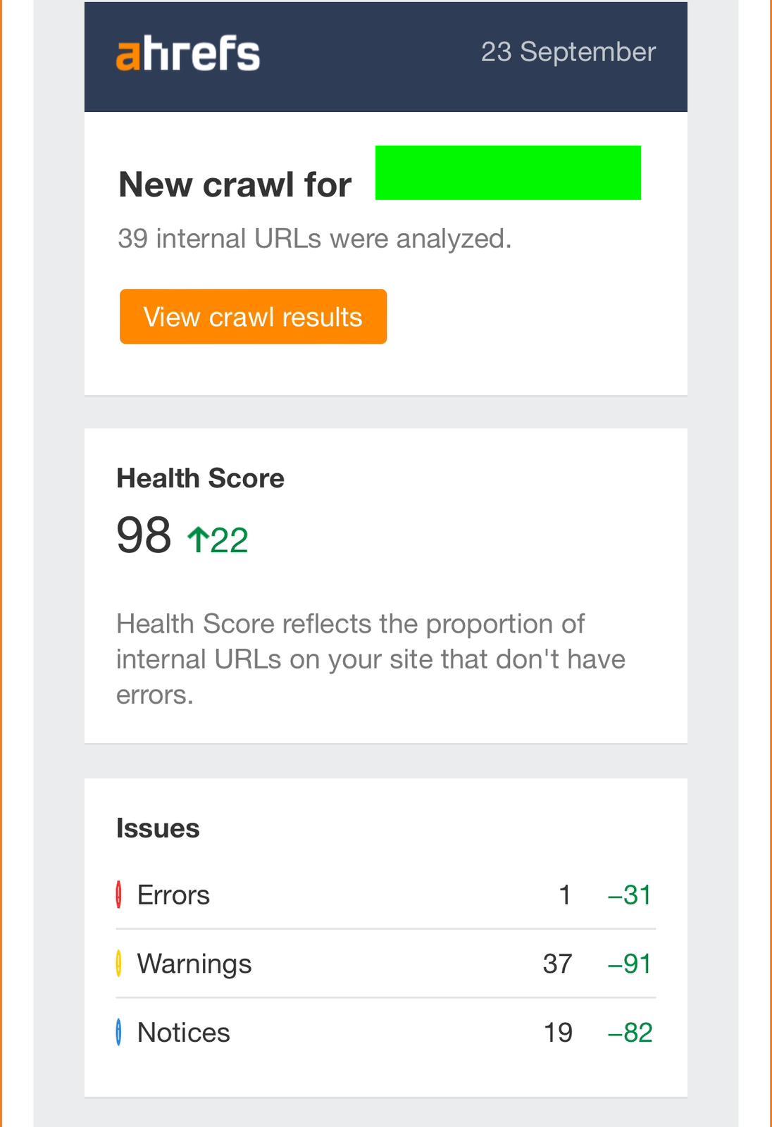
Here’s an example of a website we ported for a company recently. We ran a Site Audit using Ahrefs, the gold standard for SEO software, by just recreating the old website on konigle.com. Previously built on wix.com (another website builder) the website below saw an almost perfect health score and ~30% improvement over wix.com. This is without using additional plugins, or customisations outside of the default template. Konigle websites are SEO optimized by default.
2. Clarity
When someone lands on your homepage, you’ve got about 5 seconds to answer:
- “What does this business do?”
- “Is it for someone like me?”
- “Why should I care?”
Too many SME websites try to sound fancy and end up confusing people. Instead, just be clear. Straight up.
Example:
“We help small businesses in Singapore build better online stores.” vs “We enable transformation through digital solutions that redefine your commerce journey.” ← huh?
3. Optimised CMS
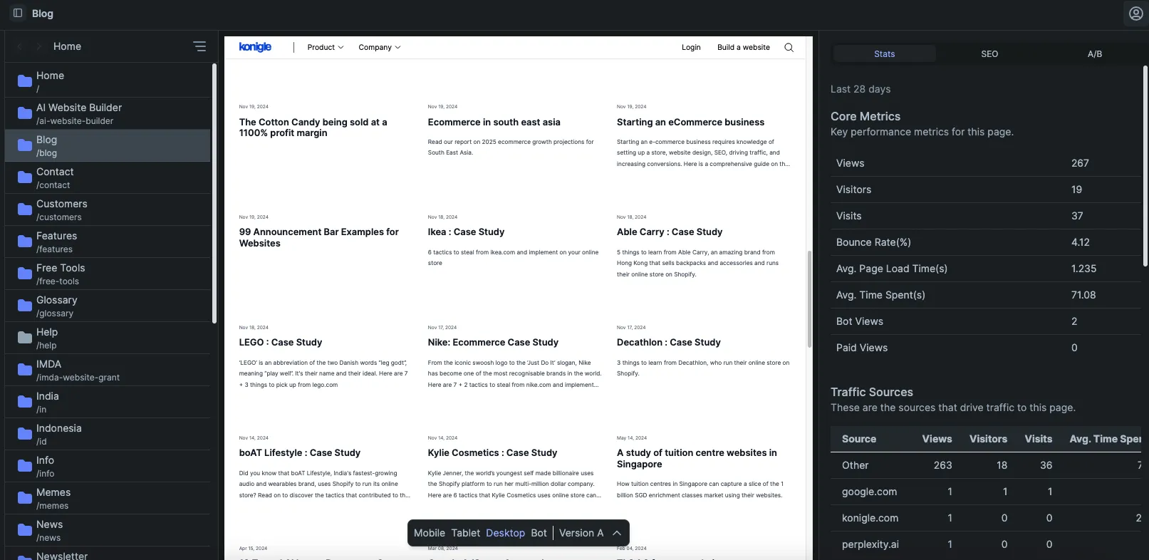
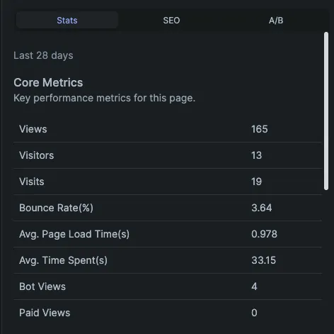
Once the website is built on solid technical foundations, another really important aspect is being able to publish SEO-optimized content often, the bedrock of getting potential customers to your website profitably. Here’s a website that publishes content often and has grown traffic and revenue significantly in 2 years, by publishing often.
4. Marketing Automation built-in:
Tobi Lutke, the founder and CEO of Shopify (a website builder platform for e-commerce), has this to say about making money using the internet.
A website builder optimized for businesses should be able to make it easy for you to collect emails and send newsletters or marketing emails. For example, a website should ask for emails from your website visitors without making it difficult to browse the website. Some examples are exit intent popups, popups that show up after browsing a certain % of a given page, and automation to validate and store these emails. Then, you can create sublists such as by country, ability to pay, device type etc. to target your audience list with different marketing messages.
5. No agency lock-in:
When you use a website builder with no agency lock-in, you have more control over your website's design and content. You can make changes to your website whenever you want, without having to go through an agency. Not only that, you can also save money on website design and maintenance fees. Hence, a website builder should allow:
- Backups - Mistakes happen. If you make mistakes you can easily revert to a working version.
- No need to code - We have seen so many clients come to us helpless and frustrated looking for a developer for a website built in a programming language that nobody wants to use or learn. Hence, the store builder platform should be code-free.
- Easy to port out - Similar to an agency lock-in, we believe there shouldn’t be a lock-in to a website builder platform. Hence, the website builder should allow a simple one-click port to another platform of choice.
6. Performances > Looks:
Here’s the biggest secret of them all. Websites don’t help a business make money by how they look but make money by how they rank in search engines. A website’s search engine ranking depends on:
- Knowing your customer - This is where we start, we help you identify your ideal customer. We talk with you to understand who they are, what they care about.
- Writing and creating content for your customer - We then work with you to create content that your ideal customer may be looking for and would love.
- Website that is easy to use - A lot of times brands make the mistake of spending time and effort trying to build a website that has pretty visual effects, cool transitions and information placed all over the place. This does not work! People are accustomed to expect websites to work in a certain way and get to information fast. That’s what needs to be kept in mind. Look at nike.com or even amazon.com. Function over form, that looks professional.
- Website that is fast - The website should load fast.
We strongly believe that websites should be focused on getting results rather than just how they look. A brand is built through trust, integrity and values conveyed by your high-ranking content rather than how different your website looks.
7. Responsiveness
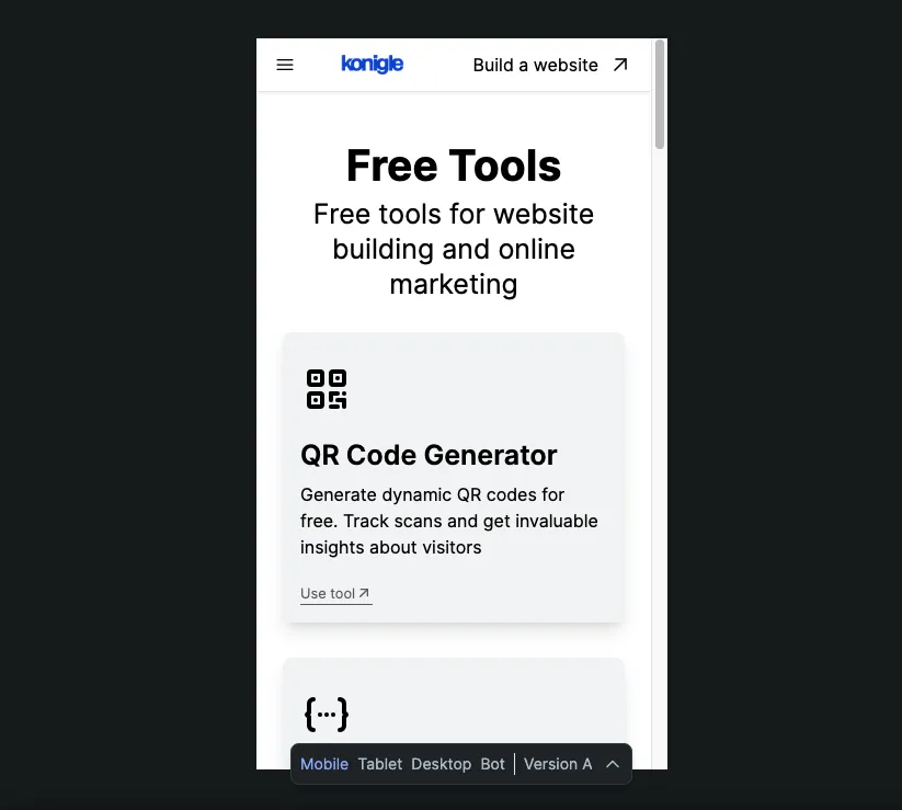
A good website isn’t just about how it looks on a desktop—it must work seamlessly across all screen sizes.
With more than 60% of web traffic coming from mobile devices, having a website that adapts to different screen sizes is essential. If users struggle to navigate your website on their phone or tablet, they’ll leave—and that’s lost business.
A responsive website should:
- Adjust its layout to fit any screen size automatically
- Maintain fast loading times on mobile
- Ensure touch-friendly navigation
Example: Google prioritizes mobile-friendly websites in search rankings. If your site isn’t optimized for mobile, you’re losing both traffic and potential customers.
8. Security
Security isn’t optional. A secure website protects user data and builds trust.
- Use SSL certificates (HTTPS) to encrypt user data
- Implement strong password protection for logins
- Display trust signals like customer reviews, certifications, or secure payment badges
Example: Google flags sites without HTTPS as "Not Secure," which can scare away visitors and hurt SEO.
9. Contact Information
A great website makes it effortless for visitors to reach out, whether they have a question, need support, or want to make a purchase decision very easily with the least possible friction.
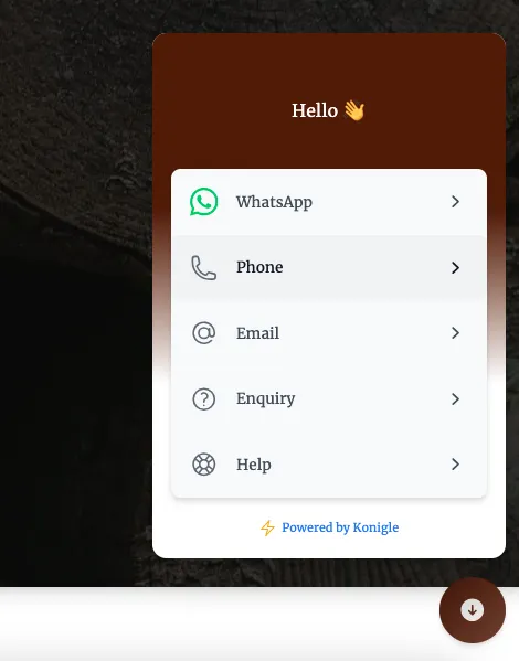
A great example is to think one step ahead by not just creating a contact page, but a floating widget on all pages which has links to all possible contact sources.
This helps to improve engagement and to get more leads from your website.
Konigle Vs Other Website Builders
If you need a marketing website for your business, we have an amazing option for you.
Our expert web designers will create a complete marketing website for your business without you having to lift a finger!
It does not stop here - we offer lifetime support via email, you just sent an email for any changes, and we will sort it out. From design changes to adding content or even marketing, we can help you out!
| OpenCart | Wix | Shopify | Konigle | |
|---|---|---|---|---|
| Ease of getting started | 30 - 50 hours | 25 - 30 hours | 25 - 30 hours | Tim (AI) does it for you. |
| Technically solid | Needs developer intervention | Needs developer intervention | Less developer intervention, need apps (more $$) | No developer intervention needed |
| Easy to publish content often | Complex to publish and optimise content | Complex to publish and optimise content | Not optimised for publishing content, have to pay additional $ to subscribe to apps to make it easier to publish content | Easiest to publish content with their ChatGPT integration and SEO optimisations |
| Marketing Automations | Need developer intervention and other software | Need developer intervention and other software | Need developer intervention and pay for apps | Everything built in to grow and engage your audience |
| No agency lock-in | Need developers, hence agencies, as upgrades to platform could have breaking changes | Need developer optimisations to keep website running smoothly | Less agency lock-in as many agencies are available to take up your website. Though easy port out is not possible, even made difficult | No agency lock-in as can be managed on your own. A 1-click export to major platforms is available, or paid assistance offered to port out. |
| Backups | No backups | Need additional apps | Need additional apps | Automatic backups |
| Security | Self-hosted so need developer assistance | Comparatively more secure | High security | High security |
| Support | Community or agency support | Community or agency support | Email and chat support | Email, chat, and need basis video support |
| Features | Commerce and CMS features | Commerce and CMS features | Commerce and CMS features, with additional features enabled via 3rd party apps | Commerce, CMS, CRM, marketing, and AI integration out of the box. Well-known for smart automation features |
A good website is just the start.
If you’ve read this far, you already know that a great website needs speed, clarity, SEO, and regular updates.
That’s exactly what Tim, our AI employee, helps with. But he doesn’t stop there.
Tim can also:
✅ Improves your SEO
✅ Sends email campaigns
✅ Updates products, banners & content
✅ Tracks what’s working — and fixes what’s not
And you don’t need to log in anywhere. Just email him like you would do to an employee and it would be done.

