Do you recall the dial-up days? The ear-splitting sound of your computer as it connected to the exciting and untamed world of the internet? Oh, those were thrilling times, with us being pioneers on a virtual adventure.
But, what about the websites themselves? The brave ones that paved the way for the internet titans we're familiar with today?
Strap in, my friend, because we're about to embark on a fun nostalgia trip to explore how some of your beloved sites looked in their very first versions.
1. Google: From Academia to Alphabet Soup
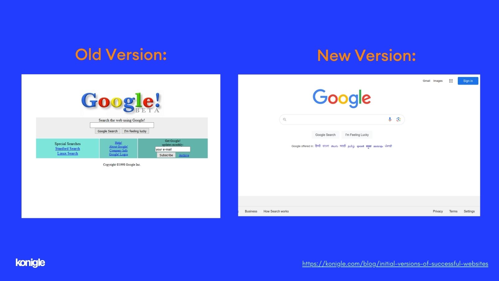
Everyone is familiar with Google's minimalist homepage today, featuring a stark white background and a simple search bar.
However, back in 1998, the design was a bit more daring. The layout featured a white background, a bulky name occupying most of the screen, and numerous text links.
Though it wasn't particularly user-friendly, it served its purpose effectively. Interestingly, the search results page hasn't changed much since then, demonstrating Google's consistent core strength from the outset.
2. Amazon: From Niche Bookstore to Retail Giant
Amazon, now known as the "everything store", began in 1995 with a much more focused vision: selling books online.
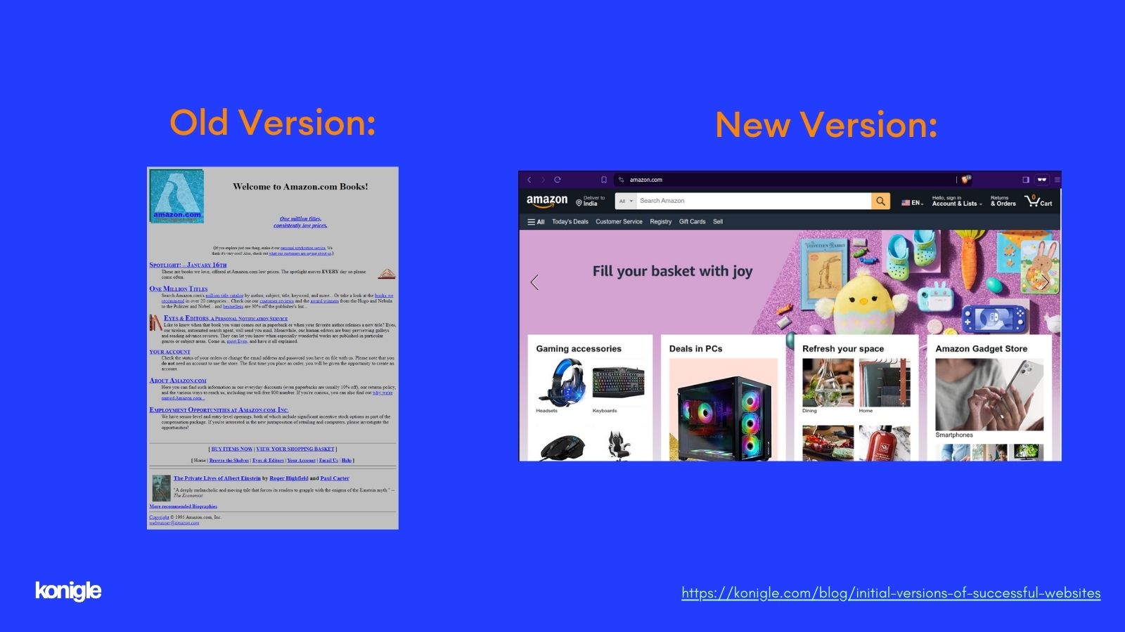
Their initial website was vastly different from the sleek, product-driven interface we're familiar with today.
Imagine a page filled with text, featuring just a simple logo and a title. There were no fancy product images or customer reviews at that time.
Despite its rudimentary design, Amazon's emphasis on user-friendliness (remember one-click ordering?) laid the groundwork for its future dominance.
3. Yahoo: The Original Guide to the Web
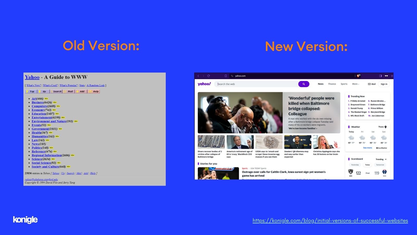
Before Google became dominant, Yahoo! was the go-to search engine. Established in 1994, their website served as a portal to the entire internet, featuring a directory of websites categorized by topic.
It functioned much like a colossal, digital library card catalog. Despite its basic, text-heavy design, it provided a valuable service in the web's early days when navigating the vast online world was daunting.
Yahoo also included engaging extras like news headlines and stats, establishing itself as a comprehensive source of information.
4. eBay: Auction Action in the Wild West
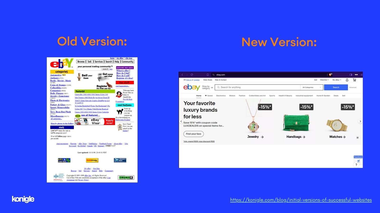
Launched in 1995, eBay, an online marketplace for a wide range of items, began with a website that seemed like it was built in someone's basement.
It was a combination of text and low-resolution images showcasing auction items, devoid of detailed product descriptions or user reviews.
Despite its simple design, eBay tapped into the public's interest in a virtual garage sale, fostering a community of buyers and sellers that remains active today.
5. Konigle: Powerhouse of Websites
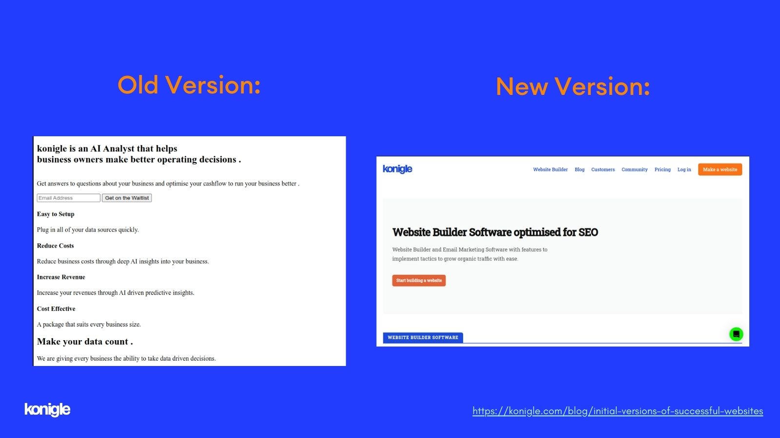
In the early days, Konigle was an AI analyst that helped business owners increase their revenue. The initial version of the website was text-based with a search bar.
Today, Konigle is a highly successful website builder. It helps businesses create outstanding websites that attract customer attention and generate significant revenue.
6. Social Media Takes Flight: The Early Birds of Twitter and Facebook
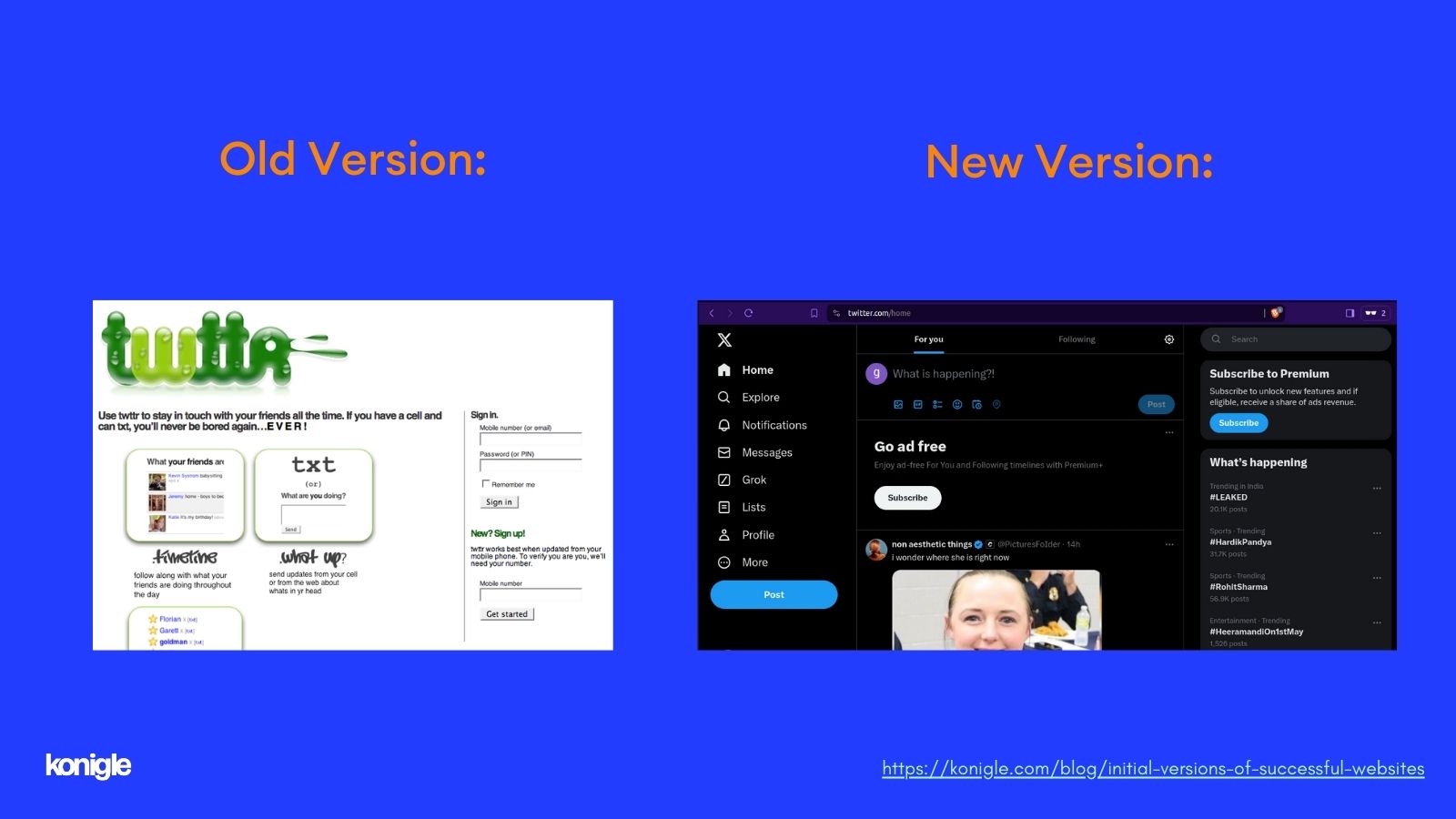
Fast forward to the early 2000s when social media began to gain traction. Twitter, launched in 2006, initially had a simpler interface than what we see today.
It was basic, featuring green and white colors, with a focus on the 140-character limit. While it didn't have the advanced features of today's Twitter, it encapsulated the concept of quick, bite-sized communication.
As you may be aware, the social media platform Twitter has recently come under the ownership of the influential entrepreneur Elon Musk. Under Musk's leadership, this popular platform has undergone a significant transformation and has been rebranded as "X".
This change reflects a new direction for Twitter, one that promises to bring an innovative approach to social media communication.
So, as we proceed, it will be interesting to see the new direction Musk's leadership brings to the platform now known as X.
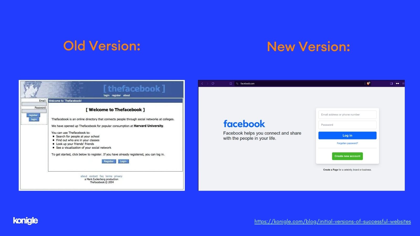
Launched in 2004 from Harvard University dorms, Facebook started as a simple online directory before evolving into the social media giant it is today.
Initially, profiles were text-heavy with limited customization options.
Interestingly, Facebook's initial target was college students, a strategy that eventually expanded to encompass the entire world.
Now, let's bring you back to the present! While reminiscing can be enjoyable, it's crucial to remember the most important aspects of running a successful website:
- Get Traffic: Draw visitors to your website using strategies such as search engine optimization (SEO) or social media marketing.
- Engage Your Email List: Build an email list and foster relationships with your subscribers.
Why revisit these early website designs? Because it's a reminder that even the largest tech giants started somewhere. They didn't begin with sleek interfaces and complex algorithms. They evolved, adapting to user needs and technological progress. Here are some key takeaways for current website owners:
- Focus on the Core: The early versions of websites like Amazon, Yahoo!, and Google were successful because they honed in on a core value proposition. Amazon simplified online book purchases, Yahoo! facilitated web navigation, and Google specialized in search. Identify your website's unique aspect and build on that strength.
- Content is King (or Queen): Even in the nascent stages of the internet, content was key. Despite the lack of visual appeal in early websites, they provided valuable content, be it product listings, blogs, search results, or news headlines. Prioritize creating high-quality content that connects with your target audience.
- Simplicity is Key: The early websites weren't cluttered with ads or flashy animations. Their focus was to provide a clear and user-friendly experience.
The Flip Side: The Importance of Keeping Up. Although the simplicity and core focus of early websites were crucial, they also serve as a cautionary tale. The internet landscape evolves rapidly, and strategies that were effective in 1998 may not work in 2024. Here's why staying up-to-date is essential:
- User Experience (UX) Matters: Today's users demand a seamless, intuitive experience. Clumsy interfaces and prolonged loading times are unacceptable. Invest in user-friendly design to guarantee your website operates seamlessly across all devices.
- Mobile First: The internet is no longer limited to desktops. With increasing numbers of users accessing websites from their phones and tablets, mobile-responsive design has become essential, not optional.
- Embrace New Technologies: The internet is an ever-evolving landscape with emerging technologies (Artificial intelligence) and trends. Be open to integrating elements such as voice search optimization or chatbots to improve your website's functionality and user experience.
Looking Ahead: Inspiration for Your Website
While these early website designs may seem comical compared to today's sleek interfaces, they underscore the importance of focusing on the core user experience. As you build or redesign your website, draw inspiration from these early pioneers:
- Prioritize User Experience: Ensure your website is user-friendly and information is easy to find.
- Focus on Valuable Content: Provide content that addresses your audience's concerns or entertains them.
- Keep It Simple (But Not Boring): Maintain a clean, well-organized layout.
So, the next time you're brainstorming website ideas, remember that sometimes the simplest solutions are the best. Who knows, your website might be the next big thing featured in a future edition of Wayback Wednesdays!
In today's competitive environment, creating a successful website requires more than just an attractive domain name. konigle, your all-in-one solution for digital needs, offers an extensive range of tools and services to create a visually appealing website that drives results.
Here's how Königle can contribute to your website's success:
- User-Friendly Design: Konigle web builder helps to create websites that are visually appealing, intuitive to navigate, and optimized for mobile devices.
- Content is King: We understand the power of compelling content. Konigle's content creation tools (Essentially, you can generate all your content using the AI within the Konigle admin interface) can help you develop high-quality content that engages your target audience and positions you as an authority in your field.
- SEO Powerhouse: Having trouble getting noticed in search results? Konigle's SEO optimize sections can assist you in optimizing your website for search engines. This will increase your visibility and drive organic traffic.
- Stay Ahead of the Curve: The digital world is rapidly evolving. Konigle keeps you updated with the latest trends and components to ensure your website remains competitive and relevant.
Ready to transition your website from a pixelated past to a potent present? Contact Konigle today for a free consultation. Let's discuss how we can help you build a website that stands out and meets your online goals. Alternatively, you can sign in.
Reflecting on early website designs is not only nostalgic but also offers valuable insights for current website owners. Focus on the most crucial aspect - delivering value to your users through clear, informative content and a user-friendly experience.
Nevertheless, don't become complacent. The internet is a dynamic environment, and staying updated with the latest trends and technologies is essential to keep your website relevant and flourishing in the constantly evolving digital world.