November 19, 2024
How to make your own website to sell things?
This blog is about how you can build a website to sell something in less than 2 hours without needing to engage a designer, marketer, or web developer.
Starting an eCommerce business requires knowledge of setting up a store, website design, SEO, driving traffic, and increasing conversions. Here is a roadmap that outlines five critical aspects to consider when launching your online store.
Topics covered:
Setting up an eCommerce store
The first step in starting an eCommerce business is planning and setting up the online store.
1. Store Domain Name
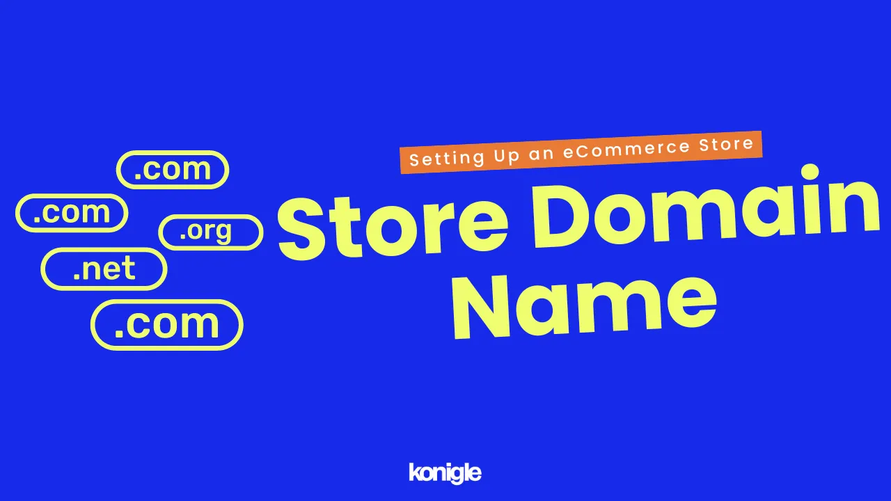
A store domain name is the "internet address" of your online store and is one of the first things that people see when they come across your eCommerce website.
Why is it important to have a strong domain name?
- Build a stronger brand presence when people are able to easily remember and find your store.
- Rank higher on SERPs as search engines like Google use domain names as one of their ranking factors. This can then lead to more traffic and boost sales.
- Gain trust and credibility with your customers
- Open up new selling opportunities. For example, selling the domain name in the future.
How to choose a good domain name?
- Your domain name should contain relevant keywords to the products and/or services you sell. This will increase the chances of people discovering your store when they perform a search of the product and/or service you offer.
- Choose a concise and memorable domain name without hyphens or numbers that is easily remembered and not commonly misspelled.
- Check the availability of the domain name at a domain registrar like Cloudflare or NameCheap before finalizing.
2. Store set up
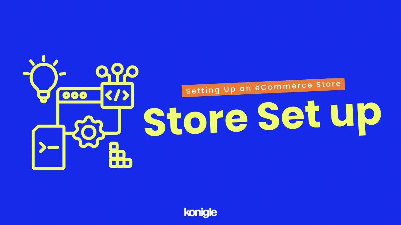
Now that you have found your store niche and domain name, the next step is to set up a website for your online store. Take some time to plan out the structure of your website; this will help you to avoid making mistakes and save time in the long run.
What are the steps involved to set up your website?
- Choose a reliable web hosting provider that can guarantee uptime, speed, and security. Web hosting is the service that stores your website's files and makes them accessible to visitors.
- Create a landing page design for your website that can create a positive user experience and establish brand identity. A zero-code AI website builder is a great starting point for people without any coding knowledge.
- Plan the content for your website. It should be high-quality and informative enough to be able to attract traffic organically and encourage visitors to engage and return. Text, images, videos, and other media are recommended.
- Once your website is live, promote it so that it is discoverable. There are many different ways to promote your website, such as search engine optimization (SEO), social media marketing, and email marketing. Track your results to see what's working and what's not.
3. Store Pages
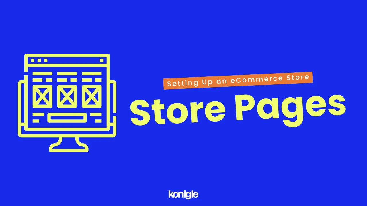
What are store website pages?
Store pages are the first point of contact for customers interested in buying products or services, providing them with information such as price, specifications, features, and policies.
Why are website pages important?
Store website pages help your customers make informed purchasing decisions with detailed product information. This also sends a signal to your customers that you care about their needs.
Aside from displaying and selling products, website pages also give you the opportunity to share information about your company, telling customers about your mission statement and values.
Types of webpages:
- The homepage is the first page that visitors see when they come to your website. It should include a clear call to action (CTA), such as "shop now" or "learn more" about your business.
- Collection pages group products based on a specified category. They are useful for customers who know what they are looking for and want to find it quickly.
- Product pages offer detailed information about the product you're selling, including its features, price, and availability.
- Search Results pages display the results of a customer's search query, helping them find products even if they don't know the exact name or category. They are crucial for improving the overall customer experience and making it easier for customers to find what they are looking for.
- The cart page is where customers add products to their shopping cart and proceed to checkout. It is important to make sure that the cart page has a good user interface so that customers can easily complete their purchases.
- The checkout page is where customers enter their billing and shipping information to complete their purchase. Make sure that the checkout page is secure and easy to use so that customers do not drop off.
In addition to these pages, there are other essential website pages that can be helpful for eCommerce stores, such as:
- An About Us page that provides information about your company, such as its history, mission, and values.
- A Contact Us page that provides customers with a way to contact you with any questions or concerns they may have.
- A Shipping Policy page that provides details about your shipping policies, including shipping costs, estimated delivery times, and return policy.
- An FAQ page that provides answers to frequently asked questions about your products or services.
Best Practices for Creating Store Pages
You can easily create a homepage with the help of A.I. and import your products in bulk by simply uploading a file on Konigle. This means that you can save time and effort that would have been spent on creating each element manually for your website.
4. Trust Badges
Trust badges are small icons or symbols that are often used by eCommerce websites. They are usually displayed on the footer of websites to reassure visitors that the website is legitimate and the types of payment methods accepted.
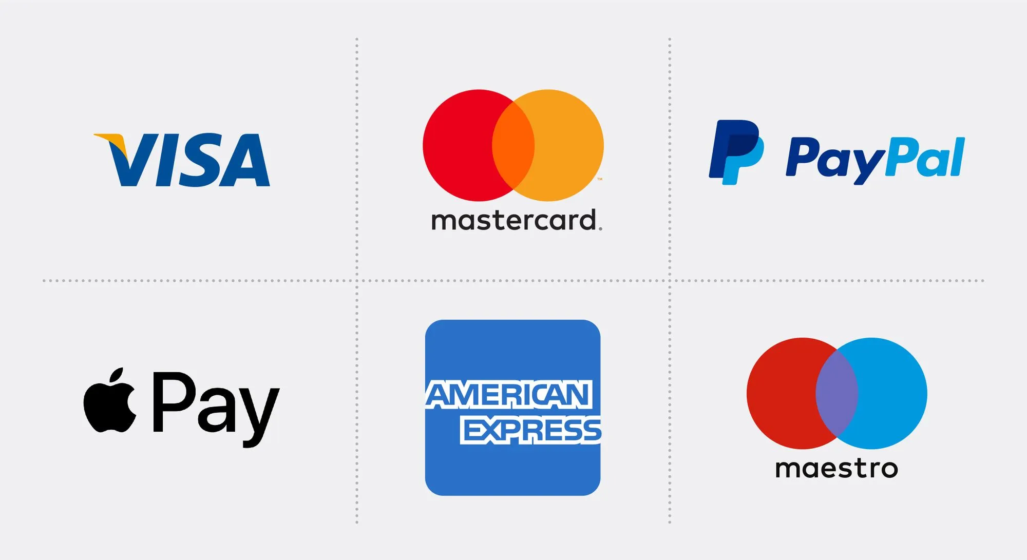
Why are trust badges important?
- In eCommerce, there is always the potential for fraud. Trust badges can help build trust and credibility by reassuring shoppers that your website is legitimate and that their personal and financial information is safe
- Trust badges can help to reduce cart abandonment by giving shoppers the confidence that they can complete their purchase securely.
- Search engines take into account factors such as trust and security when ranking websites. Trust badges can signal to search engines that your website is safe and reliable, which can improve your SERP ranking.
Here are some of the most common trust badges that you can use on your website:
- SSL certificate: is a security certificate that encrypts the data that is transmitted between your website and your shoppers' browsers. This helps to protect their personal and financial information from being intercepted.
- Fraud protection indicates that your website uses fraud prevention measures to protect shoppers from fraudulent transactions.
- Money-back guarantee assures shoppers that they can get their money back if they are not satisfied with their purchase. This can help to reduce buyer's remorse and encourage shoppers to make a purchase.
5. Import Products
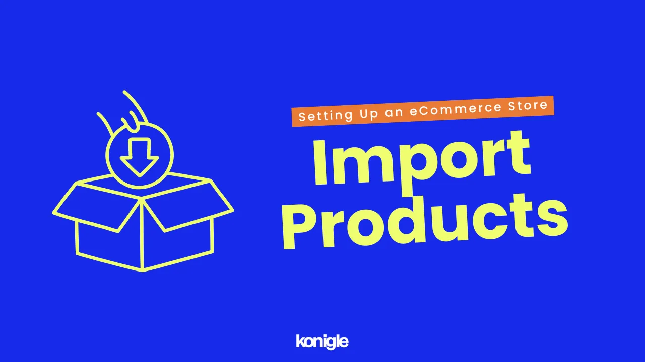
For the final step in setting up an eCommerce website, add products to your CMS and create product listings on your website. It can be a chore to add products manually, especially if you have an extensive catalog. Hence, the ability to import products in bulk is essential.
E-commerce website design
Website design in eCommerce refers to the process of creating a website that is visually appealing and functional so that it can help to build brand identity, attract more customers, and increase sales.
1. eCommerce website logo
A good logo is not just a mere visual representation of your brand; it is a key component of your business that can help you stand out. By leaving a lasting impression with your customers, it can lead to increased sales and revenue.
Why is it important to have a good logo design in eCommerce?
- Being the first thing that potential customers see, it's important that your logo be memorable and unique. This helps customers to recognize your brand and keep it in consideration when they are making a purchase. For example, the Apple logo is a simple yet iconic design that is instantly recognizable.

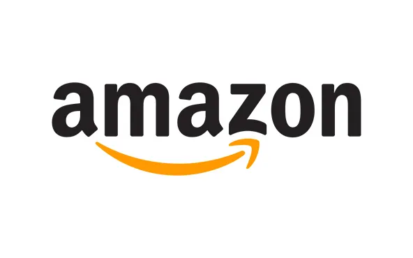
- Given that the eCommerce market is saturated, a well-designed logo can help you differentiate from your competitors by creating a visual identity that is unique to your brand. The Amazon logo has a simple arrow that represents the company's commitment to customer service and their vast selection of products, as it starts at the letter "A" and ends at the letter "Z.”
How to create a good logo for your website?
- A good logo should be simple and easy to remember. Avoid using too many colors, fonts, or complex shapes, as it may make it harder to remember.
- Your logo should be of some relevance to your brand. Consider your brand's mission, vision, and target audience when designing your logo.
- Your logo should be versatile and adaptable to various contexts, such as on your website, favicon, social media, and marketing materials.
- A good logo should stand the test of time. Avoid using trendy design elements that will look outdated in a few years.
2. Effective Typography
Typography in web design is the art and technique of arranging type on a website. It involves the selection of typefaces, point size, leading, kerning, color, and any other element that can affect the appearance of text.
The goal of good typography in web design is to create a visually appealing and easy-to-read experience for users. This means choosing typefaces that are legible and contextually appropriate, using a consistent style throughout the website, and ensuring that the text is properly spaced and aligned.
Here are some key factors to consider when designing typography for a website:
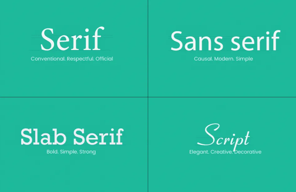
- Typeface is the most important element of typography. Each typeface has its own unique personality and style; hence, it is important to consider the overall look and feel of the website, as well as the purpose of the text. For example, a sans serif typeface is often used for body text because it is easy to read, while a serif typeface is often used for headlines because it is more formal and elegant.
- Point size refers to the size of the letters. It should be chosen such that the text is easy to read but not too big that it is jarring. A good rule of thumb is to use a point size of 16 or 18 for body text.

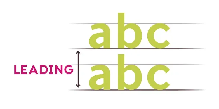
- Leading is the space between lines of text. The leading should be enough to separate the lines of text, but not so much that it makes the text look too spaced out. A good guideline is to use a leading that is equal to the point size of the text.
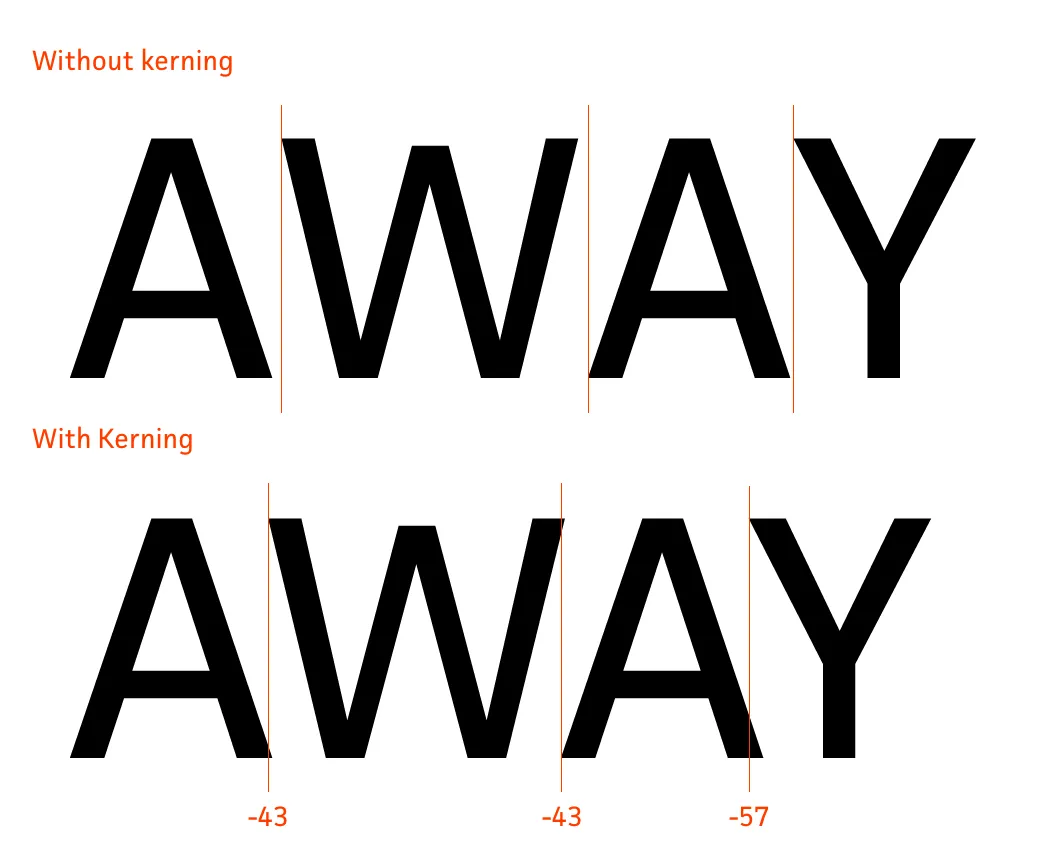
- Kerning is the adjustment of the space between specific letter pairs. This is done to make the text look more visually appealing.
- The color of the text can have a big impact on its readability. The text should be of a color that has a high contrast with the background.

Why is typography important when designing your website?
- Good typography improves readability, particularly for longer text such as product descriptions. This helps potential customers find information faster and increases conversions.
- Font and typography choices can increase brand recognition, boosting the chances of future sales.
- Certain fonts can create moods or atmospheres on websites that can, in turn, influence how users feel about the website and its products. For example, a light and airy font can create a sense of calm, while a bold and striking one can create excitement or urgency.
- Good typography can improve a website's usability by creating a clear hierarchy of information and easier scannability of text, enabling users to find information quickly.
- Typography can engage users by creating visually appealing designs and highlighting important information, such as CTA buttons.
What to consider while choosing typography for your website?
- What is the purpose of the text? Is it informative, persuasive, or something else?
- Who is your website's target audience? What are their age, interests, and level of education?
- What kind of overall mood or atmosphere are you trying to create?
3. eCommerce Website Banner
An eCommerce banner is a large, visually appealing image that is displayed prominently on a website. Banners are used to promote products, services, or special offers. They can also be used to highlight new arrivals, clearance items, or seasonal promotions.
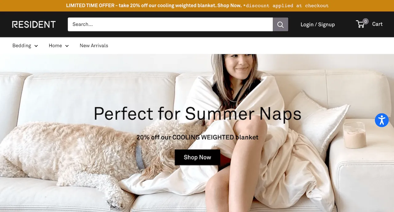
Effective eCommerce banners should be:
- Eye-catching / attention-grabbing
- Relevant to the target audience
- Clear and concise in their messaging
- Have call-to-actions, such as "Shop Now" or "Learn more"
Some common sizes include:
- 1920 x 1080 pixels (horizontal banner)
- 1280 x 375 pixels (vertical banner)
- 1170 x 569 pixels (square banner)
- 1024 x 300 pixels (wide banner)
- 800 x 200 pixels (narrow banner)
- 570 x 274 pixels (small banner)
Why is it important to design appealing banner images?
- Banner images are the first thing that visitors see when they land on your website, so they need to be able to grab attention and make visitors want to learn more.
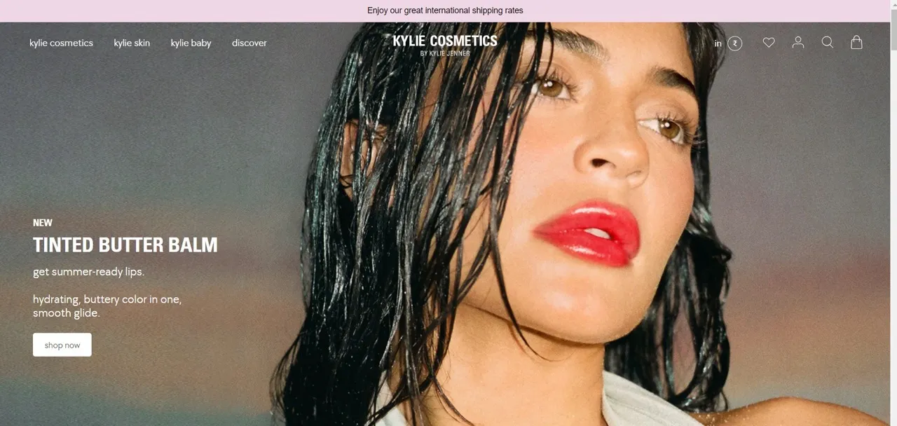
- Banner images are a great way to highlight your latest products and discounts or declare an ongoing sale, which can help to generate excitement and interest to make a purchase.

By incorporating website banners strategically and optimizing them for search engines, you can effectively convey your brand's message, showcase your products, and drive more conversions on your website.
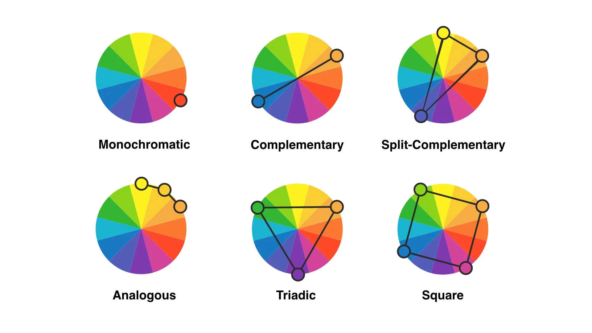
4. eCommerce Website Color Schemes
The color palette of a website is a combination of colors that are used throughout the website's design. The colors should be chosen carefully to create a cohesive and visually appealing look. The color palette can also be used to create a certain mood or atmosphere on the website.
There are many factors to consider when choosing a color palette for a website, such as the website's purpose, target audience, and overall branding.
Some popular color schemes for websites include:
- Monochromatic: This scheme uses variations of a single color. It is a simple and elegant option that can be effective for a variety of e-commerce websites.
- Complementary: This scheme uses colors that are opposite each other on the color wheel. It is a striking and eye-catching option that is often used for websites that want to make a statement.

- Analogous: This scheme uses colors that are next to each other on the color wheel. The use of analogous colors is a versatile and effective way to enhance the visual appeal of a website while also creating a sense of harmony and balance.

When choosing colors for a website, it is also important to consider the accessibility of the colors. Some colors, such as red and green, can be difficult to read for people with color blindness. It is important to choose colors that are easy to see and understand for all users.
Why color palette is important in designing a website?
- Color can have a big impact on consumer behavior - attention, mood, and decision-making. For example, red is associated with excitement and urgency, while blue is associated with calmness and trust.
- Use colors to create a unique brand identity. Choose colors based on your target audience and the message you want to convey. For example, a young, hip clothing brand might use bright, bold colors, while a more traditional brand might use more muted colors.
- The right colors can improve your website's readability and user experience. For instance, using a dark background and light text can improve the visual appeal and make it easier to scan.
- Colors can be used to create a sense of hierarchy on your website, which helps users focus on the most important information. For example, you can use a darker color for sections on your website you wish to be highlighted.
- Good color choices can create a positive user experience, leading to better sales and satisfaction.
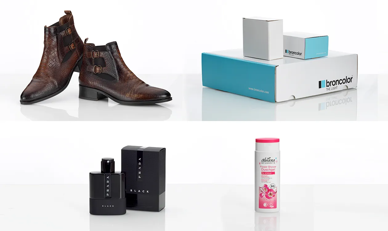
5. eCommerce Product Images
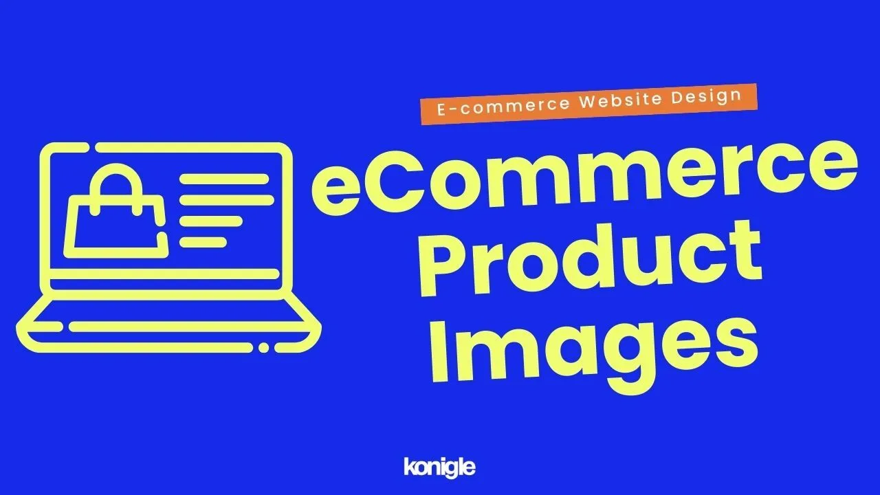
High-quality product images are essential for any eCommerce website, as they can help to attract customers, boost sales, and build a strong brand image.
What are the factors that contribute to product image quality?
- Image resolution is the number of pixels that make up an image. A good rule of thumb is to use images that are at least 72 dpi (dots per inch) and have a width of at least 1000 pixels. This will ensure that the images are sharp and clear, even when they are viewed on a large screen.

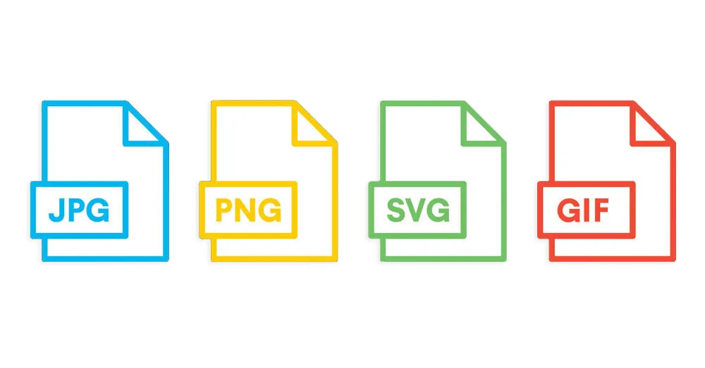
- Image format is the way image data is stored. Some common image formats include JPEG, PNG, WebP, SVG, and GIF. The recommended image format to be used on websites is WebP, as they do not compromise website speed at the expense of good image quality.
- It's important to pay careful attention to image lighting. Make sure that the lighting is bright and evenly distributed throughout the image so that every aspect of your product is clearly visible.
- Image composition should be carefully planned and executed with visual appeal in mind. This can involve a variety of techniques, such as the use of complementary colors, contrasting textures, and strategic placement of the product within the frame.

Why is quality of product images important?
- First thing your shoppers see. When people visit your website, the first thing they will see are the product images. If the images are blurry, pixelated, or poorly lit, they will be less likely to stay on your website and browse your products.
- Help customers better understand your products. Product images can help customers see the details of your products, such as the size, color, and texture. They can also help customers visualize how the product will look in their home or on their body.
- Boost your brand. High-quality product images can make your brand look more professional and trustworthy. They can also help you create a more engaging and visually appealing shopping experience for your customers.
- Give you a competitive edge. In the highly competitive e-commerce market, when customers are comparing products from different websites, they are more likely to choose the website with the best product images.
- Lead to increased sales and fewer returns. When customers can clearly see what they are buying, they are less likely to return the product. This can save you money on shipping and handling costs.
- Increase the likelihood of social media sharing. When customers share your product images on social media, it can help you reach a wider audience and generate more sales.
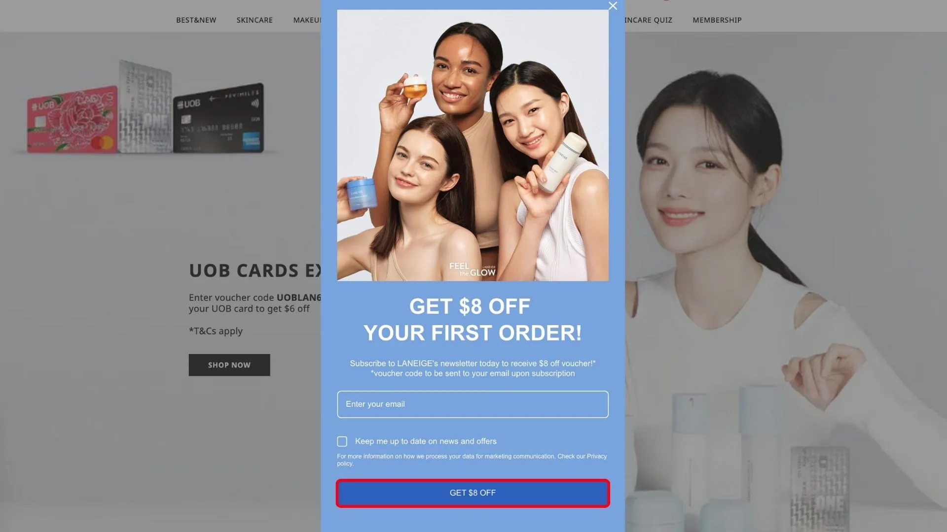
6. eCommerce Popups
Website popups are a powerful tool that can be used to engage with website visitors. One common use of popups is to collect email leads, which can be a valuable asset for businesses. By offering a discount or limited-time offer in exchange for an email address, businesses can build their mailing list and perform targeted email marketing in the future.
We cover more about email lists in this blog. Click here to skip to that section!
Here are some of the most common types of eCommerce pop-ups:
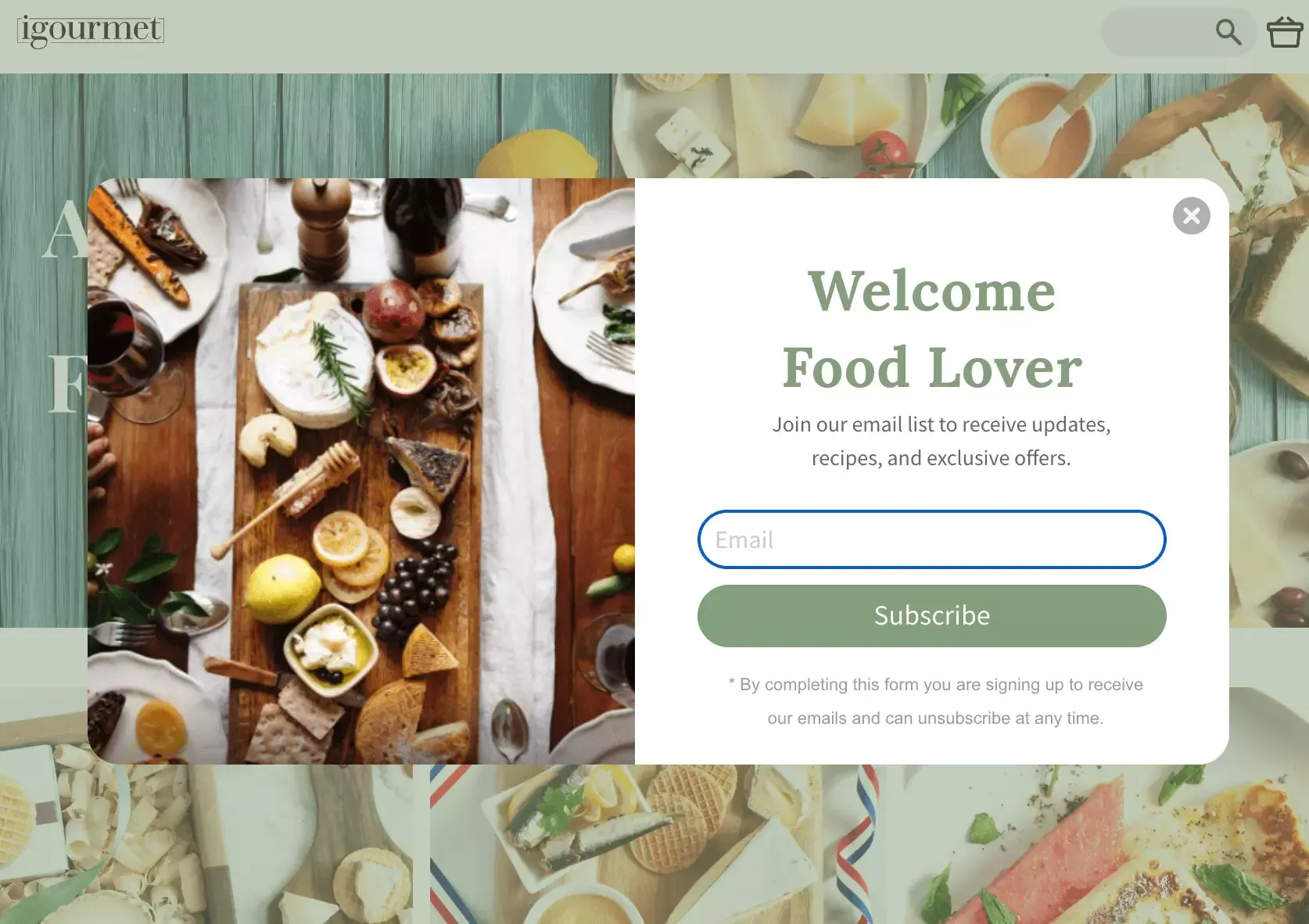
A welcome popup appears when a visitor first lands on the website. It introduces the brand and its products and offers a discount or free shipping for signing up for the email list.
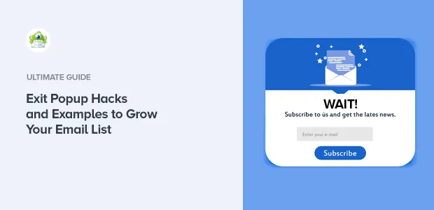
An exit-intent popup appears when a visitor is about to leave the website. It is a 'last' attempt to convince the visitor to stay and possibly convert.
A cart abandonment popup appears when a visitor has added items to their cart but not yet checked out. It reminds the visitor of their cart and offers an incentive to complete the purchase.
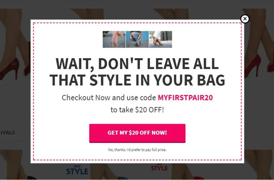
As effective as they may be to increase conversions, they can come off as annoying and intrusive if not used correctly. Hence, we should always be mindful to configure the popups such that they are not spammy and appear at appropriate timings.
SEO For eCommerce Product Pages
SEO for product pages involves optimizing them to rank higher in search engine results pages (SERPs). By doing so, your product pages will be more likely to appear in search results when people search for terms related to your products or services.
There are various ways to optimize SEO for your eCommerce product page, such as conducting product keyword research, selecting the right product titles, descriptions, and URLs, adding alt text to your product images, indexing, and adding a schema.
1. Product Keyword Research
What is product keyword research?
Product keyword research is the process of identifying and analyzing keywords that potential customers use when searching for products online. With this, you can optimize your eCommerce website and product listings, improving their search result rankings.
Why product keyword research is important?
According to the Jumpshot report, 46% of product searches start with Google. This means that there are millions of potential customers that you can attract if you can identify the keywords that your customers are searching for and optimize your website and product listings well enough to rank higher on the Google SERPs.
In other words, the first step to growing your online business is making your website and products discoverable and driving traffic there.
How to do keyword research for a product page?
1. Use Google's autocomplete predictions
You may have noticed that when you search for something on Google, the search engine suggests specific keywords for you.
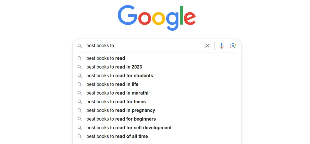
This is the Google Autocomplete Predictions feature. It looks at people's past searches as well as the popularity of other search queries to come up with predictions for what your potential customer might be looking for.
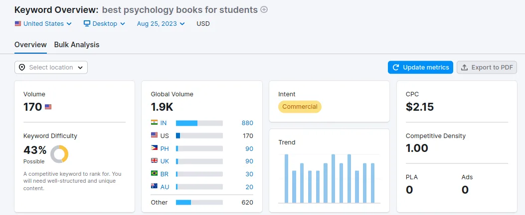
For example, let's say that you are selling books. When you type "books to" into Google, you will see that it suggests 5-6 other related keywords for that term.
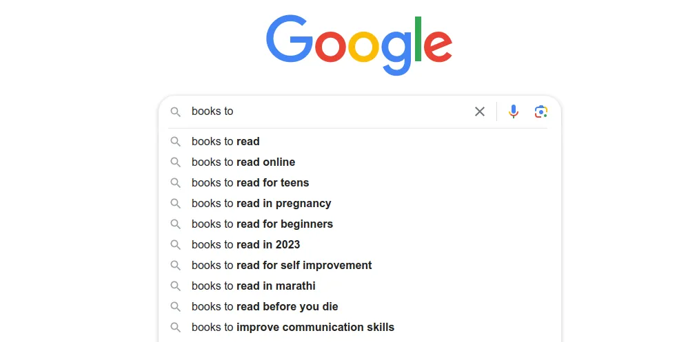
The autocomplete suggestions are typically longer, consisting of five or more words. As these are "long tail" keywords, they tend to have a good amount of search volume with lower competition, making it easier for you to rank for them.
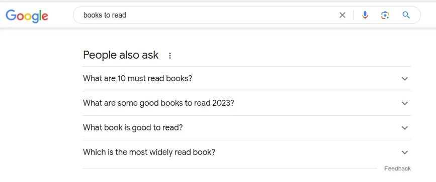
Additionally, there is the "People also ask" section that appears in a box below the search results. These predictions suggest related questions that potential customers might want to explore and can be useful for those looking to learn more about a particular product.
2. Know Your Target Audiences' Intent
When conducting keyword research, it is important to consider the intent of the searcher. Are they simply looking for information? Or are they ready to make a purchase?
By understanding intent, you can tailor your content to better serve your customer's needs and increase the likelihood of a conversion. For example, if your potential customer is looking for information, you could give them resources like articles or blogs, while someone who's ready to make a purchase might find product listings or reviews helpful.
Here are some examples of keywords to help you understand the potential intentions of your target customers:
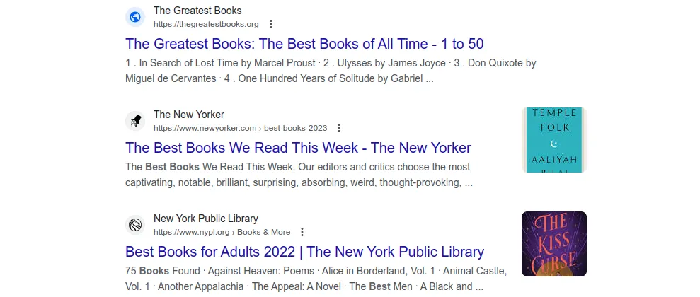
- Informational keywords are used by people who are searching for information about a product or service. They are typically longer and more specific than other types of keywords. For example, "Best Books for College Students" or "How to Use a DSLR Camera?”
- Navigational keywords are used by people searching for something specific in mind. They typically include the name of the product or a variation of it. For example, "Apple phone" or "Nike shoes.”
- Commercial keywords are often used by individuals interested in purchasing a product or service. They are typically transactional in nature and may include words such as "buy," "shop," or "price." For example, "buy a new book" or "best deals on bestseller books.”
- Transactional keywords are used by people who are ready to make a purchase. They are typically the most specific type of keyword and may include the name, model number, or price of the product. For example, "2023 MacBook Pro" or "Atomic Habit Book.
3. Use keyword research tools
Using keyword research tools can help you discover related keywords as well as their search volume and level of competition. Some of the more popular keyword research tools are Google Keyword Planner, SEMrush, and Ahrefs.
With this information, optimize the content of your eCommerce website and product listings to improve your search engine rankings. This will ultimately drive more traffic and leads to your store.
2. SEO product titles
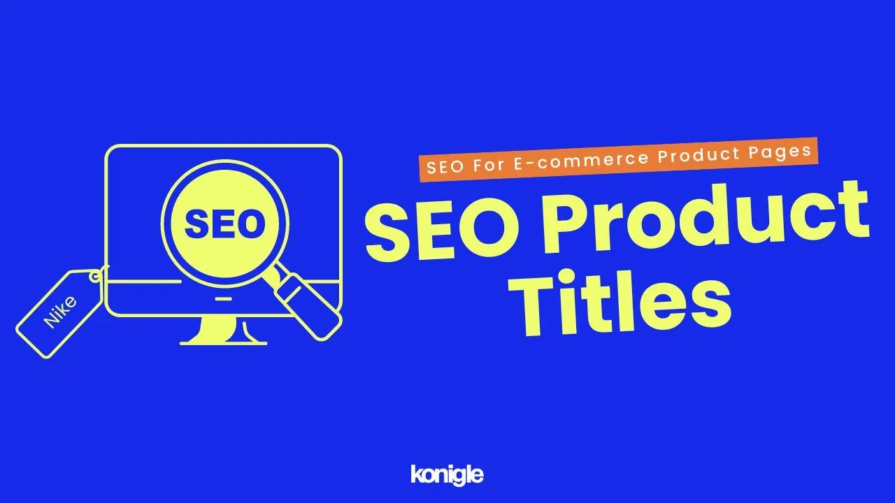
A product title is the name of your product that appears on SERPs. It can help Google and other search engines briefly understand what your product is about and how it can be relevant to the queries of potential customers.
Having the appropriate product title is crucial for a product page's SEO and Click-Through-Rate (CTR).
When someone sees your product in the search results, the meta title is the first deciding factor on whether they should click or not; having the right keyword in the meta title that summarizes what your entire product is about can boost CTR.
“The title is one of the most important parts of your ad or free listing. A specific and accurate title will help us show your product to the right customers.” - Google
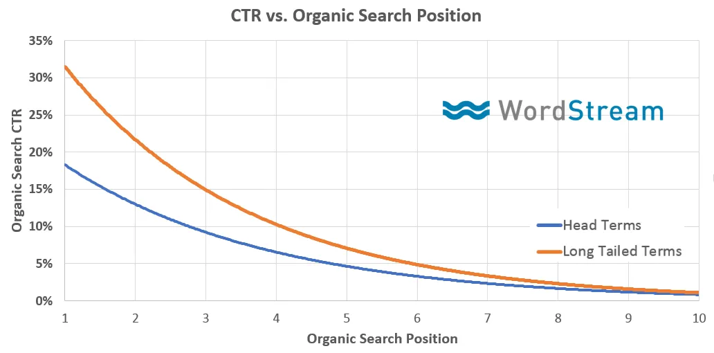
As per this case study published on the Moz blog, organic click-through rate serves as a Google ranking signal where organic CTR and search position are directly proportionate.
How to Optimize Your Product Title for CTR
1. Include Your Keyword In Your Title
Include high-demand keywords and phrases in your title that potential customers are likely to search for (basically, these are the keywords that you found during your keyword research). To avoid confusion for search engines and customers, use a unique title for each product that accurately describes it.
Some other best practices to follow:
- Keep the title under 60 characters to avoid getting cut off in search results. Include important keywords and points within the first 60 words to ensure that even if Google cuts off the title, the most essential information will still be conveyed.
- Consider adding your brand name to the title (starting or ending). This will keep the focus on your product. However, it depends on and is not required for all product titles.
- Do not use all caps, as it can be difficult to read and may come across as aggressive or spammy.
2. Include specific product details in the title
Including specific details about the product in the title, such as the material, style, size, or other unique features, can help customers understand what sets your product apart and improve its visibility in search results.
For example:
- "100% Cotton T-Shirt - Soft & Comfortable"
- "Wireless Headphones - 20 Hours Battery Life"
- "Leather Laptop Bag - Fits 15-Inch Laptops"
3. SEO product description
A search engine optimized product description is written content that incorporates relevant keywords and phrases, aiming to inform shoppers about a product, convert them into customers, and increase the product's visibility in organic search results.
Why is an SEO-friendly product description important?
By including relevant keywords in your product descriptions, you can help search engines understand what your product is about and how it can benefit potential customers. This can lead to your product appearing higher in search results for relevant queries, increasing the visibility of your eCommerce store and driving more traffic.
"A product description page (PDP) informs shoppers about the features and benefits of your product before they complete their purchase with Buy on Google. - Google
Best Practices for SEO Product Description
1. Use keywords naturally
When you write product descriptions, always keep in mind that your main goal is to connect with your target audience. Of course, including relevant keywords for search engine optimization is important, but it's equally important to make sure that your customers know how your product's unique features are able to benefit them. By doing this, you can increase sales.
Additionally, ensure that your product description is easily crawled by search engines, as they utilize web crawlers to scan and index webpages. This means that they read the page differently from humans.
2. Let buyer awareness drive length
When optimizing for search engines like Google, it's important to keep in mind that content length plays a significant role. However, there's no hard and fast rule for how long your product descriptions should be in order to drive sales. What works for one product might not work for another.
So, how do you figure out the right length for your product descriptions? How much does your target audience already know about the benefits of your product? This will determine how much persuasion is needed before making a purchase.
3. Create a clear call to action (CTA)
It's important to make sure your CTA stands out and is easy to locate on the product page. You can use action-oriented words that encourage shoppers to take specific actions, like "Buy Now" or "Add to Cart." And to make it more effective, you might want to include a sense of urgency as well, such as "Limited Time Offer" or "Only a Few Left in Stock.”
4. Image Alt Text
What is an image alt text?
The alt text of an image is a brief description of the image used for visually impaired users, as well as by search engines to understand the image's content. To improve SEO, the alt text should be descriptive and relevant to the image and include keywords that you want your image to rank for.
Why are image alt text important?
Like any piece of metadata, your product image alt text is an opportunity to provide Google with information about your product. When search engines crawl your product pages, they examine the alt text for images to gain a better understanding of what the page content is about. This can improve your pages' ranking in SERPs.
Best Practices for Optimizing Your Image Alt Text
1. Be descriptive
Use specific details when you're writing alt text in order to ensure that the visually impaired and search engines are able to understand the image. This means describing the colors, shapes, textures, and quantity to paint a clear picture of what the image is showing. If the image doesn't add any meaning to the content / is just there for decoration, you can leave the alt text empty or add the word "decorative" or "background."
While it is important to include keywords in your alt text for SEO purposes, avoid overstuffing it with too many keywords. The alt text should provide an accurate description of the image's content without sounding overly promotional.
2. Keep it short and concise
Keep your message short and sweet while also avoiding oversimplifying complex ideas. Therefore, it's essential to strike a balance between being concise and providing enough detail to communicate your message effectively. One way to achieve this is by avoiding unnecessary jargon.
3. Don't use the words "image of" or "photo of"
It is best to avoid using phrases such as "image of" or "photo of" as they can come across as redundant and unnecessary. Don't be afraid to get creative with your descriptive words and phrases; instead of just saying "A photo of a sunset," try describing the colors, textures, and mood of the scene to create a more immersive experience for your readers.
5. Product variants
What are product variants?
Product variants refer to different versions of a product that eCommerce stores offer to customers. These versions may differ in color, size, features, or any other aspect that is relevant to the customer. By offering product variants, you can meet the diverse needs and preferences of customers, which can ultimately help increase sales.
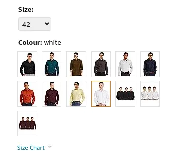
Why are product variants important?
From an SEO standpoint, creating separate product pages for each variation allows you to optimize each page for a different keyword or keyword phrase. Doing so can help you rank for a wider range of searches, increase your click-through rate (CTR), and boost sales.
How to set up product page variants for better SEO?
1. Use unique URLs for each product variant
If you want your product variants to rank higher on Google, it's important to use unique URLs for each product variant. One great way to do this is by using a combination of the product name and variant attributes (like color, size, or material) in the URL. Take some time to create unique URLs for each product variant and optimize them with relevant keywords. This will help maximize visibility and appeal to potential customers.

2. SEO for images of each product variant.
As you already know, images are an essential tool to help people visualize the product and make a purchase decision. It's important to note that the quality and relevance of the images can have a significant impact on customers' decisions to buy the product.
By using relevant keywords in the file name, alt text, and other image attributes, the images can be more easily discovered by search engines, which can increase the visibility and traffic of the product variant page.
3. Use rel="canonical" tags to prevent duplicate content issues.
If you're using the same content on multiple product pages, use rel="canonical" tags to show Google which page is the original one. This will prevent any issues with duplicate content that could harm your search engine optimization efforts and make sure that your website is seen as a trustworthy and authoritative source of information by search engines thus, driving more traffic to your business.
6. Ecommerce product indexing
What is product indexing?
Product indexing is the process of adding product information to a search engine's index, making it discoverable to users searching for products. This process involves crawling the product pages of a website, extracting relevant information, and storing it within the search engine's index.
Why is product indexing Important?
Product indexing enhances the visibility of your store's products online. After a search engine indexes a product page, it can be presented to users who are actively looking for that product. This increases the probability of a sale.
Best practices for product indexing
1. Set up Google Search Console (GSC)
- Verify ownership of your eCommerce website on GSC and submit a sitemap of your website to Google
- Use the URL Inspection tool to check the indexing status of your product pages and request indexing for any non-indexed pages
- Use the performance report feature to monitor search traffic and clicks for your product pages. Make adjustments as necessary to improve their visibility.
2. Product Page Optimization
- Keep your product information up-to-date, as outdated information is less likely to rank high in search results.
- High-quality images and videos on your product pages can improve the user experience and facilitate better product indexing.
- Optimize your product pages for mobile devices. With the increasing number of customers using their mobile devices to shop online, make sure that your product pages are easy to navigate on smaller screens and available for mobile indexing.
3. Use structured data markup
Structured data markup provides additional information about your products to search engines. This helps search engines better understand your products for indexing purposes. There are various types of structured data markup available, but the most commonly used for e-commerce is product schema markup.
Read on to find out more about schema for eCommerce product pages.
7. Schema for ecommerce
What is a schema for e-commerce?
An eCommerce schema is a structured format used to organize and display information about products in your store. It allows you to provide detailed information about your products, including their name, description, price, availability, and more.
Why is a schema for e-commerce important?
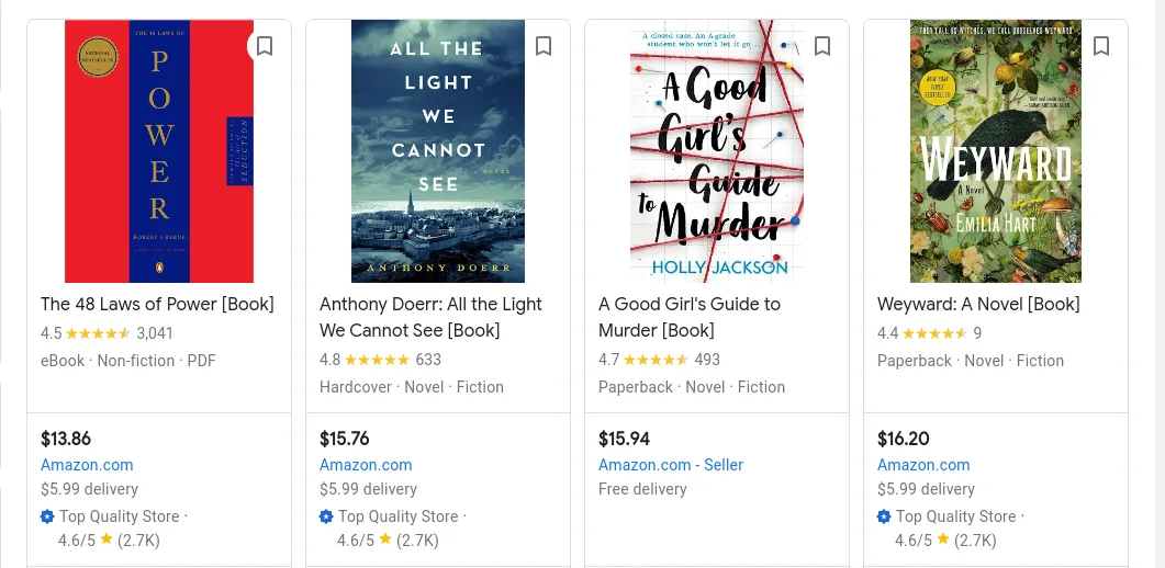
Having a schema helps search engines understand the content of your site and provide rich snippets in search results, such as product images, prices, and reviews. When search engines have a better understanding of your products, they are then able to comprehend what your eCommerce business offers and hence index your products faster on Google.
It can also ensure that all products in your eCommerce store are appropriately categorized, making it easier for customers to find what they are looking for, leading to an improved CTR
Best practices
1. Include only relevant structured data.
There are many different types of schema markup that can be used for eCommerce products.
Some of the most common ones include:
- Product schema: This schema markup can be used to provide information about individual products, such as their name, price, description, and images.
- Review schema: This schema markup can be used to display reviews of your products.
- Rating schema: This schema markup can be used to display ratings of your products.
- Offer schema: This schema markup can be used to display offers for your products, such as discounts or free shipping.
- Organization schema: This schema markup can be used to provide information about your business, such as your address, phone number, and hours of operation.
Schema markup is most effective when used for information that's directly related to your products or services. Including irrelevant information can actually confuse search engines and decrease your chances of being shown as rich results. So, it's important to carefully choose which information you want to markup and which you want to exclude.
2. Focus on the main purpose of the product.
When you're adding schema markup for products, focus on the core meaning of the product and provide as much detail as possible. Apart from the product name, price, and availability, the product description and image are also important aspects.
All product pages for websites built on Konigle come pre-equipped with a product schema markup. We have lowered the barriers to entry for new eCommerce business owners, so what are you waiting for!
3. Test your schema markup
After adding a schema markup to your eCommerce store, test it to ensure it is working correctly. You can use either Google's Structured Data Markup Tool or the Schema Markup Validator to test your schema markup.
8. Product URL
What is a product URL?
A product URL is a web address that directs users to a specific product page on an eCommerce website. It usually consists of the website's domain name, followed by the product's unique identifier, such as its product code or name.
For example, the product URL for the "Red T-Shirt" on the website www.example.com could be: www.example.com/products/red-t-shirt
Why is an optimized product URL important?
With a product URL that is clear and concise, it can improve your product page's SEO, making it more visible to potential customers. The product URL should be easy to share on social media and other channels. This can help you promote your products and drive traffic to your website.
How to improve product URLs?
1. Use descriptive keywords
The product URL should be an accurate description of the product being linked to. By doing so, Google will be better able to understand what your page is about and can easily match it to relevant search queries.
In fact, using relevant keywords (found from your keyword research) in the URL can also help attract potential customers who are searching for exactly what your product offers. This will maximize your page's visibility and attract the right audience.
2. Keep it concise yet informative
A short and sweet URL can be easier to remember and type, but it might not give your audience a clear idea of what they'll find on the page. On the other hand, a long and complicated URL might overwhelm your audience or even slow down your website. So, you should aim for a nice balance and create a URL using relevant and necessary keywords to convey the main gist of the product.
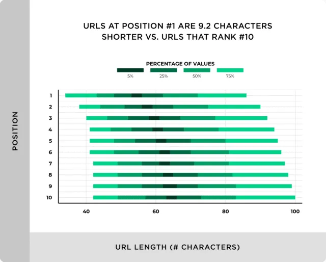
In fact, according to a Backlinko study, the average URL length for a top 10 result in Google is 66 characters, ranging from 40 to 100 characters.
Bonus Tips
- Use hyphens to separate words in your URL. This will make your URL more readable and easier for Google to index.
- Avoid using special characters in your URL, such as underscores, ampersands, or question marks. These characters can make your URL difficult to read and can also cause problems with some search engines.
- If your product has different variations, such as different colors or sizes, it is important to use similar URLs for all variants. This allows Google to recognize that they are different variations of the same product and makes it easier for customers to find the product they are looking for.
Proven ways to drive traffic
1. E-commerce Email List
What is an eCommerce email list?
An eCommerce email list is a collection of email addresses belonging to website visitors who have opted in to receive promotional messages and updates from an eCommerce business. This list is a crucial marketing tool that businesses use to increase sales through targeted email marketing campaigns.
Why is an eCommerce email list important?
Having an eCommerce email list is like having a direct line to your potential customers whom you can keep in touch with. You can use it to send them business updates on new products, promotions, and special offers. This is an excellent way to keep them engaged with your eCommerce store and increase LTV.
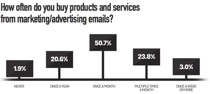
According to SaleCycle, 59% of respondents reported that marketing emails influenced their purchase decisions. Additionally, 77.5% made a purchase from a marketing email at least once a month.
Running email campaigns also allows you to collect valuable data and insights about your customers. You can keep track of their purchase history, preferences, and behavior on your website to make future marketing efforts even more personalized. Acquiring new customers can be tough, so why not try winning back existing customers that already have some level of trust in your business instead?
Best Practices
Here are some best practices for collecting email lists and gaining traffic for your e-commerce store:
- Offer a lead magnet (which can be a free ebook, a discount code, or free merch) to give people a reason to provide you with their email addresses.
- Strategically place subscription forms in locations where they are likely to be seen, such as your store’s homepage, product pages, and blog posts.
- Personalizing your subscription forms, such as addressing people by name and tailoring the offer to their interests, can increase the likelihood of them signing up.
- To increase conversion rates, make it easy for people to subscribe. Ideally, they should be able to enter their email address and subscribe with as few clicks as possible.
- After people subscribe to your email list, send them content that they will find valuable, like product updates, special offers, or educational material.
2. Targeted Blog Posts
What is a targeted blog post?
A targeted blog post for an eCommerce store is content specifically written to promote or showcase the products available for purchase on your website. The article can contain useful details about your products, such as descriptions and reviews, that potential customers will want to know. A targeted blog post can also be used to showcase your latest products, provide exclusive promotions, or offer tips on how to maximize the use of your products.
Why are targeted blog posts important?
If the created blog posts can directly address your ideal customers' pain points, they will be more convinced to buy from you. Consider your target audience's interests, pain points, and needs. Determine how your products or services can help them solve problems or achieve goals.
Best practices for writing targeted blog posts
Aside from conducting keyword research, understanding your audience, optimizing for SEO, and email marketing (all of which were already covered in the previous section of this blog), here are some other best practices to follow when writing targeted blog posts for your website:
- Create an effective content plan that considers the needs and interests of your target audience and the frequency of publishing content. A regular publishing schedule signals to search engines that your website is consistently updated with fresh content.
- Include internal links to relevant product pages or other blog posts on your eCommerce store within your blog content to increase page view time and make other pages more discoverable.
- Even though the primary objective is to deliver value, you can also incorporate mentions of your product placement subtly. Demonstrate how your products can address particular issues or improve the reader's quality of life.
- Enhance the visual appeal of your blog post with high-quality images and graphics. Visual content can make the reading experience more engaging and shareable.
- To reach a wider audience with your blog posts, promote them on social media platforms such as LinkedIn. Use relevant hashtags and engage with your followers to create conversations around your content.
- Make use of long-tail keywords that are more specific instead of targeting high-volume and high-competition keywords. If you need help with this, Konigle has an in-built plugin that helps you identify long-tail keywords based on a topic provided.
3. Glossary Terms

What is a glossary term?
A glossary term is an explanation of a word or phrase that is commonly used in the business's context, but customers may not be familiar with the term.
Why is a glossary term important?
Glossary terms relevant to what your target audience is searching for can attract visitors who are more likely to be interested in your products. When your visitors see that you understand the jargon of your industry, it can help build trust between them and your business.
Also, including glossary terms can not only improve search engine optimization (SEO) by providing more relevant content for search engines to crawl and index but also improve internal linking within your website when hyperlinks are added to other blogs that mention the term.
Best practices for writing a glossary term
- Not all terms are created equal when it comes to driving traffic; some are super competitive. Hence, you need to find opportunities that are less competitive and yet still of value and relevance to potential customers. You can use a keyword research tool to help you identify these terms.
- Once your glossary terms are created, share them with your target audience. In fact, submitting your glossary terms to online glossary directories can increase visibility and attract more users. Promoting your glossary can help establish your authority in your field and build a stronger relationship with your audience.
- Ensure that your glossary terms are up-to-date. As new terms are introduced and old terms become obsolete, make sure to update your glossary accordingly.
4. Social media engagement
Social media engagement is how much customers are interacting with an eCommerce business on social media. This includes likes, comments, shares, and direct purchases. You can use social media to showcase your products, offer special promotions and discounts, and address customer feedback in real time, which can be used to improve your products and services.
Why social media is important in e-commerce to gain traffic?
Facebook has over 2.9 billion active users, and Instagram has over 1 billion
With the large and active user base on social media platforms, it's easier to get your message out there. According to Sproutsocial, 49% of consumers report discovering the perfect product through targeted ads, while almost 40% find it through organic brand posts.

In other words, if you're not active on social media, you might be missing out on a large potential audience.
Best practices for social media engagement post
- Have a content calendar that outlines what and when you'll be posting. A content calendar can help create a roadmap for your content marketing efforts to increase traffic to your eCommerce store. You can align your posts with important events or holidays while ensuring that you cover all relevant topics within your industry.
- Maintain a consistent visual identity, including color schemes, fonts, and style, to help create a recognizable and professional image.
- Make interactive content that engages your audience. For example, you can create polls to get your target audience's opinions. In fact, creating challenges that require the audience to use their creativity or problem-solving skills can be a fun and engaging way to attract customers to your store.
5. Promotional ads/ advertising
Promotional ads are created to promote a product or service to potential customers. These ads can be displayed on various platforms such as social media, search engines, and email campaigns.
Why are promotional ads important?
Promotional ads help create brand awareness, generate interest in a product or service, and ultimately drive sales. Through these ads, you can share your unique selling point, highlight the benefits of your products or services, and stand out from your competitors.
By tracking metrics such as click-through rates, conversion rates, and engagement levels, you can gather valuable data about your target audience. Use this data to adjust your messaging, targeting, or creative accordingly. This can lead to more effective and efficient marketing efforts in the long run.
According to the Feed Marketing Report 2022, 91.55% of e-sellers promote their products on search channels, while 54.15% of online retailers advertise on social channels. This high percentage also indicates that social channels are considered a relevant platform for advertising products.
It is also an effective way to emotionally connect with your target audience by appealing to their needs and desires. By using creative visuals, catchy slogans, and engaging storytelling, your eCommerce store can easily capture the attention of potential customers and build a lasting relationship with them. This can lead to increased loyalty, word-of-mouth referrals, and repeat business.
Best practices for Promotional ads
- Simply putting up an ad is not enough. Ensure that your ad reaches the right audience by targeting them based on demographics such as age, gender, location, and interests. By analyzing past purchase behavior, you can identify people who are more likely to convert. This level of targeting not only increases the chances of conversion but also helps you maximize your advertising budget by avoiding wasted impressions.
- Use eye-catching visuals to make a strong impression on your target audience. One way to achieve this is by conducting market research on your target demographic's preferences and behaviors.
- Not all advertising platforms are equally effective. Hence, consider which platforms are most likely to reach your target audience, and then focus your advertising efforts there. This way, you can maximize both your use of budget and campaign effectiveness.
- Create clear, concise, and informative ad copies. Highlight the unique selling point of your product without using too many industry jargons that are hard to understand and your target customers cannot relate to. Include CTAs that encourage specific actions like signup, buy now, etc.
Get Conversions (CRO)
Conversion rate optimization (CRO) is the process of making changes to your website in order to improve the percentage of website visitors who take a desired action, such as making a purchase or signing up for an email list.
1. Compelling eCommerce Landing Page
What are eCommerce landing pages?
An eCommerce landing page is a standalone webpage typically created for a specific marketing campaign or offer and designed to be as persuasive as possible in order to convert visitors into customers.
Why should you have a compelling landing page?
- A well-targeted landing page can help you reach the right people with the right message. By creating a specific message tailored to the needs and interests of your target audience, you can ensure that your landing page resonates with the people who are most likely to become customers.
- Having a landing page that contains important and relevant information helps you to build a strong relationship with your audience and makes your business look more credible. This increases conversion as people are more likely to buy from brands they trust.
- When your landing page contains valuable information, it can help generate leads as it makes potential customers want to leave their contact information. You can stay in touch with potential customers and nurture them until they are ready to buy.
- A well-optimized landing page can help improve your search engine ranking, leading to more traffic to your website. With more traffic, the chances of conversion increases too, resulting in an increased ROI.
How to create a compelling landing page?
- Headline: Your headline should be clear, concise, and attention-grabbing. It should tell visitors about the page and why they should care.
- Image or video: High-quality and relevant to the offered product or service. It should grab visitors' attention and make them want to learn more.
- Sales copy: The sales copy should be clear, concise, and persuasive. It should highlight the benefits of the product or service and why visitors should buy it. Note: It should also be free of jargon and technical terms.
- Call-to-action (CTA): The CTAs on your website should be clear and concise. It should tell visitors what you want them to do, such as "Buy Now" or "Sign Up for a Free Trial.”
2. Persuasive product descriptions

What are product descriptions?
Although the answer to what product descriptions are has been covered in the previous section, to reiterate in layman's terms, product descriptions are a critical part of a customer's journey and should be able to convince customers that your product is the right fit for them.
Why are they important?
- Helps customers make informed decisions by providing customers with all the product information they need to know, including its features, benefits, and specifications.
- Builds trust and credibility with customers as you provide them with all the necessary information. This ultimately leads to repeat business.
- Improves SEO by using keywords throughout the product description to help the product rank higher in SERPs. This results in more customers seeing the product and being more likely to buy it.
- Reduces customer service inquiries by providing customers with the information they need to troubleshoot problems or answer their questions.
- Increases conversion rates when potential customers understand the value of the product and why they should buy it.
How to craft persuasive product descriptions?
- Understand your target audience and speak directly to them. Who are you trying to reach? What are their needs, wants, and pain points?
- Highlight the product's unique selling point. How will it solve the customer's problem? Focus on the benefits that are most important to them.
- Use clear and concise language so that customers can easily understand why they need your product. Avoid technical terms that they may not understand.
- Be persuasive. Use strong verbs and adjectives like "easy," "convenient," and "affordable" to make the product sound appealing.
- Connect with the customer on an emotional level by appealing to their desires, fears, or needs. For example, how your product will make them feel more confident, stylish, or successful.
- Use keywords throughout your description that will help your products rank higher in search results. When choosing keywords, focus on the words that your target audience is likely to use.
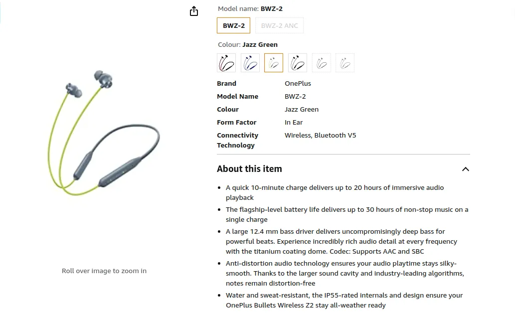
Key components of product descriptions include:
- Product Title: A concise and descriptive title that accurately represents the product. It should include relevant keywords for SEO purposes.
- Product Image: High-quality images that showcase the product from various angles.
- Product Features: A concise list of the product's main features and specifications.
- Product unique selling point: Explanation of how the product can solve a problem, setting it apart from competitors.
- Other Descriptions: A more detailed narrative including information about the product's materials, manufacturing process, size, color options, and more.
- Product Specifications: Details including information about the product's materials, manufacturing process, size (dimensions & weight), color options, materials used, and any other technical information that is relevant to the product.
- Usage and Application: Instructions on how to use the product, its intended purpose, and any maintenance or care guidelines.
- Price and Availability: Information about the product's price, any discounts or promotions, and its availability in terms of stock.
- Call to Action (CTA): A clear and compelling statement encouraging the customer to take action, such as "Add to Cart," "Buy Now," or "Learn More."
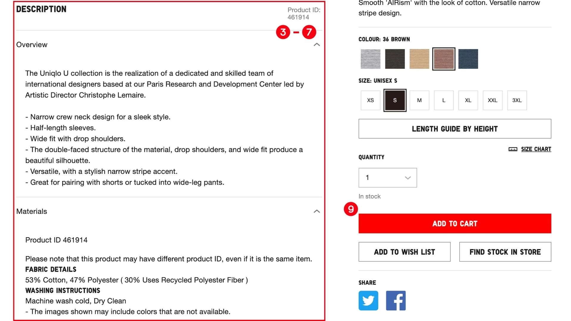
3. Effective Call-to-action (CTA)
What are Call-To-Actions?
A CTA is a marketing prompt on a website that tells visitors to take a specific action. Some commonly seen examples are:
- Buy now: Used to encourage users to purchase a product immediately.
- Shop now: To invite users to browse a product catalog or collection.
- Add to cart: Prompts users to add a product to their shopping cart.
- Subscribe to our newsletter: Used to collect email addresses so that the brand can stay in touch with them.
- Follow us on social media: Used to encourage users to follow the brand on social media platforms such as Facebook, Twitter, and Instagram.
Why are CTAs important?
- CTAs guide visitors through the whole buying process from browsing to purchasing. For example, a CTA button that says "Add to cart" tells visitors that they can add the product to their shopping cart.
- CTAs improve user experience by making it clearer what visitors can do on your site. It can help reduce confusion and drop-offs and encourage them to stay longer.
- Combining all of the above will ultimately lead to an increase in conversion rates.
How to craft effective CTAs?
- Clear and concise CTAs let visitors know exactly what action is being asked of them.
- Placing the CTA in a prominent location on the website makes it easily noticed by visitors.
- When a sense of urgency is instilled in your visitors, they are more likely to take action immediately. For example, "Hurry, the offer is ending soon!"
- When personalized to the individual visitor, it is more likely to resonate with them. For example, "Get 10% off your first purchase."
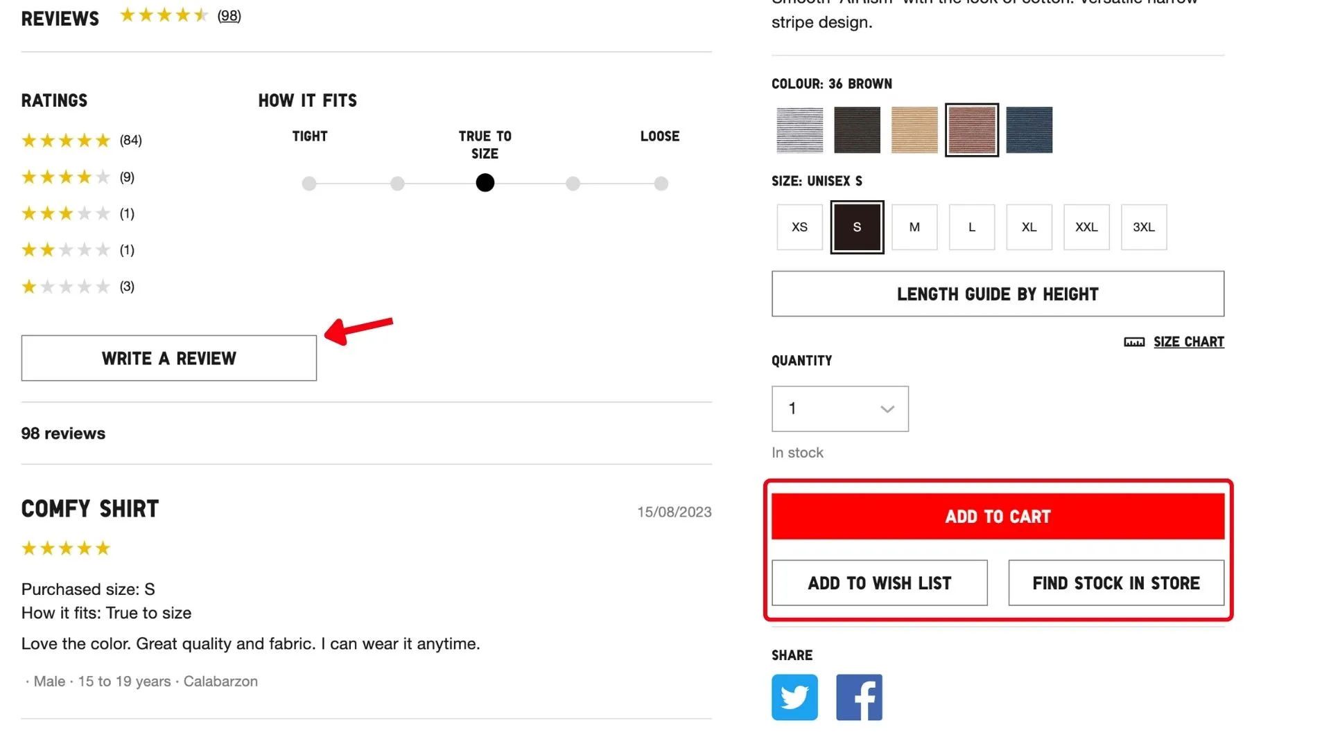
4. Social Proof in eCommerce
What is social proof in eCommerce?
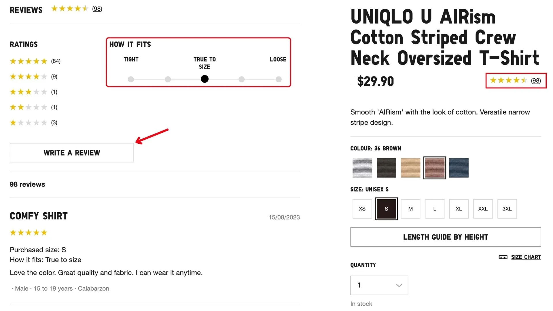
Social proof in eCommerce is the concept of using the actions of others to influence the buying decisions of potential customers. Here are some examples of social proof in e-commerce:
- Customer reviews and ratings: One of the most effective forms of social proof as they allow potential customers to see what other customers have said about a product or service. They can also help customers identify potential issues or areas for improvement.
- When people mention a product or service on their social media, it shows their interest and willingness to talk about it with their followers. This can be a powerful form of word-of-mouth marketing. Therefore, it is important for businesses to have an active presence on social media platforms and to encourage their customers to share their experiences with their networks.
- Case studies provide an in-depth analysis of how a particular product or service has helped other businesses or individuals achieve their goals. They often include detailed information about the challenges faced by the customers, the solutions offered by the product or service, and the outcomes achieved. Additionally, case studies can be used as a powerful marketing tool, as they provide tangible evidence of the benefits and value of the product or service.
Why is social proof important for conversion?
- Reduced perceived risk: When potential customers see that other customers have taken the risk and made purchases, it can make them feel more comfortable doing the same.
- Creates a sense of urgency: Seeing other people buy a product or service, can make potential customers feel like they need to act quickly before the product or service sells out.
- Increases sales: Studies have shown that social proof can increase sales by up to 38%. This is because social proof can help convince potential customers that they are making the right decision by purchasing a product or service.\
- Build trust and credibility: When people see that other people have had positive experiences with a product or service, they are more likely to trust that they will have a positive experience as well.
How to establish social proof in e-commerce?
- Use a review aggregator: A review aggregator is a third-party service that collects and displays reviews from multiple sources. This brings more exposure for your reviews and makes them more credible.
- Display ratings & reviews: You can display ratings on your product pages, or use a third-party rating system such as Trustpilot or Google Reviews.
- Social media mentions: Track social media mentions using a tool like BrandWatch or Mention.
- Create case studies: Create case studies yourself or obtain them from other businesses that use your products or services.
5. Urgency and Scarcity
What are Urgency and Scarcity?
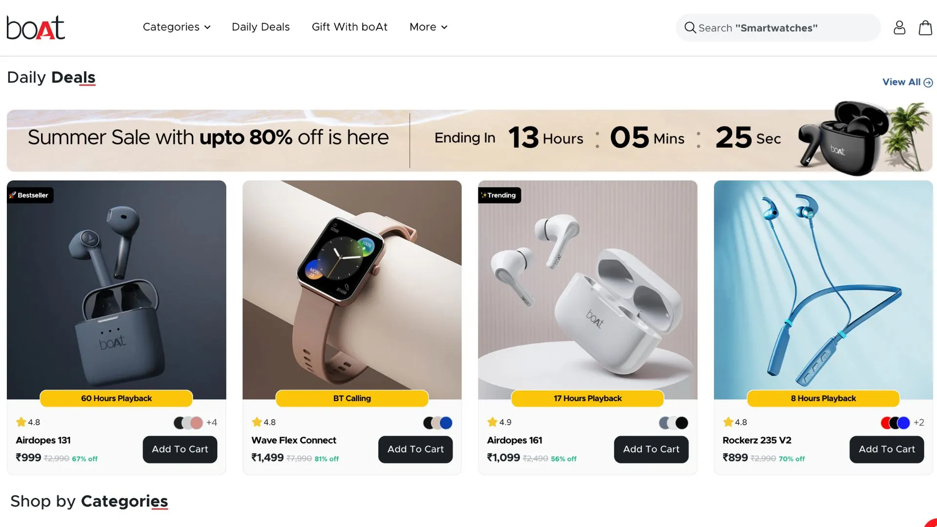
Urgency and scarcity are two marketing principles that can be used to increase sales in eCommerce. Urgency refers to the limited time available to take advantage of an offer, while scarcity refers to the limited quantity available for a product. A study by HubSpot found that scarcity-based marketing can increase conversion rates by up to 15%.
Why should you apply urgency and scarcity tactics?
- When people see that a product is only available for a limited time or quantity, they are more likely to want it. This is because a sense of FOMO is created where they don't want to miss out on the opportunity to own something exclusive.
- A product that is scarce or in high demand has an increased perceived value. This is because they assume that if a lot of people want something, then it must be good.
- FOMO combined with increased perceived value leads to impulse purchases. This is because people are worried that they will miss out if they don't act now. With that, conversion increases.
Ways to use urgency and scarcity tactics
- Limited-time offers: For example, offer a 20% discount on all products for the first 24 hours after a new product launch.
- Countdown timers: A visual way to create a sense of urgency. When customers see that they only have limited time to take advantage of an offer, they are more likely to act quickly.
- Back in Stock alerts: These alerts allow shoppers to be notified when a product they are interested in is back in stock, ensuring that they do not miss out. For example, you could offer shoppers the option to sign up for back-in-stock alerts for out-of-stock products.
- Limited-edition: Create a sense of scarcity and make shoppers more likely to buy the product. For example, release a new product in limited quantities and only make it available for a few weeks.
6. Lead Nurturing Emails
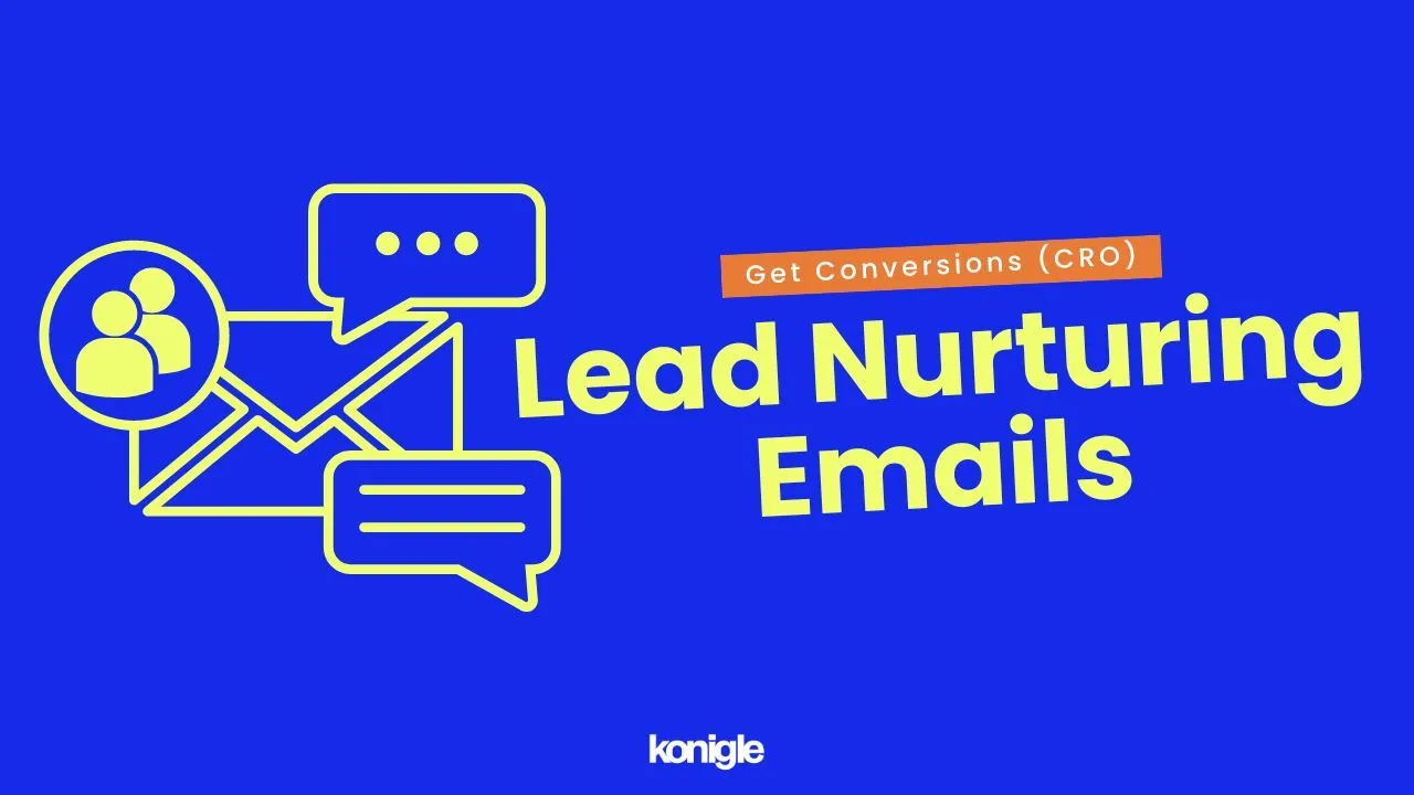
What are lead nurturing emails?
Lead nurturing emails are a series of emails sent to potential customers who have shown interest in your products or services but have not yet made a purchase. The goal of lead nurturing emails is to build a relationship with the lead and keep them engaged with your brand until they are ready to convert. Some of the most common types of lead nurturing emails include:
- Welcome emails: Sent to new subscribers to introduce your brand and products.
- Abandoned cart emails: Sent to customers who have added items to their cart but have not completed their purchase. These emails remind the customer of the items they left behind and incentivize them to complete their purchase.
- Product recommendations: Sent to customers based on their past purchase history or browsing behavior, recommending products that the customer might be interested in.
- Educational content: Educate customers with information about your products, services, or industry and build trust in your brand.
- Special offers: Sent to offer customers discounts, coupons, or other incentives to make a purchase.
Why should you capture emails and nurture leads?
Helps reach your target audience
By capturing someone's email address, you obtain their permission to reach out to them with marketing messages. This gives you a direct line of communication with your target audience, which you can use to stay top-of-mind and promote your products or services.
Helps build relationships with potential customers
Nurturing leads involves providing valuable information and content that helps potential customers learn more about your brand and offerings. This builds trust and rapport, increasing the likelihood of future conversions.
Helps increase sales
Nurturing leads keeps them engaged with your brand and products, increasing the likelihood of a purchase in the future.
Helps save money
Lead nurturing is a cost-effective way to market your products or services. Nurturing a lead is much cheaper than acquiring a new customer.
How to start sending lead nurturing emails?
- Personalize emails: Use their name, interests, and past purchase history.
- Short and concise: People are busy and don't have time to read long emails. Avoid jargon and technical terms.
- Make emails visually appealing: Use high-quality images and videos.
- Use CTAs: Tell the recipient what you want them to do, such as visit your website, sign up for a newsletter, or make a purchase.
Ways to capture emails and nurture leads
- Offer a lead magnet: A lead magnet is a free gift or incentive that you offer in exchange for someone's email address. This could be a discount, an e-book, a coupon, or anything else that would be valuable to your target audience.
- Pop-ups and exit intent forms: These are a great way to capture emails from people who are interested in your products or services. Pop-ups appear on your website when someone visits a certain page, while exit intent forms appear when someone is about to leave your website.
- Add a newsletter signup form to your website: A newsletter signup form is a great way to keep your customers updated on your latest news, products, and promotions.
- Run giveaways: Giveaways are a fun and engaging way to capture emails from potential customers.
- Track your results: It is important to track the results of your lead nurturing campaigns so you can see what is working and what is not.
7. eCommerce Trust Signals
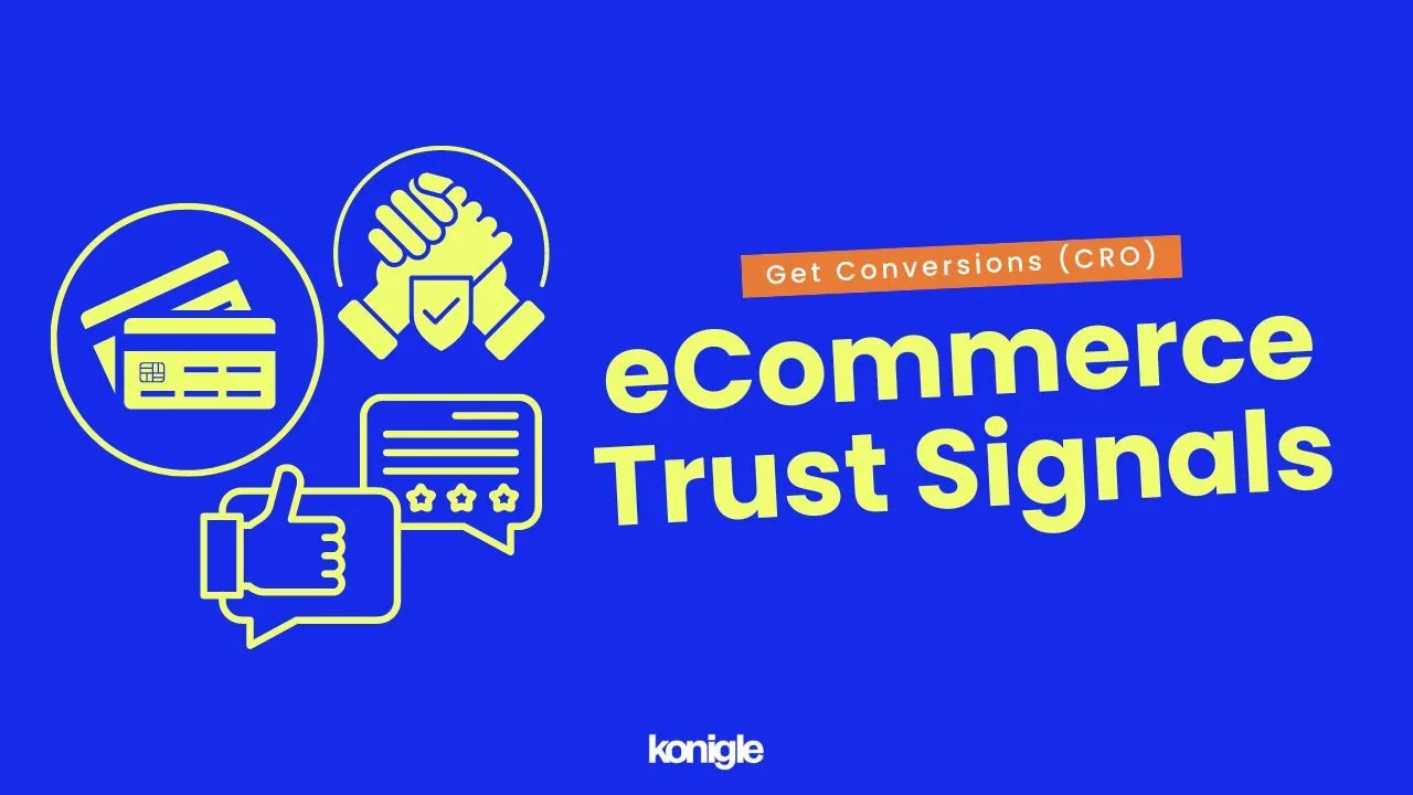
What are trust signals?
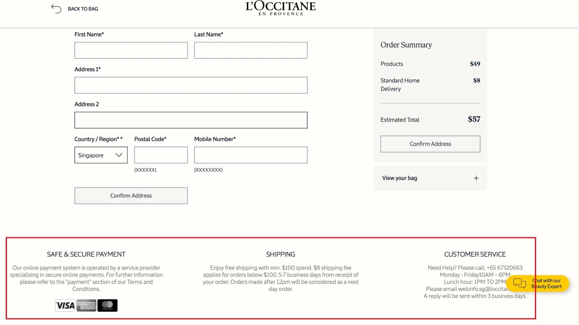
Trust badges are visual cues that indicate a website is safe and secure. They can be placed in different areas of the website, such as the checkout page, product page, or homepage. Some of the most common trust badges include:
- Payment trust badges: These small icons indicate the accepted modes of payment. When people see a recognizable brand, it helps them feel more confident.
- Customer reviews: Positive customer reviews can help to reassure potential customers that they are making a good decision by shopping with your store.
- Guarantees: Offering a money-back guarantee or another type of guarantee can help reduce the perceived risk for potential customers.
- Pricing and shipping information: Competitive pricing can serve as a trust signal suggesting your business is legitimate and not trying to exploit customers. Providing clear and transparent shipping information can also help build trust and confidence.
- Contact information: Making it easy for customers to contact you if they have any questions or concerns can also help build trust.
Why are trust signals important?
In the digital age, where online shopping is becoming increasingly popular, it is more important than ever for businesses to show potential customers that they can be trusted.
- Increased trust and brand reputation: Trust signals show that you are a legitimate business and can help to increase trust and confidence with potential customers leading to more sales and conversions.
- Reduced cart abandonment: When customers are reassured that their personal and financial information is safe during checkout, they will be less likely to abandon their cart.
- Increased customer loyalty: Trust signals show that you value your customers and are committed to providing a safe and secure shopping experience hence increasing customer loyalty.
How to implement trust signals in your store?
The specific trust signals that you use will depend on your industry, target audience, and other factors. Here are the steps on how to implement trust badges in e-commerce:
- Choose the right trust signals: There are many different trust signals available, so it is important to choose the ones that are relevant to your business and target audience. i.e. Security certificates, customer reviews, etc.
- Place the trust signals prominently: The trust signals should be placed prominently on your website, such as on the homepage, the checkout page, or the product pages.
- Use high-quality images: The trust signals should be high-quality images that are clear and easy to read. This will make them more effective in building trust with potential customers.
- Keep the trust signals updated: If you change any of the information on the trust signals, such as your contact information or your privacy policy, be sure to update your website as well. This will ensure that potential customers are always seeing accurate information.
8. Value Proposition in eCommerce
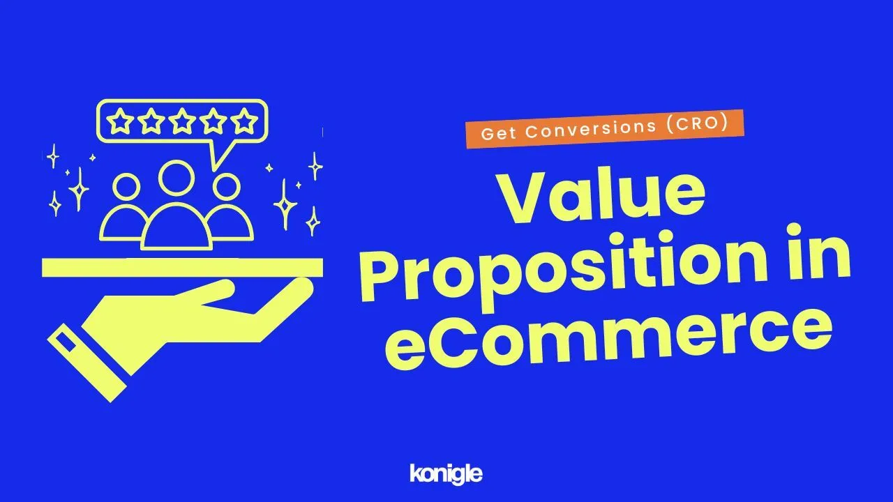
What is a value proposition?
A value proposition in e-commerce is a statement that summarizes the unique benefits and value that your products or services offer to your target customers. It should answer the question, "Why should customers buy from you instead of your competitors?”
A good value proposition should be:
- Specific: Clearly state the benefits that customers will receive. For example, "Our products are high quality," vs "Our products are made with 100% organic materials and are guaranteed to last for at least 10 years."
- Pain-focused: Focus on the problems that your products or services solve for customers. For example, "Our products are affordable," vs. "Our products are affordable, so you can save money without sacrificing quality."
- Differentiated: Highlight the unique benefits that your products or services offer, compared to your competitors. For example, "Our products are great," vs. "Our products are the only ones on the market that are made with recycled materials."
Why is having a value proposition important?
Differentiate from competitors
In the e-commerce industry, several businesses sell similar products or services. A robust value proposition can help you stand out from the crowd and attract customers seeking the benefits you offer.
Attract new customers
A clear and concise value proposition can help you communicate the value of your products or services to potential customers and persuade them to buy from you.
Increase sales
A well-crafted value proposition can convince customers to choose your products or services over those of your competitors.
Build customer loyalty
A value proposition that focuses on the benefits customers will receive can help you build customer loyalty and encourage repeat purchases.
Improve customer satisfaction
A value proposition that addresses the needs and concerns of customers can help improve customer satisfaction and reduce the likelihood of customer churn.
How to find your value proposition?
- Identify your target customers: Who are you trying to reach with your value proposition? What are their needs and wants?
- Understand their pain points: What problems are your target customers facing that your products or services can solve?
- Identify the benefits that you offer: What are the specific benefits that your products or services offer to your target customers?
- Unique selling point: What makes your products or services unique and different from those of your competitors?
- Simple and concise: Your value proposition should be easy to understand and remember.
- Test and iterate: Once you have a draft of your value proposition, test it with your target customers and get feedback. Make changes as needed.
A well-crafted value proposition can be a powerful tool for attracting new customers and increasing sales. By taking the time to write a compelling value proposition, you can set your e-commerce business up for success.
9. Product Sampling
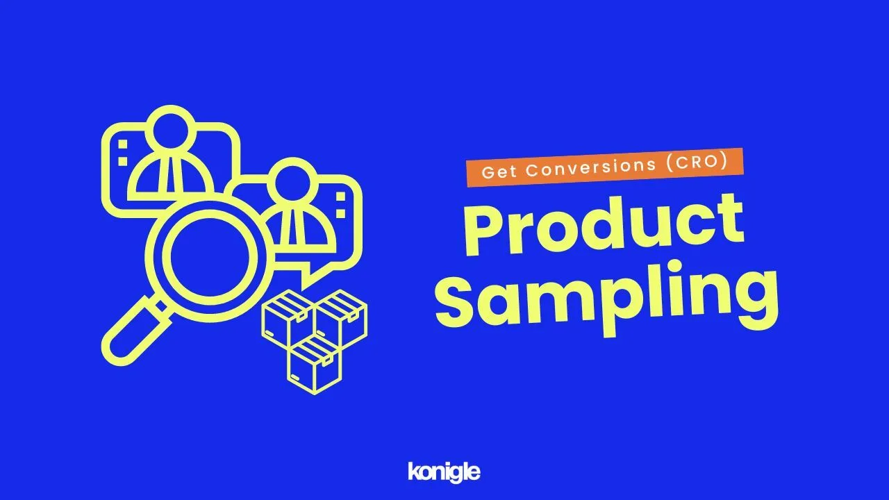
What are product samples?
Product sampling in e-commerce is the practice of offering customers free samples of products to try before they buy.
- In-order samples: The most common type of product sampling in e-commerce. When a customer places an order, they are given the option to add a free sample of a product to their cart.
- Free samples with email signup: This is another popular way to offer product samples in e-commerce. Customers are asked to sign up for your email list in exchange for a free sample. This is a great way to build your email list and reach new customers.
Why is providing product samples important?
Product sampling can help to increase brand awareness, boost sales, and reduce product returns. If you are looking for a way to improve your conversion rates, product sampling is a strategy worth considering.
- Increase brand awareness: Product sampling allows customers to try your product before they buy it, which can help to increase brand awareness and build trust.
- Boost sales: Customers who try your product are more likely to buy it.
- Reduce product returns: Customers are less likely to return a product that they have already tried.
- Improve customer satisfaction: Customers appreciate the opportunity to try new products before buying them.
How to allow potential customers to request samples?
1. Choose the right products to sample
The products you choose to sample should be relevant to your target audience and should be something that they are likely to be interested in trying.
2. Decide how you will distribute the samples:
You can distribute samples in a variety of ways, such as:
- Adding them to existing orders
- Giving them away at trade shows or events
- Offering them as prizes in contests or giveaways
3. Set a budget
Product sampling can be expensive, so it's important to set a budget before you start. The cost of sampling will vary depending on the size and type of samples you are giving away, as well as the method of distribution.
4. Measure results
It's important to measure the results of your product sampling campaign so that you can see how effective it is. You can measure the results by tracking sales, return rates, and customer satisfaction.
10. Good customer service
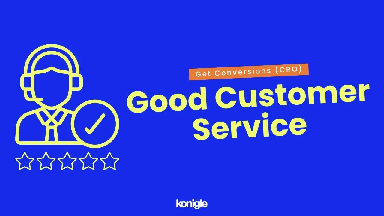
What is good customer service?
Good customer service in e-commerce is all about providing a positive and helpful experience to customers, whether they are shopping on your website, using your app, or contacting your customer support team.
Why is good customer service important?
1. Increase sales
Customers who have a positive experience with your customer service are more likely to make repeat purchases from you. In fact, a study by American Express found that 86% of customers are more likely to do business with a company again after having a positive customer service experience.
2. Build customer loyalty
Customers who feel valued and respected by your customer service team are more likely to become loyal customers. This means that they are more likely to continue doing business with you and to recommend your company to others.
3. Improve brand reputation
When customers have a positive experience with your customer service, they are more likely to speak positively about your company to others. This can help to improve your brand reputation and attract new customers.
4. Reduce customer churn
Customer churn is the rate at which customers stop doing business with your company. Good customer service can help to reduce customer churn by resolving problems quickly and efficiently, and by making customers feel valued and respected.
5. Save money
Good customer service can help you to save money in the long run by reducing the number of returns and refunds, and by preventing negative reviews and social media posts.
How to provide good customer service?
Be responsive
Customers expect to be able to get in touch with you quickly and easily, whether they have a question about a product, need help placing an order, or have a problem with their purchase. Aim to respond to customer inquiries within 24 hours, or even sooner if possible.
Be empathetic
Put yourself in the customer's shoes and try to understand their needs. Be patient and understanding, even if the customer is upset or frustrated.
Be accurate
Make sure that your customer service representatives are accurate in their responses and that they provide the correct information. This will help to build trust and confidence with customers.
Be solution-oriented
Focus on finding solutions to customer problems, not just on apologizing for the problem. Offer clear and concise instructions on how to resolve the issue, and follow up to make sure that the customer is satisfied.
Be personalized
Personalize your customer service interactions as much as possible. This could mean using the customer's name, referring to their previous purchases, or sending them a follow-up email after their order has been shipped.
Go the extra mile
Sometimes, going the extra mile for a customer can make all the difference. This could mean offering a refund or replacement for a damaged product or giving the customer a free gift.
Conclusion
Therefore, by following this guide along with careful attention to detail and consistent effort, any online store can become a successful and profitable business venture!